25 Modern Accountant Websites that Win Clients
 By David Nge | Last Updated: January 07, 2025
My work is supported by affiliate commissions. Learn More
 By David Nge | Last Updated: January 07, 2025
My work is supported by affiliate commissions. Learn More
Here are some of the best account and accounting firm websites I've found online.
They're based all around the world and there's design and copywriting tip in each of them to inspire your own :)
They are handpicked after scouring over a hundred accountant websites on the internet.
All of these websites are built using affordable website builders and content management system (CMS) such as Wordpress and Squarespace, which are highlighted below if you're curious.
If you need more details, check the review I wrote on top beginner friendly website builders that are easy to get started.
Enjoy!

Blue is one of the most used colour in large corporation websites since it conveys trust, confidence and honesty.
But, CPA Australia has done a great job with highlighting the contrast with mustard yellow for the primary call to action buttons, i.e the Sign up button, login, starting a live chat with their customer support.
The tile design breaks away from conventional layouts and makes it easier for users to find relevant info on site.
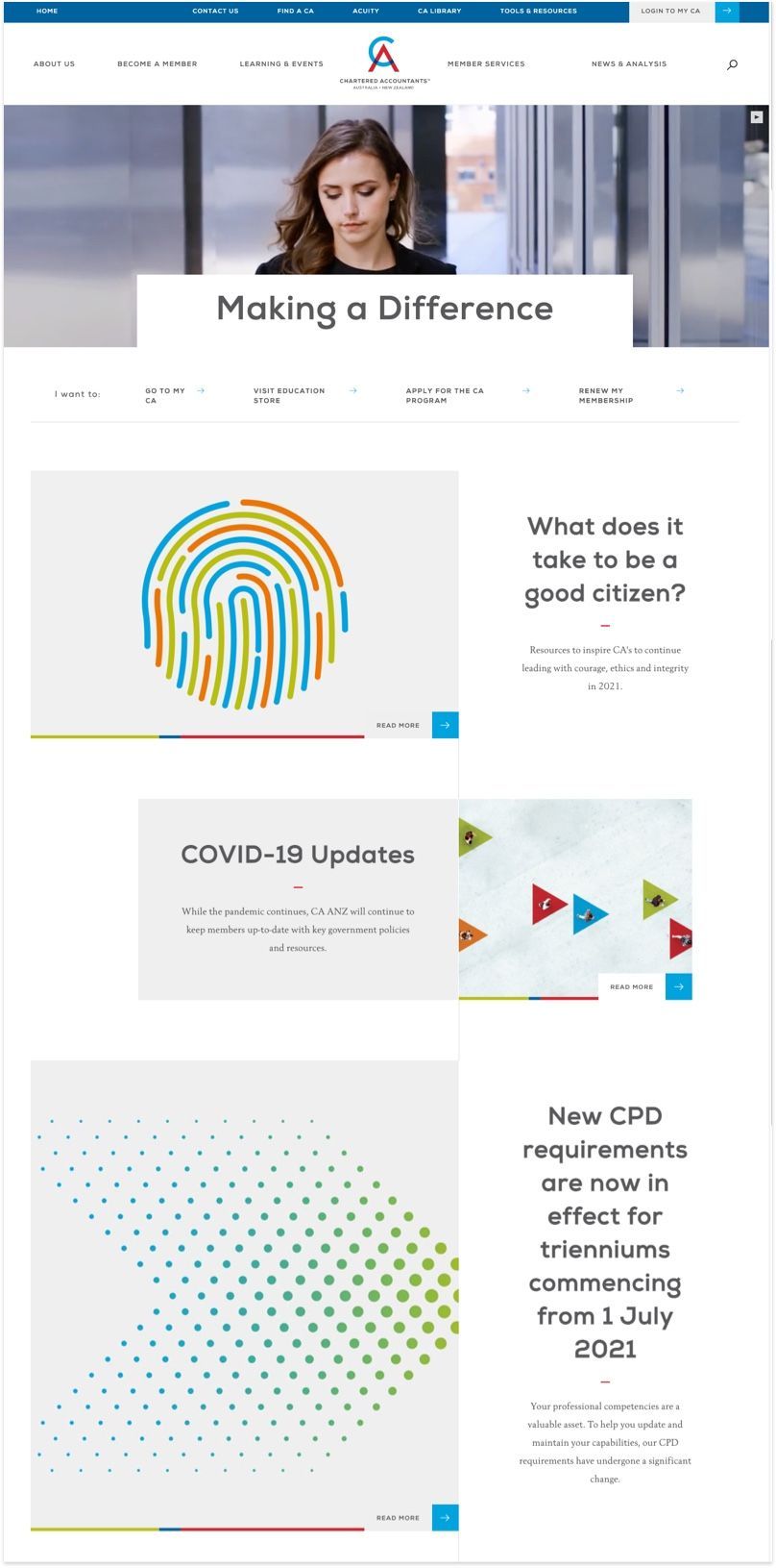
This is a great example of using typography, white space, and good imagery to depict a professional website. It's easy to read (thanks to ample white space used), and the writing is not overly formal. This website is definitely built with the end user in mind.
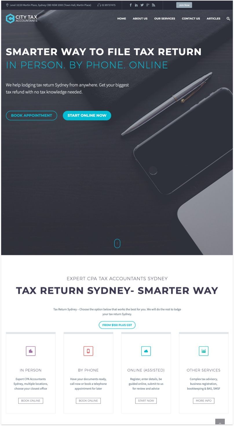
If you have a distinct colour brand logo like City Tax, use it as an accent colour across your website. It's an easy way to add personality to your website (on top of a neutral colour) without having to choose a complicated colour palette for your site.
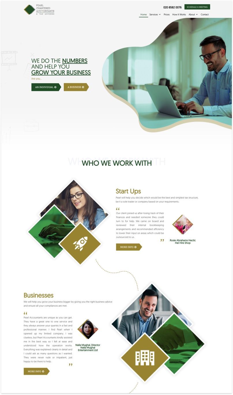
Brand colour isn't the only way to leverage your website design. Pearl Chartered Accountant's web developers cleverly utilizes diamond images that mimic the shape of their logo.
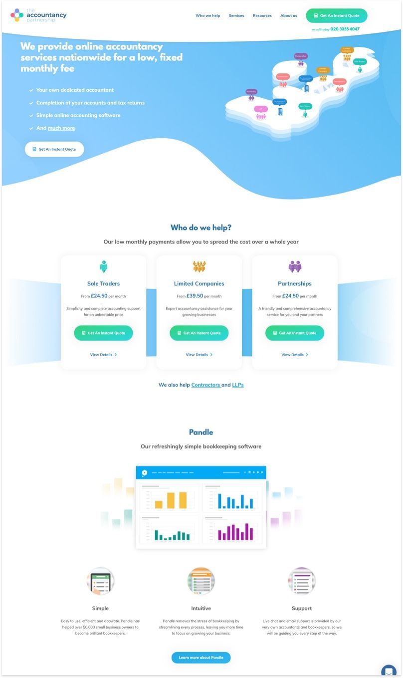
When your brand logo is made up of multiple colours (just like the accountancy partnership). A quick way to keep your design "on brand" is to incorporate those colours in icons and illustrations. Careful not to overdo it, otherwise you'll clutter the overall website aesthetics.
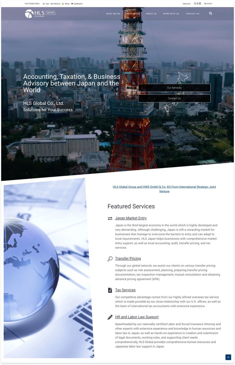
An easy way to get images appear less boring? Crop the images into trapezium instead of the original rectangle. You can imagine how boring the HLS Global website would look otherwise. This simple image alteration is a welcome surprise without spending extra resources.
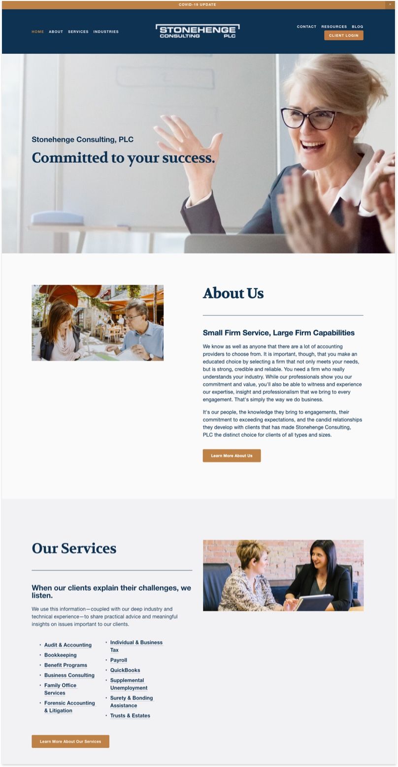
The color palette used on the Stonehenge Consulting home page is simple, unassuming, and most importantly, gives a sense of professionlism that CPA firms should have. There are tons of free tools in the market to help you find awesome colour palette for your site such as Coolors and Color Hunt.
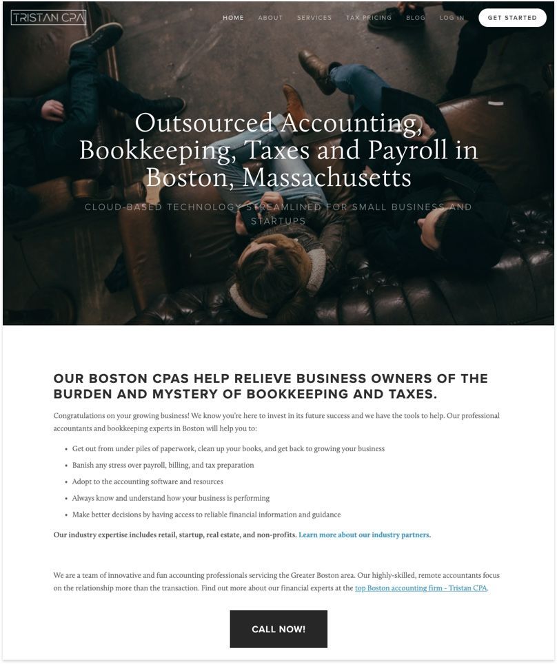
Tristan CPA's website, while simple, has done a good job explaining everything that a client needs.It's easy to understand and jargon-free, which definitely helps clients understand their core offerings.
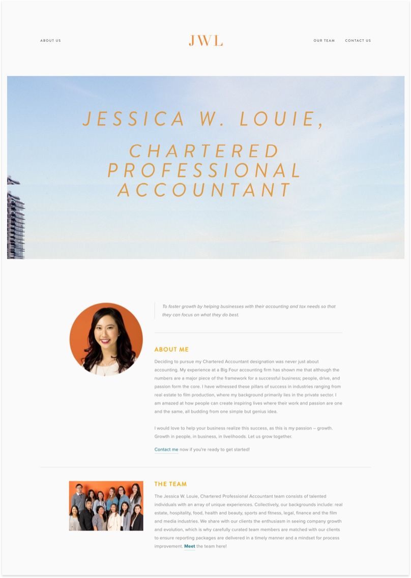
Jessica runs JWL consulting with the goal of helping business foster growth with their accounting and tax needs. One great tip for header images is to find one with ample space for your headline, such as this city view with a great skyline.
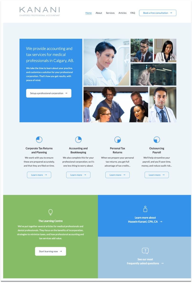
Kanani's Website is a great example of incorporating an image gallery that visually attracts reader's attention. Although, the only critism is their use of stock images. They could leave a bigger impact if they use photos of their own staffs.
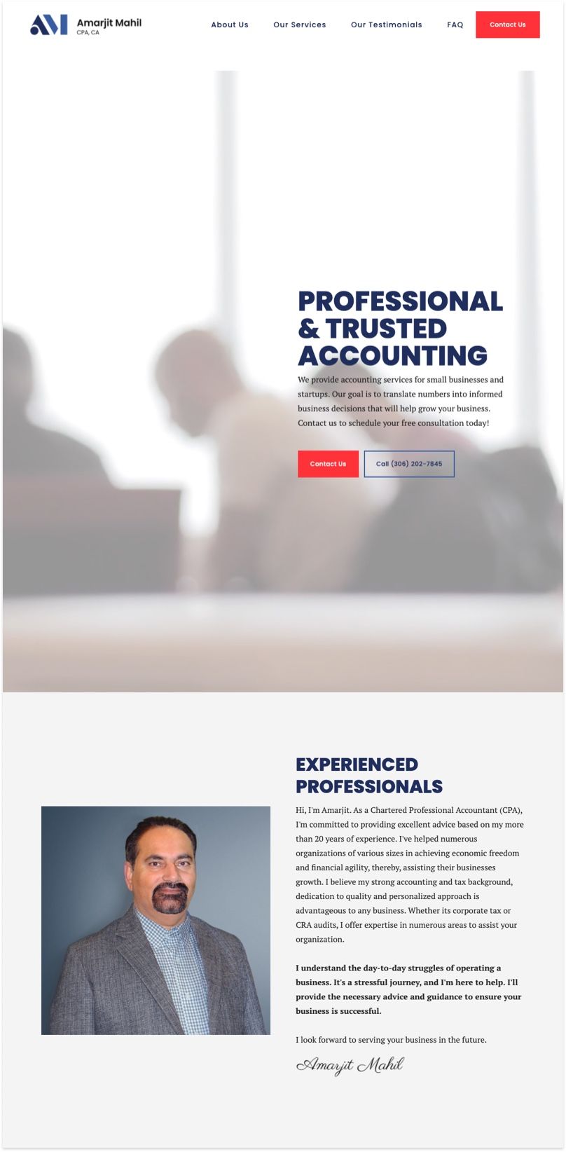
Amarjit runs a CPA firm based in Saskatoon, Canada. As the face of the accounting firm, it's important to get a professional portrait and a profile write up that convince clients why you're the person that'll get the job done.
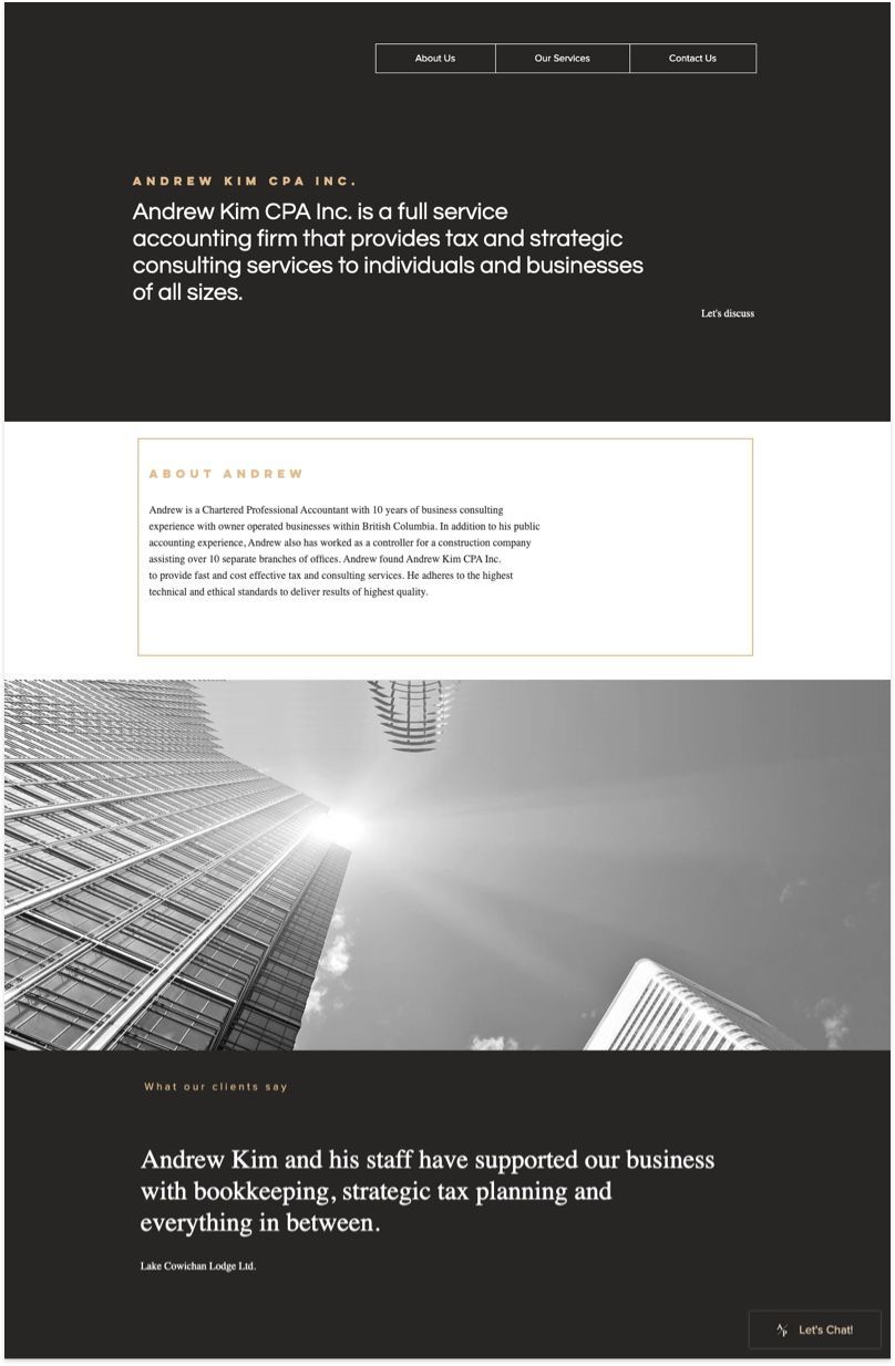
It's rare to come across a service website in Black and White. Andrew and his web design team did a great job with the classic aesthetic while delivering his credentials and services in an unassuming way.
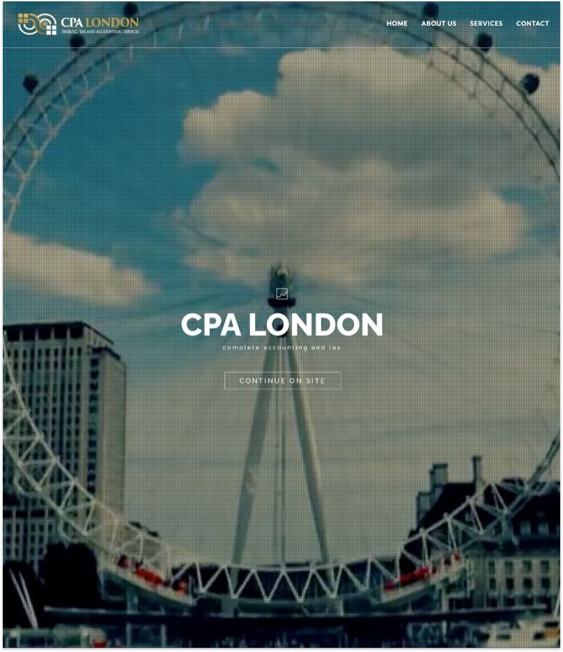
CPA London primarily offers complete accounting and tax solutions for small businesses, Limited Companies and self-employed individuals in North London. The overall site is professionally designed with heavy use of high quality images and videos of London which reflects the local businesses they serve.
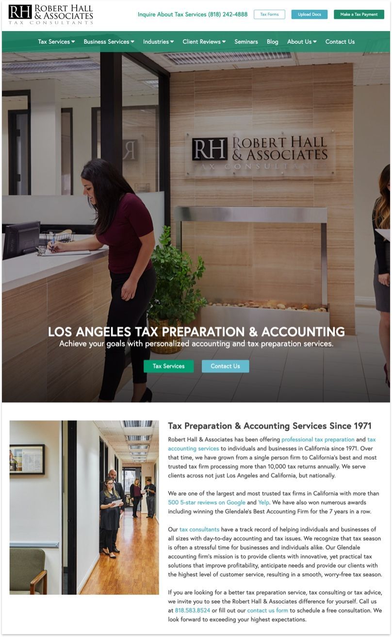
Robert Hall and their team did a great job staying away from using stock photos on their site, a common mistake for corporate sites. Most often than not, using images from your own company with your own staffs helps build an authentic relationship with your clients.
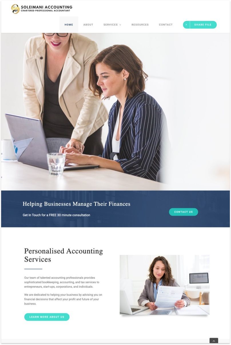
Soleimani Accounting is a Vancouver based licensed CPA firm that Mona Soleimani built since 2013! The overall vibe of the site is friendly yet professional which is a testament to the personalized accounting services that Mona and her team offers.
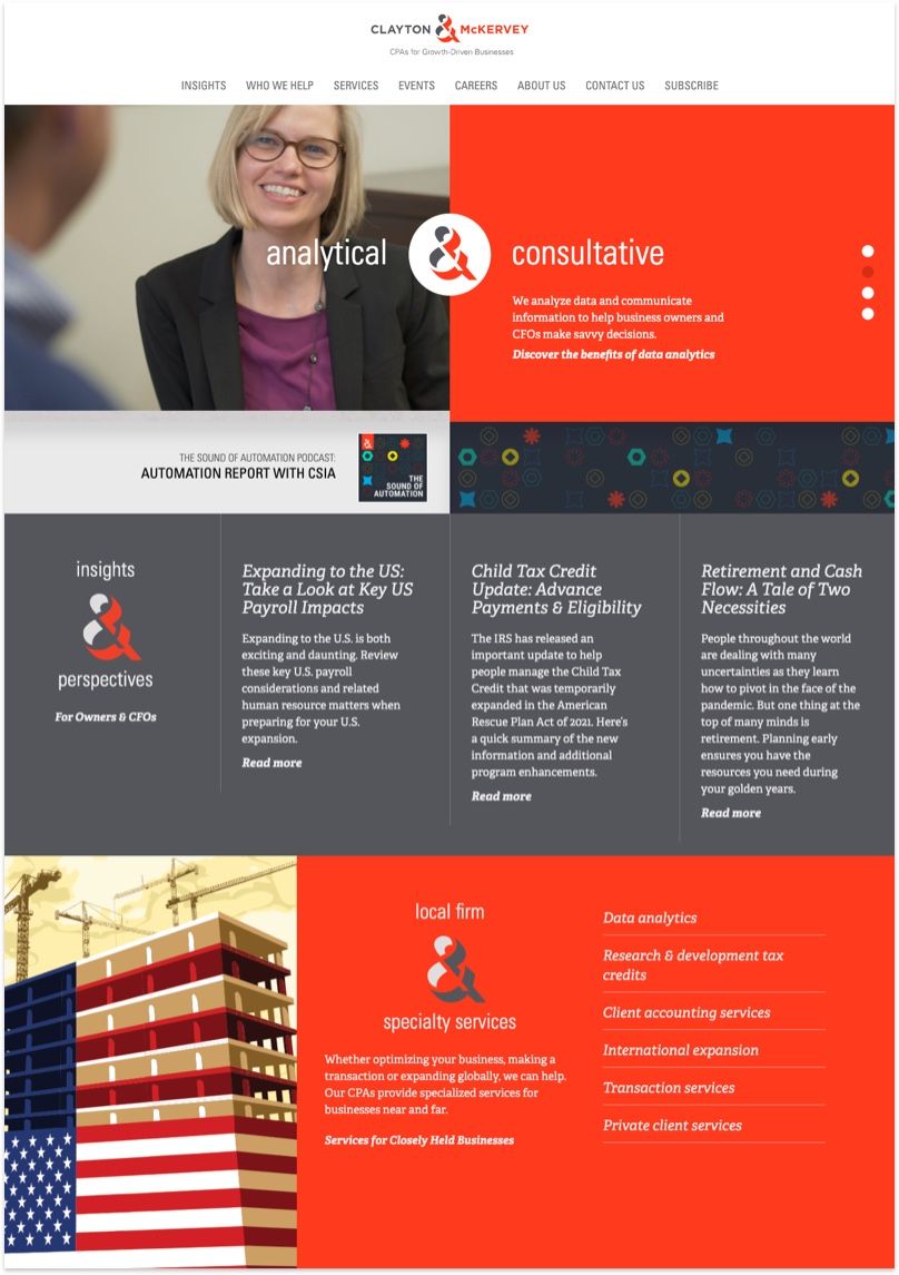
It's good (and rare) to see a corporate website breaks away from traditional color palette and design layout, and that's what Clayton McKervey and the team did. The grid design break ups information so it's easier to digest, and use of bold red that reflects their brand logo, and the use custom images & illustrations really makes the entire site stands out.
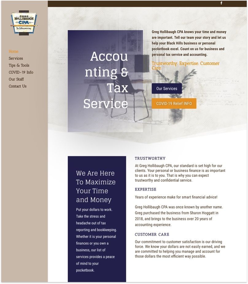
Greg Hollibaugh's website has a classic charm to it. The subdued colour palette is calming and the use of water color illustration puts you in a state of ease. Afterall, their mission is to help businesses take the stress and headache out of tax reporting and bookkeeping so the clients have a peace of mind to their pocketbook.
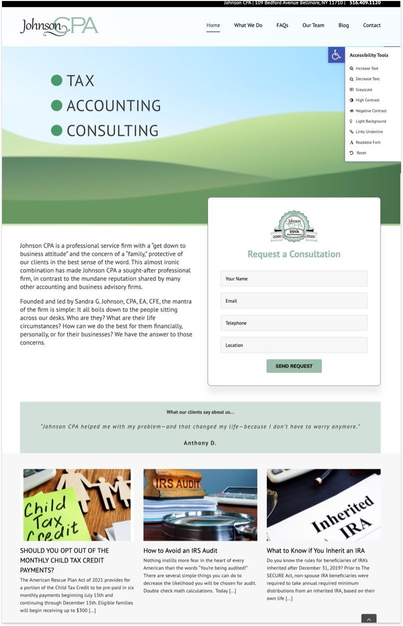
Johnson CPA is one of the rare corporate sites that actually caters to those visually impaired. There's a handy toolbar to adjust the text size, contrast, and highlights of the webpage. There's even a quick tool make the entire site more readable! Kudos do the New York based CPA firm who pride themselves of protecting their clients in the best sense of the word.
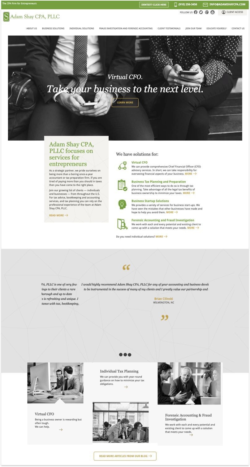
Adam Shay is a North Carolina based CPA firm that helps entrepreneurs plan their tax year round. While the overall site uses black and white photographs, it shows that with a touch of accent colour, which in this case is the colour of their brand , logo, really helps accentuate the personality of the site.
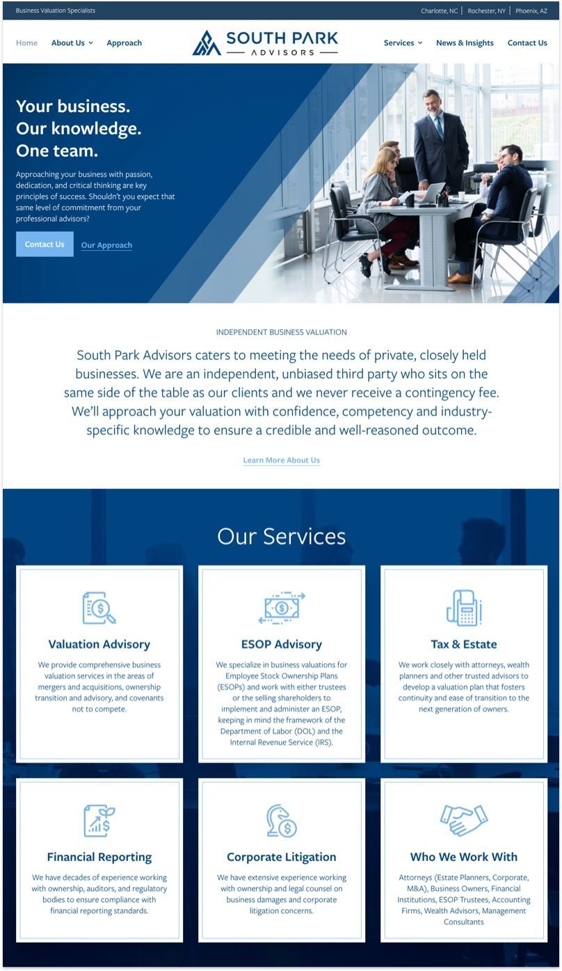
Out of all the accounting firm websites I've reviewed, this is easily the top 3. A great case study of clean and crisp design, professional write up and photography, and tasteful animation throughout.
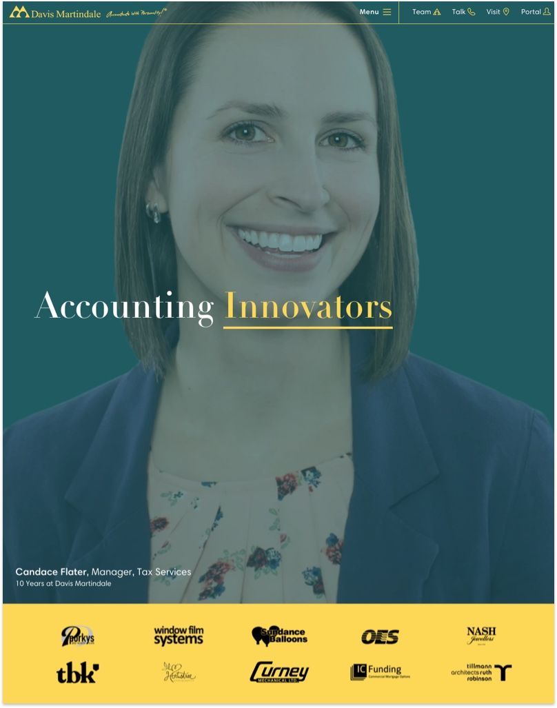
When you have an impressive portfolio of clients be sure to showcase them just like Davis Martindale's team did. Here are a few tips to display your clients: Make sure the logo sizes are well proportioned and they are of the same color so that they are easily distinguishable.
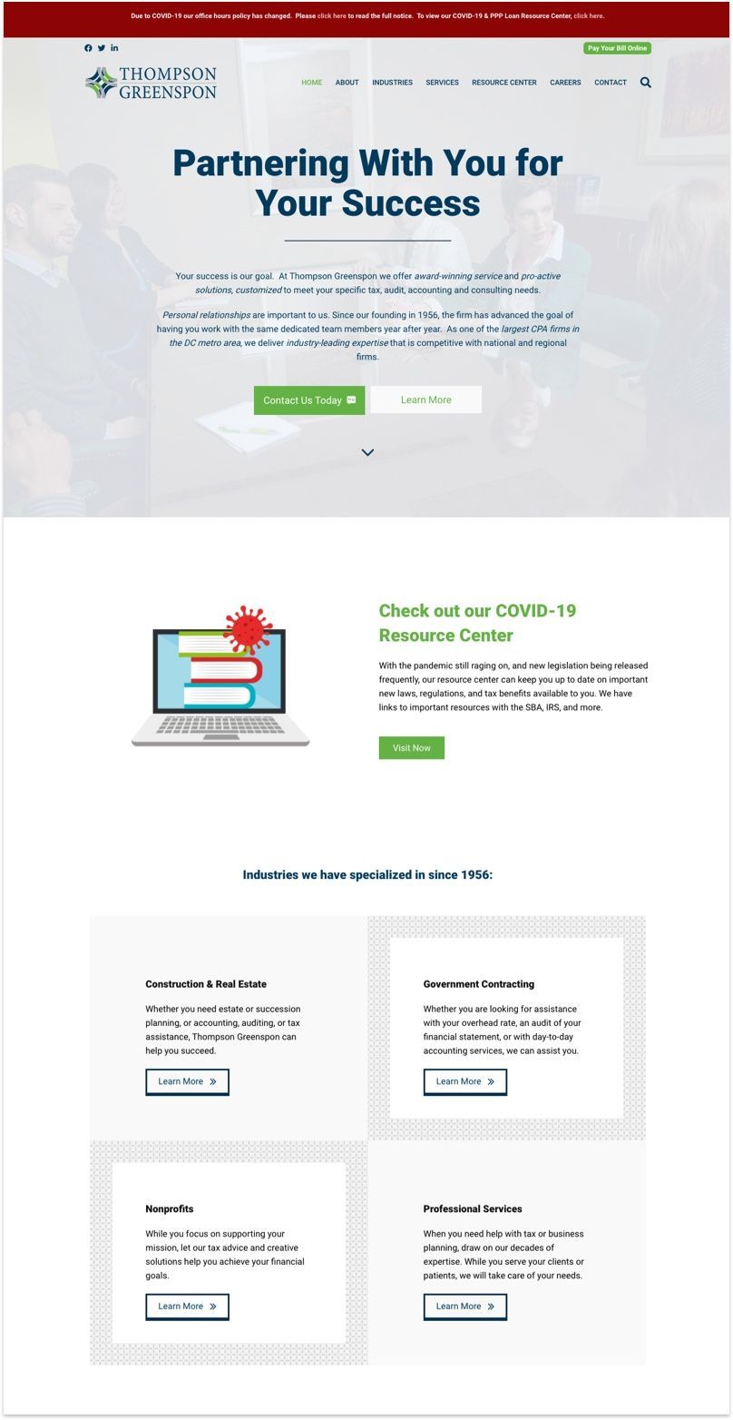
Thompson Greenspon is an award winning accounting firm based in Fairfax, Virginia. One quick tip for designing a headline on top of an image is to add background overlay like the one they did here. The reason for this is to lower the contrast between the text and the background image as a photograph is usually quite busy.
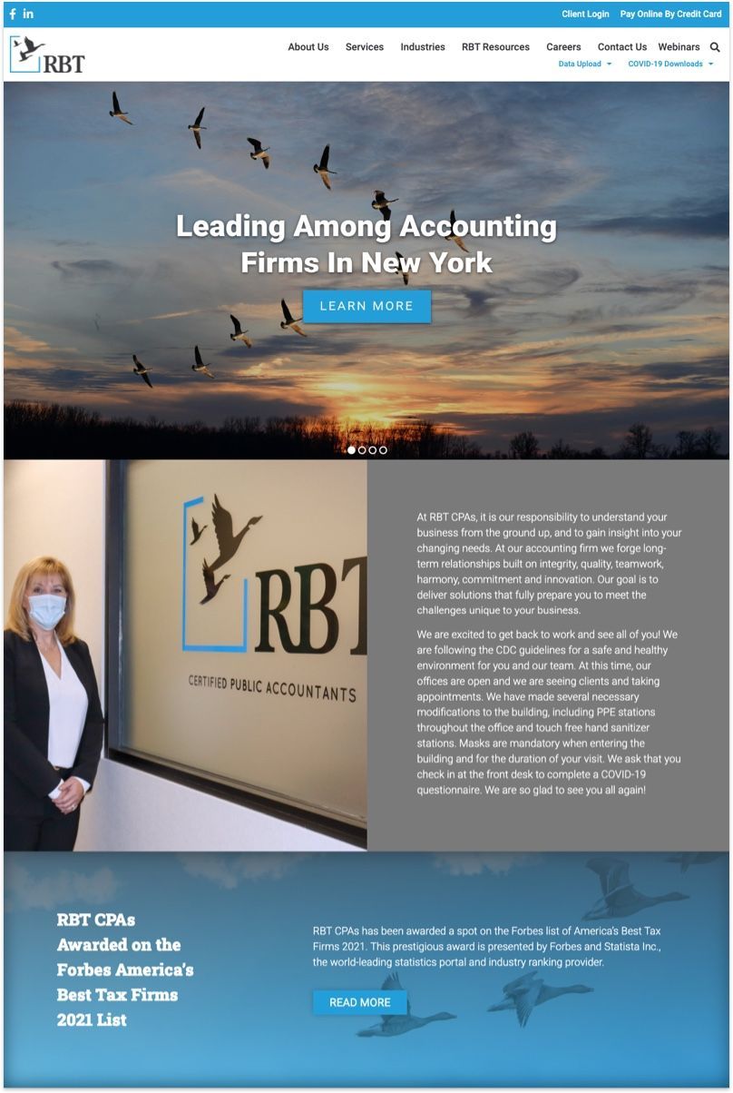
This is a great example that showcase you don't need creative flair to design a professional corporate website. When in doubt use as many in house photographs as you can to highlight your company's achievements, service, and customer care.

Sponsel's website doesn't have a lot of design elements to it but a great photograph with a strong headline can take you a long way. One other compliment I would give is the how they organize their site: It's clear, unambiguous, and most important of all, easy for potential clients to find relevant info for their service.
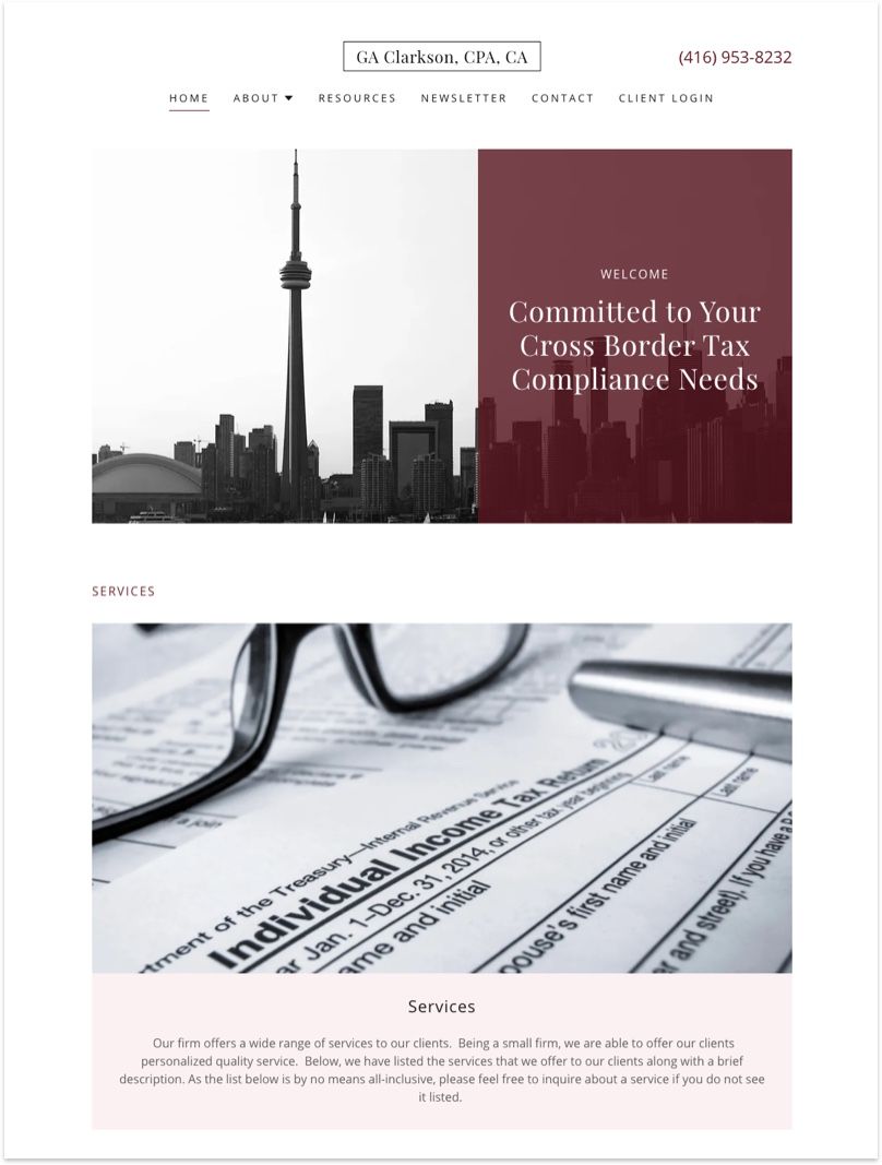
GA Clarkson is run by none other than Aristaea Clarkson, a sole practitioner of Expatriate Tax in Toronto. One great initiative she offers that most other accounting firms don't is a newsletter that helps client keep up with industry's best practices. It's a good way to demonstrate value and expertise to potential client who are on the fence.