27 Inspiring Coaching Website Examples (and how it's made)
 By David Nge | Last Updated: November 14, 2024
My work is supported by affiliate commissions. Learn More
 By David Nge | Last Updated: November 14, 2024
My work is supported by affiliate commissions. Learn More
Here are some of the best coaching websites I've found online.
Whether they're world famous life coach, high performing executive coach, or award winning transformation coach, there's design and copywriting tip in each of them to inspire your own :)
They are handpicked after scouring over a hundred coaching websites on the internet.
All of these websites are built using website builders and content management system (CMS) such as Wordpress, which are highlighted in case you're curious.
If you need more detail, check the review I wrote on top beginner-friendly website builders that are easy to get started.
Enjoy!
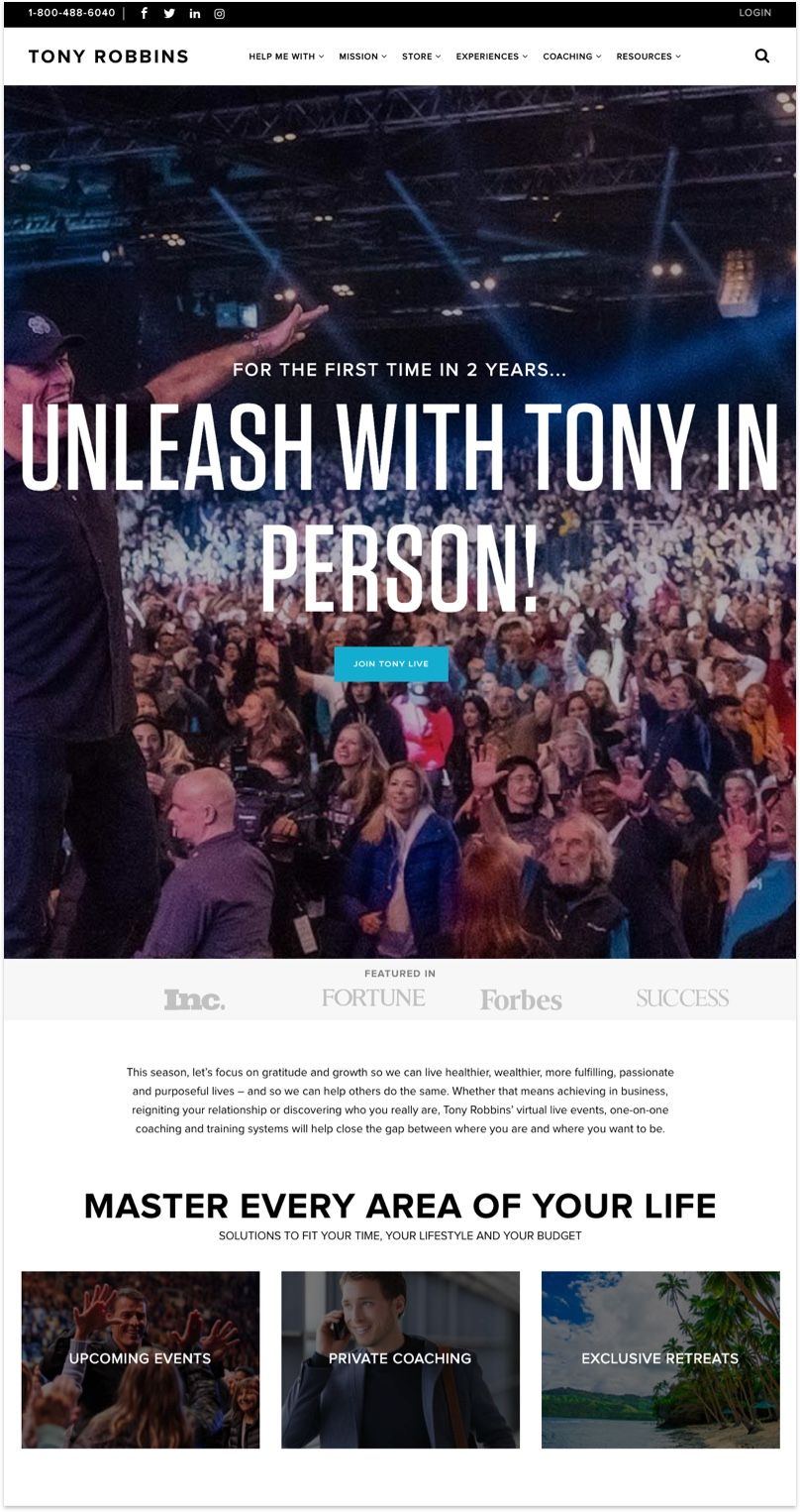
Best-selling author Tony Robbins and his team did a great job with the website by utilizing one of his best assets — live event photos and videos. Live event and photographs from Tony's personal coaching sessions paint a realistic picture of what to expect if you attend one of his sessions.
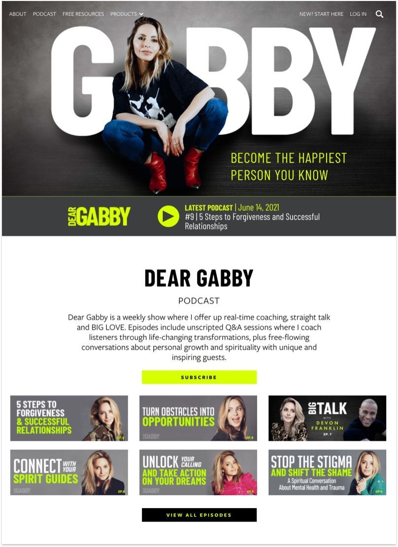
Besides all of the excellent portraits that Gabby has going on, her website features strong typography and accent neon to highlight important message and call to actions. She also has a membership which is hosted on Memberium.
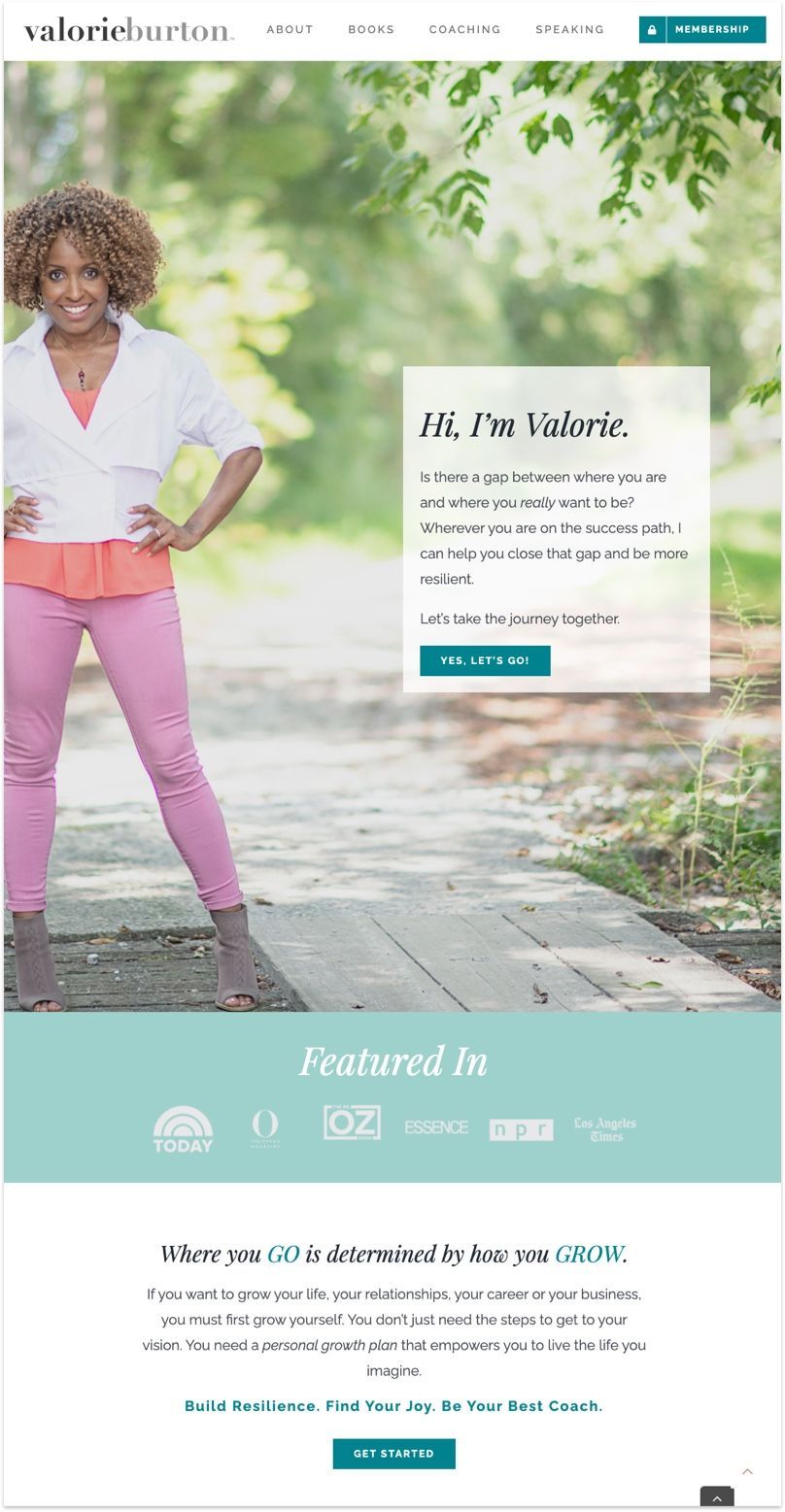
Valorie welcomes you with a power pose to set the tone. You can tell she's a big nature person with all the nature inspired cover photo throughout her website. It's important to highlight your personal quirks as much as you can since the website is an embodiment of your personality.
Sidenote: Valorie hosts her membership site with Kajabi.
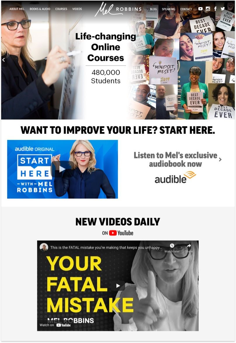
Mel Robbins uses her website as a powerful personal branding tool. You'll be able to tell from the get go all the ventures she's a part of. From online courses, business coaching, audio book, hosting talkshow, speaking events, and more.
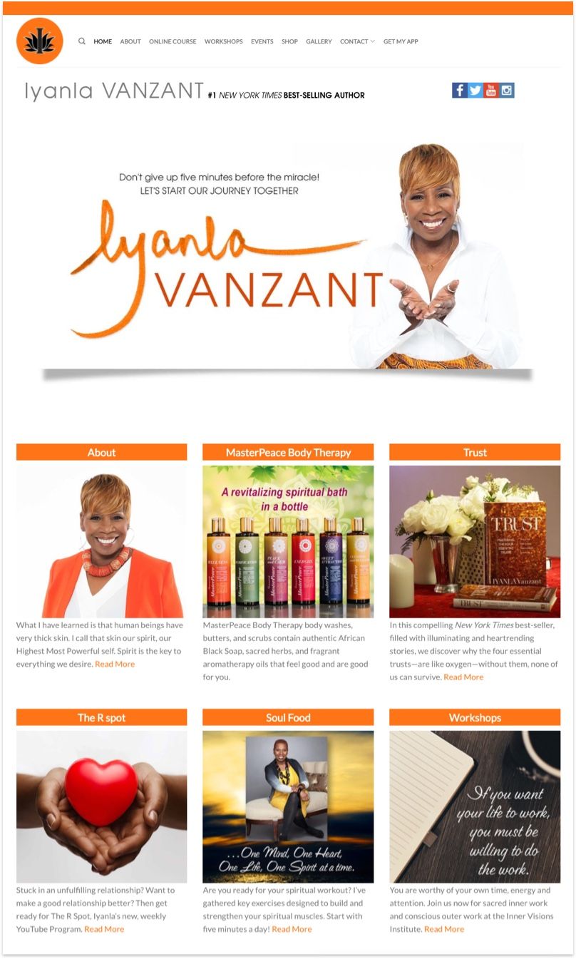
A trend we're seeing now from personal branding website: Choose a favourite color and design around it. Iyanla's website features a coherent layout with tons of personal stories. She even has a merchandize store that's built on WooCommerce
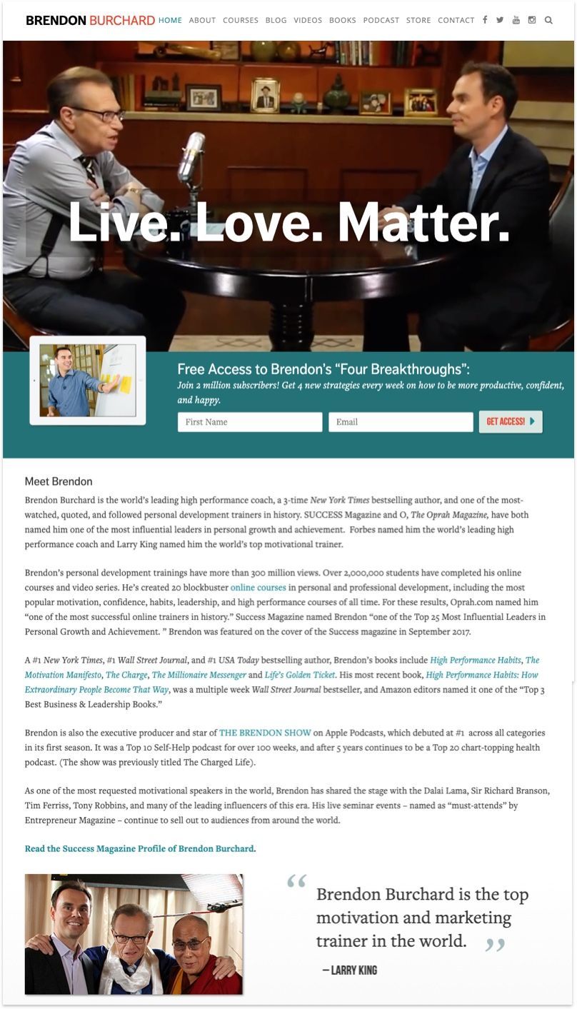
Brendon Burchard makes a compelling statement — A mantra if you will — on his home page along with highlights of his career. He even has a video reel featuring his work with notable figures such as Larry King, Oprah Winfrey, Bill Clinton, and more.
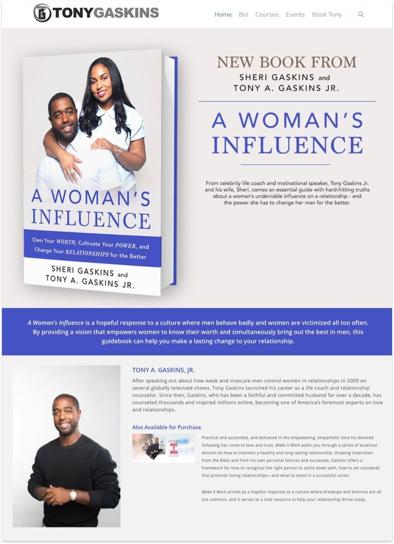
It's relatively simple to build a personal website such as Tony Gaskin's with website builder tool such as visual composer. A drag and drop page builder for Wordpress that saves you a ton of time building your webpage from scratch.
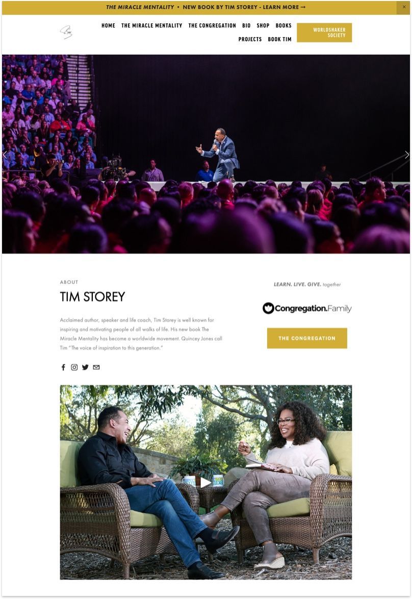
Tim is an acclaimed author, speaker and life coach who is well known for inspiring and motivating people of all walks of life.
Quick tip from Tim's Website — The home page and the header image is a great opportunity to feature important moments and quotes that resonate with your audience.
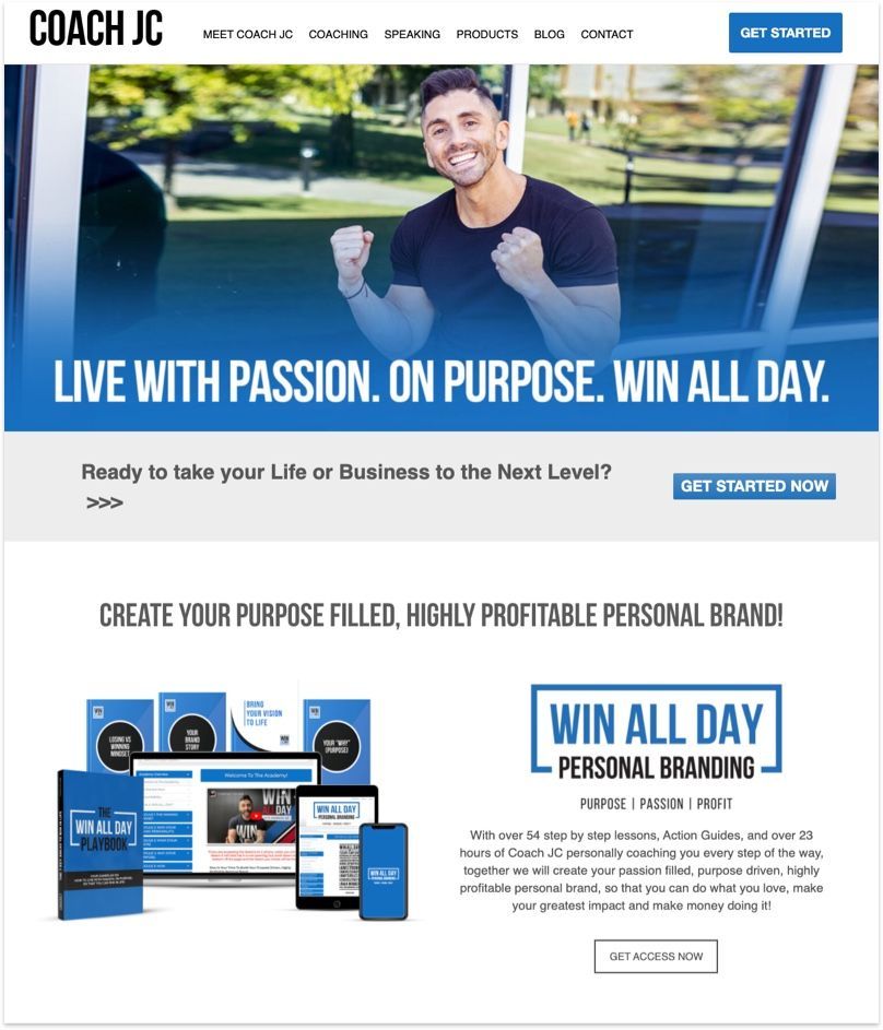
If you have a coaching product — An online course, membership, physical products, etc, be sure to highlight them just like coach JC did on his home page. It tells your audience the best value you have to offer.
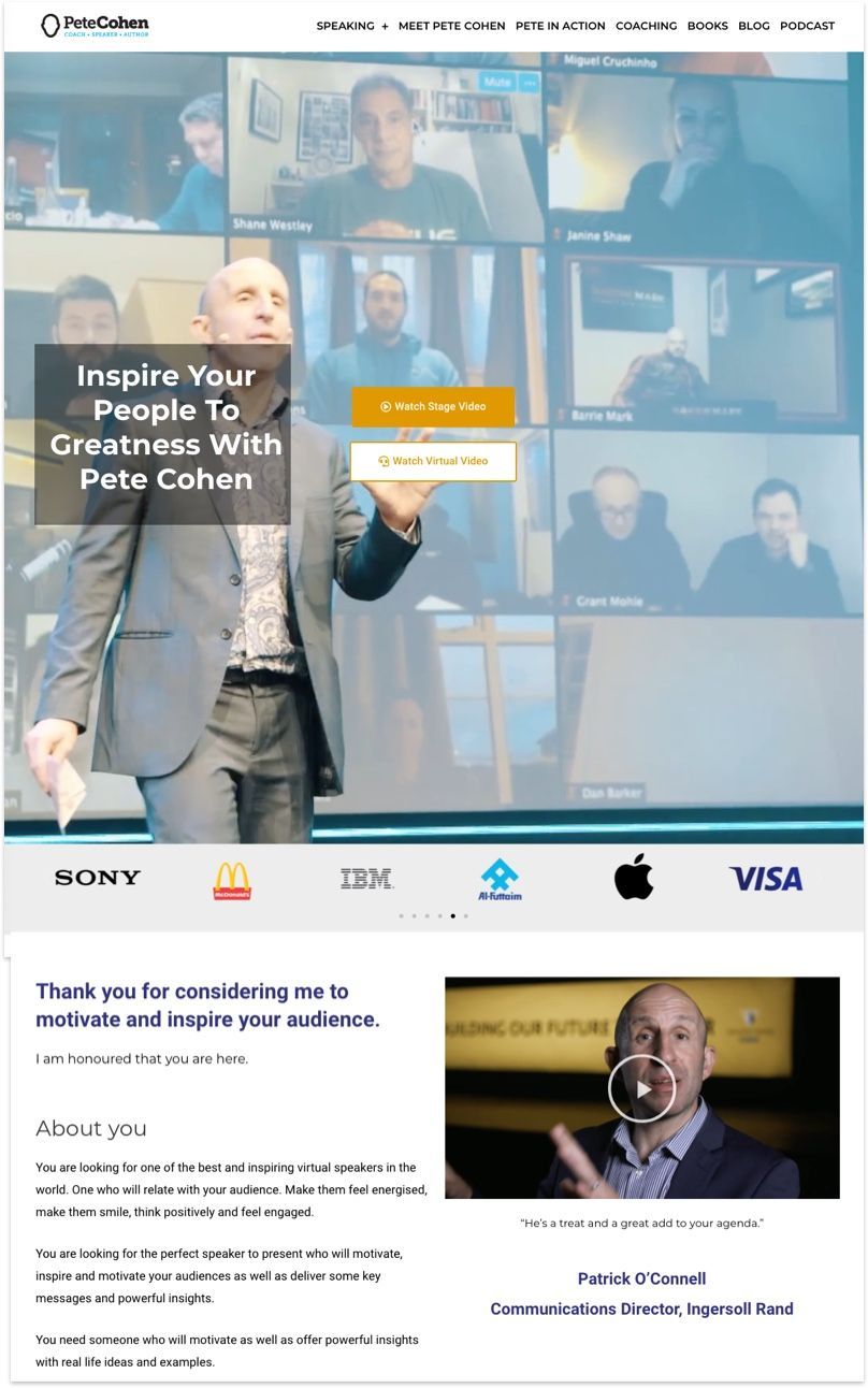
Not everyone can claim they've worked with McDonald's, Apple, and IBM. But that's who Pete used to work with, and you should take very opportunity to highlight this social proof on your home page.
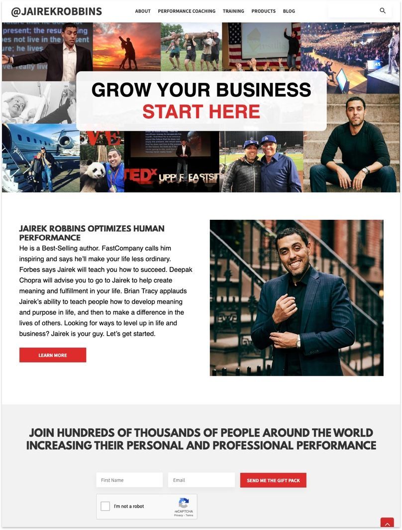
Jairek is a high performance coach who understands the values and competitive advantages he brings to his clients. And he made sure to pitch that on the home page. All successful pitch ends with a call to action, which is exactly what you'll find — A strong ask for you to sign up for his free personal performance gift pack.
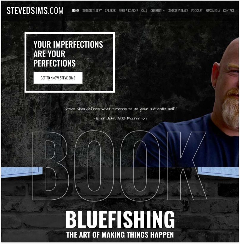
Like his website, Steve is a badass. He coaches popular figures like Elon Musk and Elton John and has a knack for getting clients to focus on real impact.
His website stays away from convention web layout and focuses on key message from his book instead.
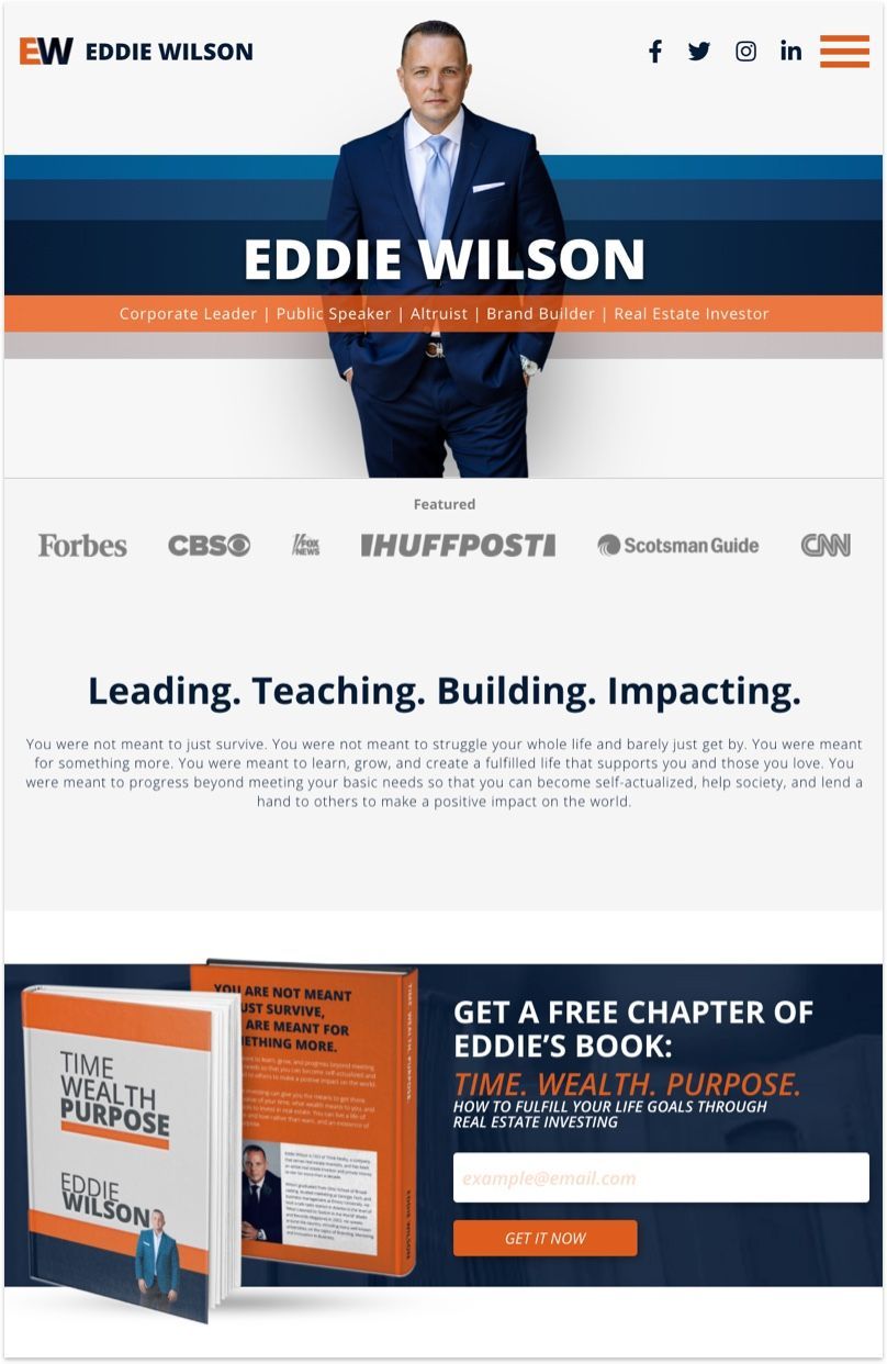
Eddie Wilson owns a ton of business and is happy to each you how to do the same. The first impression you get on his home page? Authority. A great tip for anyone who's written a book — give a free chapter away to build your email list.
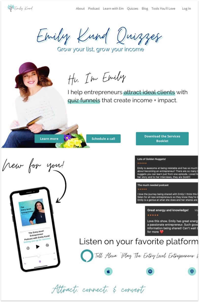
This is a great example of letting your personality comes through your website. It's fun, it's jazzy, and just overall a good vibe. While everyone's website uses a professional serif font, Emily doenn't mind showing off some handwritten typography.
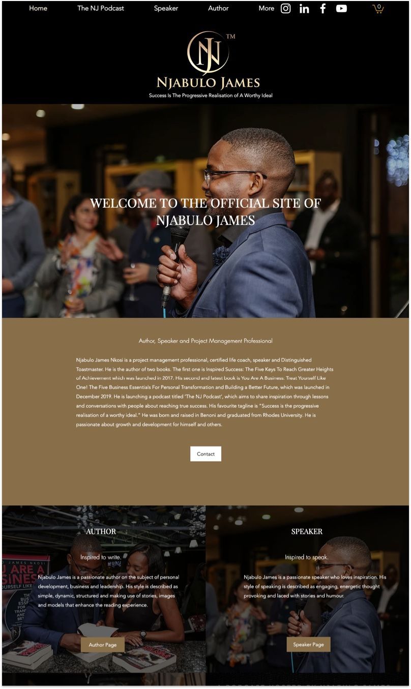
This is a great example of a Wix website that uses a sophisticated dark theme paired with high contrast, quality photographs. The key to make white fonts legible on top of photographs is to darken (or create a dark overlay on top of) the image like Njabulo James' team did.
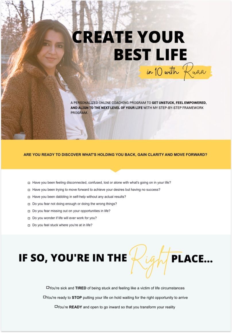
Ruaa created a one-page landing page (using LeadPages) for her 10-week personal coaching course to pursue self-empowerment. The design is simple yet practical.
The use of mustard yellow is really effective to highlight and contrast important messaging against the rest of sections in light background.
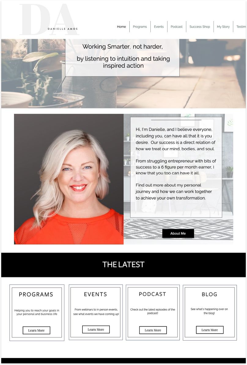
Danielle and her team chose a gentle and nature inspired theme for her website. The choice of using the Raleway font is interesting as well as it's one of the most readable free fonts from Google.
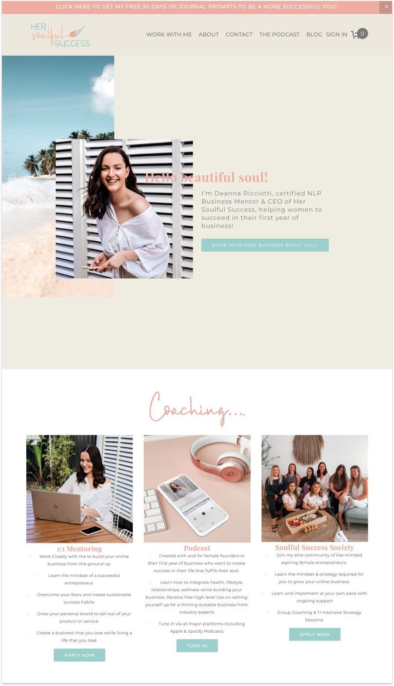
Deanna's goal is to help women succeed in their first year of business! It's crucial that she lists clearly all the coaching programs available to her clients so the expectation is set right from the start.
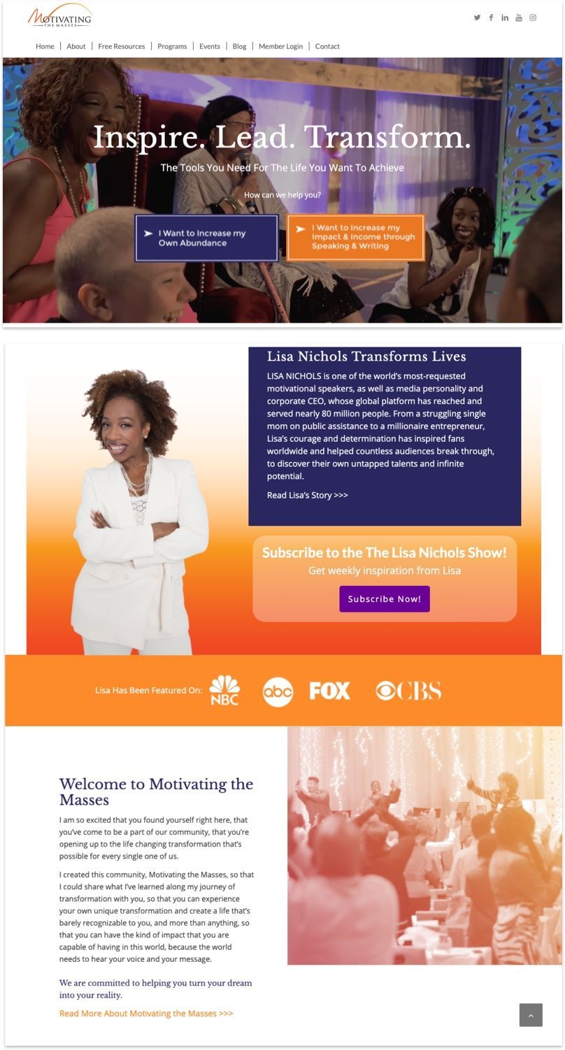
Lisa Nichols and her team also used a video reel to showcase her coaching highlights on the home page. The multiple choice question on the header image is particularly interesting to help web visitors determine how Lisa can best help them with their problems.
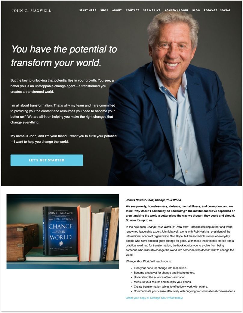
John C. Maxwell's website design isn't particularly inspiring, but his words are. He is the author behind business classics after all. This is a great example of letting your writing come through instead of relying on fancy web design.
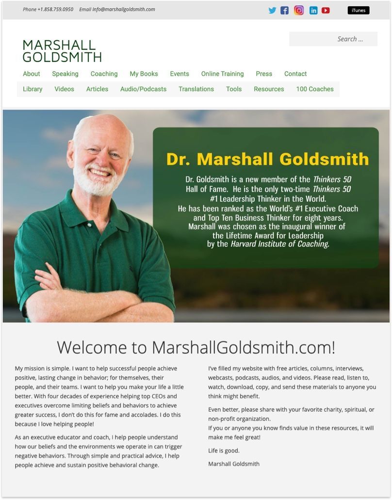
Dr. Marshall Goldsmith is one of the world’s most accomplished and in-demand executive coaches. While green isn't a popular colour for personal branded websites, it works particularly well for Dr Marshall. The smiling portrait is a nice touch too.
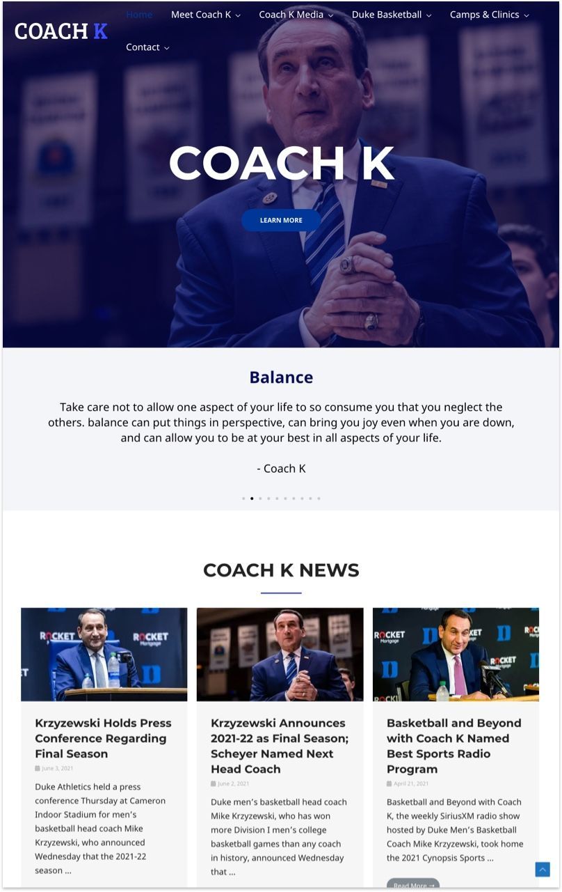
Coach K is the head coach at Duke University who helped them won 5 NCAA titles, the pre-cursor to NBA. The team kept the website simple, highlighting only his best coaching philosophies around team management.
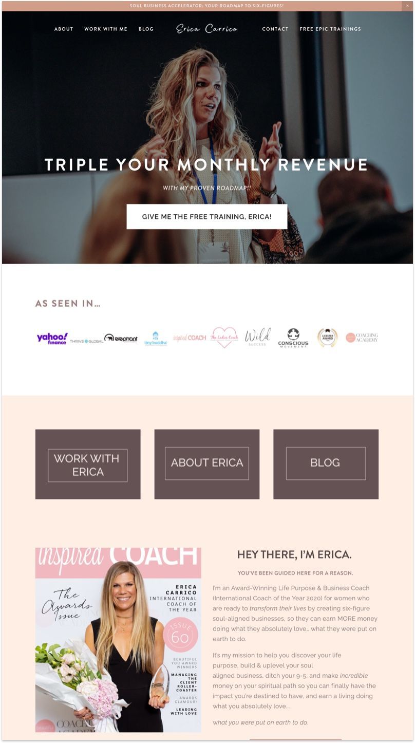
Erica is an Award-Winning Life Purpose & Business Coach for women who are ready to transform their lives by creating six-figure soul-aligned businesses. The website is clean and professionally designed with a soft colour palette to suit her brand.
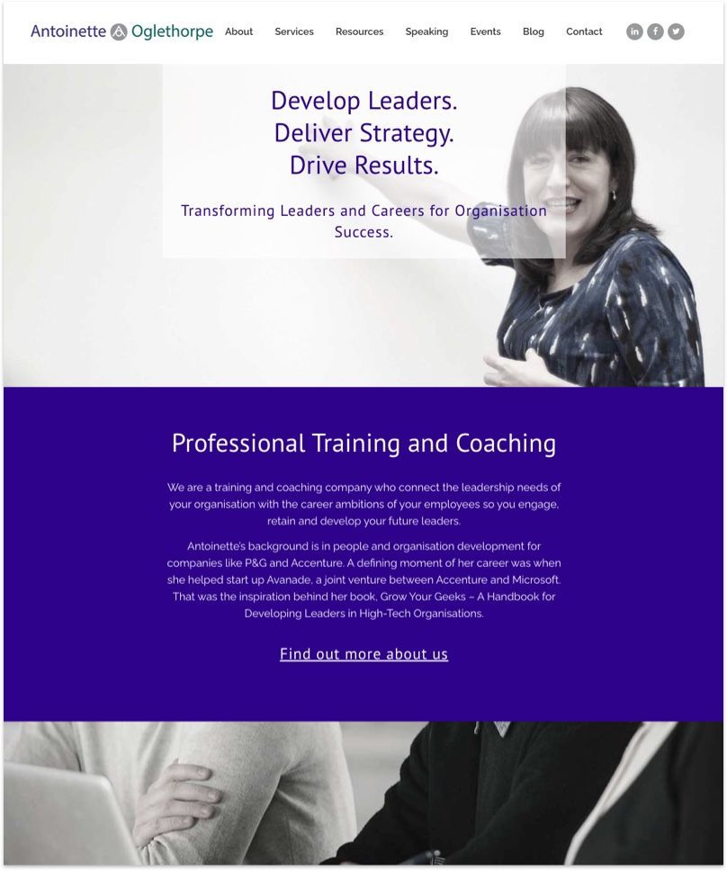
Antoinette is leading her team to provide training and coaching workshops for leaders in organization such as P&G and Accenture. Her website features a no frill deep blue design with a practical layout that highlight her team's expertise.
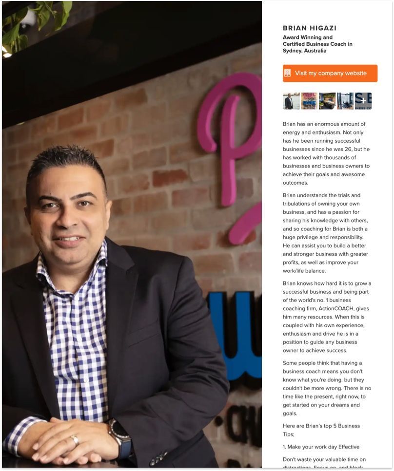
Sometimes you just want to keep it simple. And that's what Brian did. Brian is an award winning Certified Business Coach in Sydney, Australia, and this is a great example of coupling your portrait with a strong written profile to promote your personal brand.
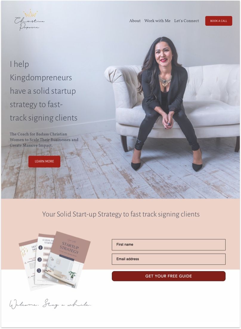
Christina is a navy veteran, motivational speaker, and certified Health Coach. What's great about her website is that she immediately makes an impression with her portrait. She's relaxed, confident, and is quick to provide value by offering free start-up strategy for her client.
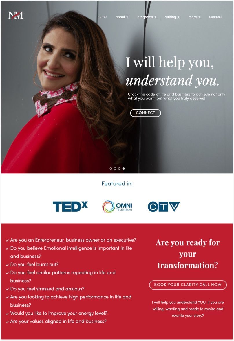
The headline is the first place to make an impression and to capture your audience's attention. Nadiya did a great job delivering her value proposition clearly and succinctly in the headline.