20+ Dental website examples (To build trust & book clients)
 By David Nge | Last Updated: January 27, 2025
My work is supported by affiliate commissions. Learn More
 By David Nge | Last Updated: January 27, 2025
My work is supported by affiliate commissions. Learn More
Here are 17 unique dental care business websites run by independent dentists, doctors of dental surgery (DDS), and doctors of dental medicine (DMD).
I'll share some tips on best practices and what makes a good dentist website.
Interestingly, more Dentist practitioners (or their team) opt for business website builders like Hubspot, Squarespace and Shopify recently on top of the usual Wordpress.
I've labeled each of them right above the description.
Let's get right to it.
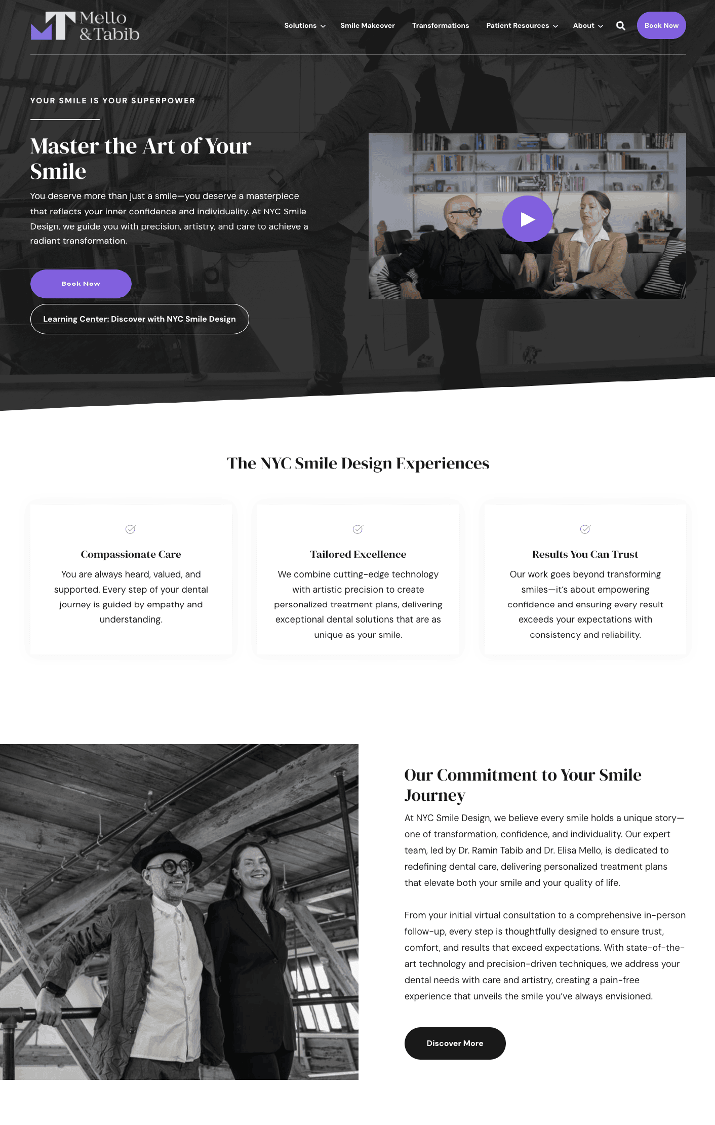
NYC Smile Design, led by Dr. Ramin Tabib and Dr. Elisa Mello, offers personalized dental care in New York City.
Both of them specialized in different aspects of dentistry (complex dental reconstruction and aesthetic dentistry, respectively) while continuing to master breaking developments in their profession.
They're great at combining advanced technology with artistic precision to create personalized treatment plans.
For example, they utilize Digital Smile Design (DSD) to craft custom-designed smiles that enhance natural features, where the patients can preview their new smile before treatment begins.
A key part of their lead generation strategy is incorporating Hubspot's built-in CRM tool and lead generation form.
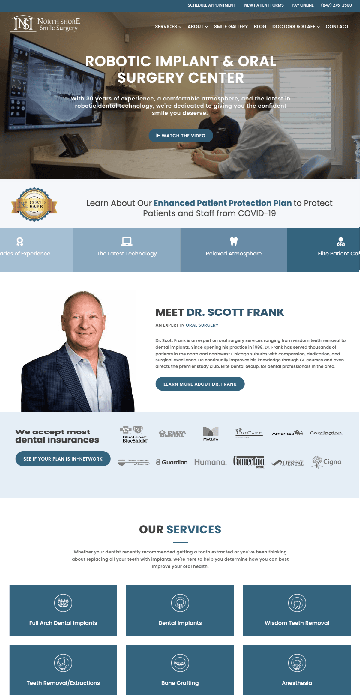
North Shore Smile Surgery, led by Dr. Scott Frank since 1988, offers oral surgery services in Buffalo Grove, Illinois.
He and his team actually uses 3D x-rays and digital impressions to plan and rehearse surgeries virtually before the actual procedure, leading to more precise outcomes and faster recovery times.
This website is a great example of why it's important to display your credentials prominently. They serve as strong social proof, increasing the likelihood that potential clients will feel confident enough to reach out and make the call.
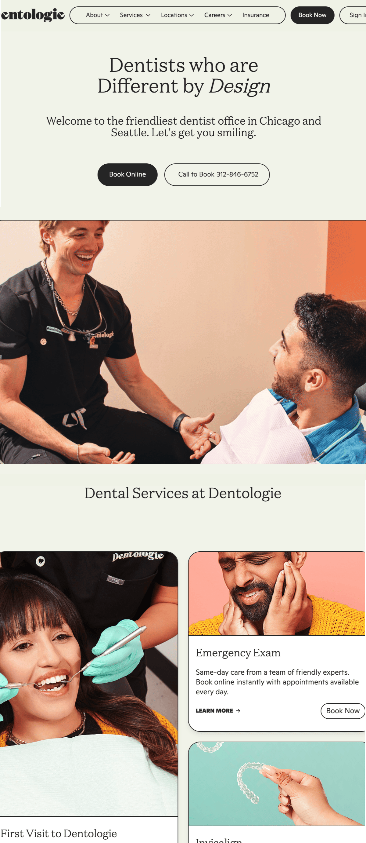
Dr. Hany Kurdi, Dr. Oussama Founas, and Dr. Suhail Mohiuddin founded Dentologie in 2013, and they emphasizes a very patient-centered approach, focusing on comfort and personalized care.
Their clinic also has an app, which allows patients to easily communicate with their doctors and access resources like treatment plans and make appointments scheduling.
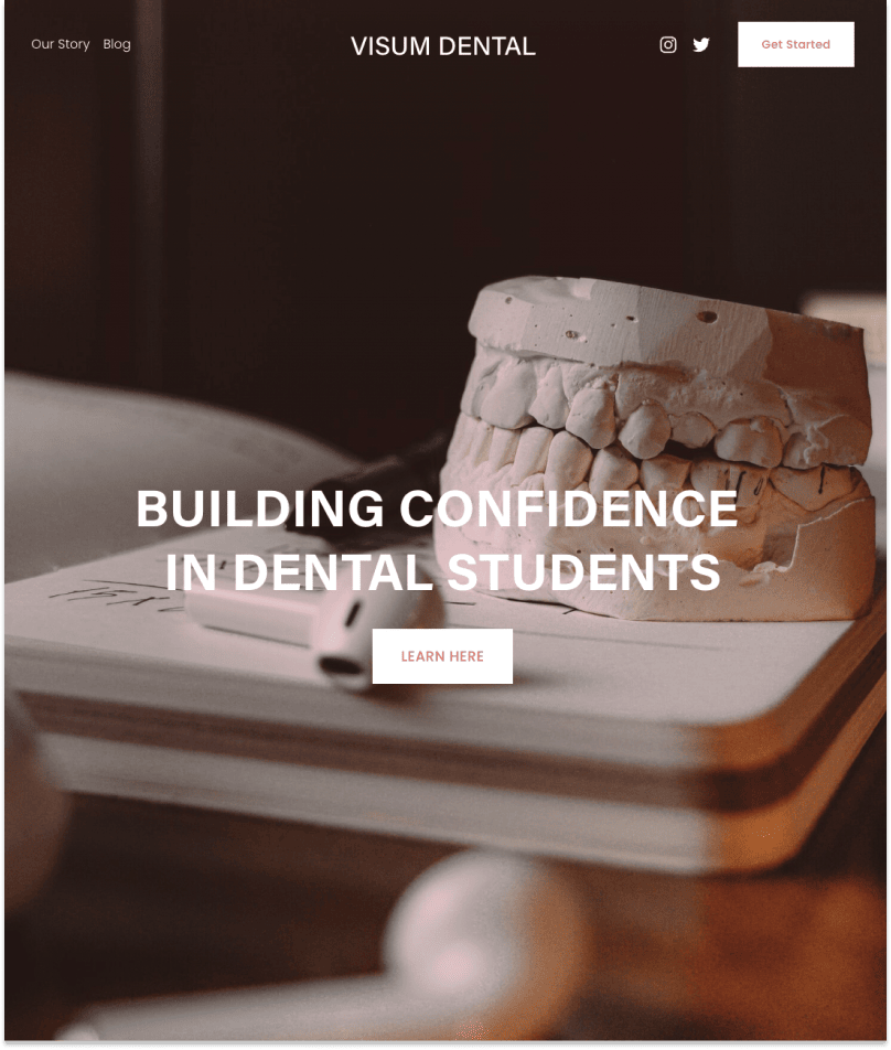
This is a blog site for dental students. It aims to guide students with blogs about issues they may have in their dentistry practice and at school.
The home page gives limited information with two options: "Learn here" for information about the site or "subscribe" to the mailing list.
The "Our Story" page talks about how they want to offer guidance and support through dental school. The "Blog" page has various posts regarding dentistry and dental school.
They also offer other social media connections.
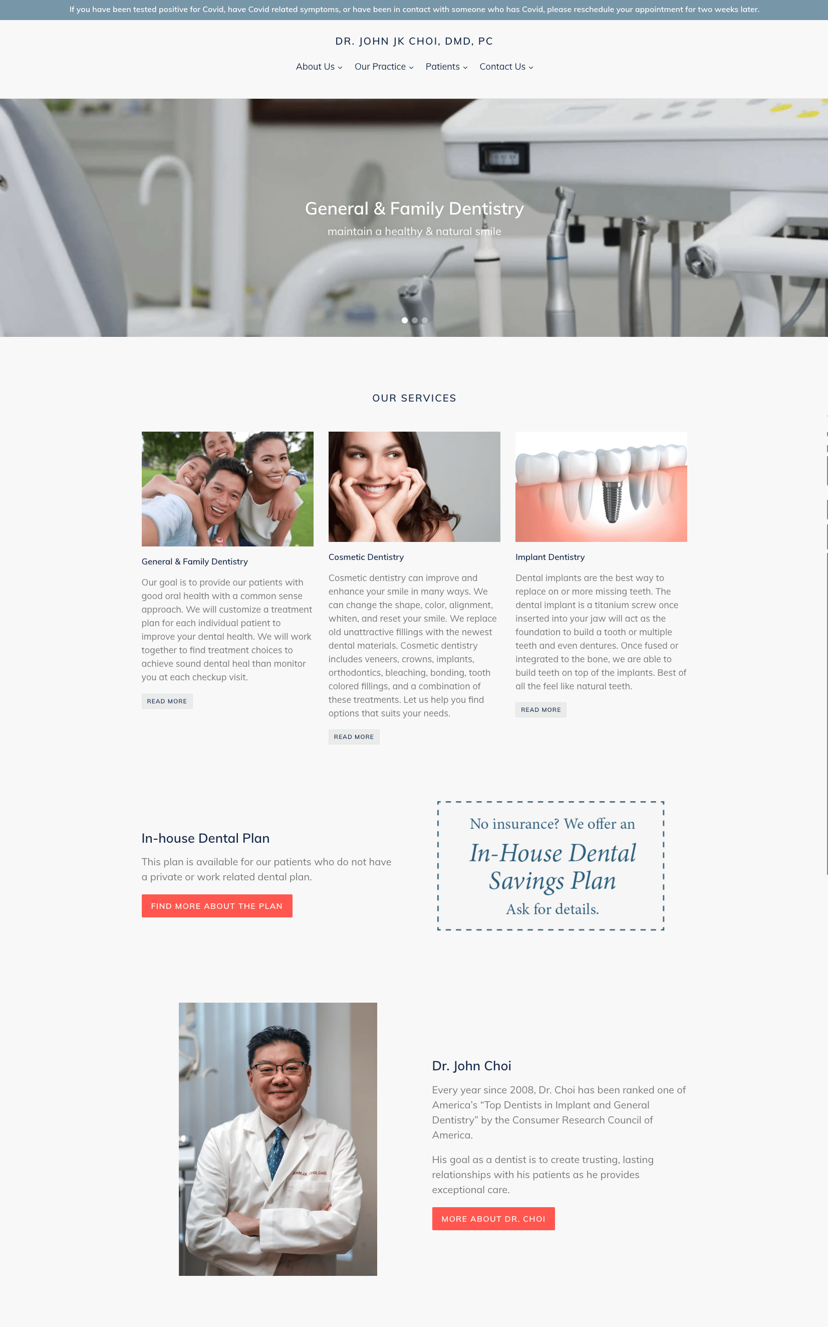
This is a clean-looking website for a general and family dental office. It opens with rotating pictures that can be clicked for more information about Covid procedures and services.
You wouldn't need to click through beyond the home page unless you require specific information. The home page will give you all the essential information you need to make an appointment.
This office has a unique in-house insurance plan for those with no insurance.
They are also the only site with a Q.R. code that patients can use to post reviews and positive feedback.
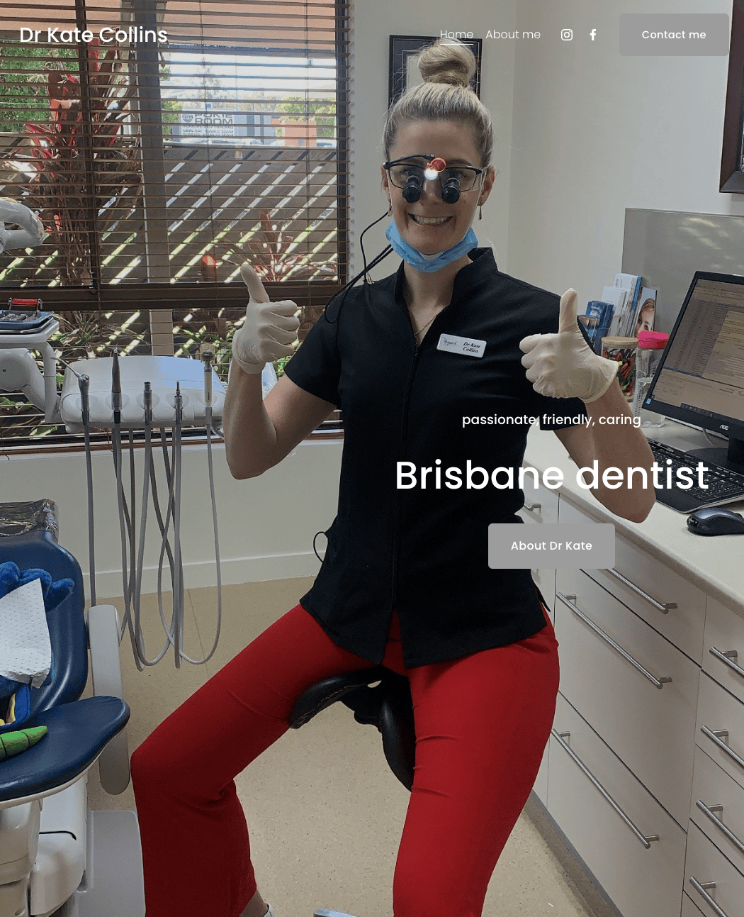
Dr. Collins' dental site features plenty of images she personally took from her office. While the site is simple, she provides a comprehensive overview of her background, services she offers, and specialties.
If you live in Brisbane, it's easy to contact her via several mediums such as Instagram, Facebook, office contact number.
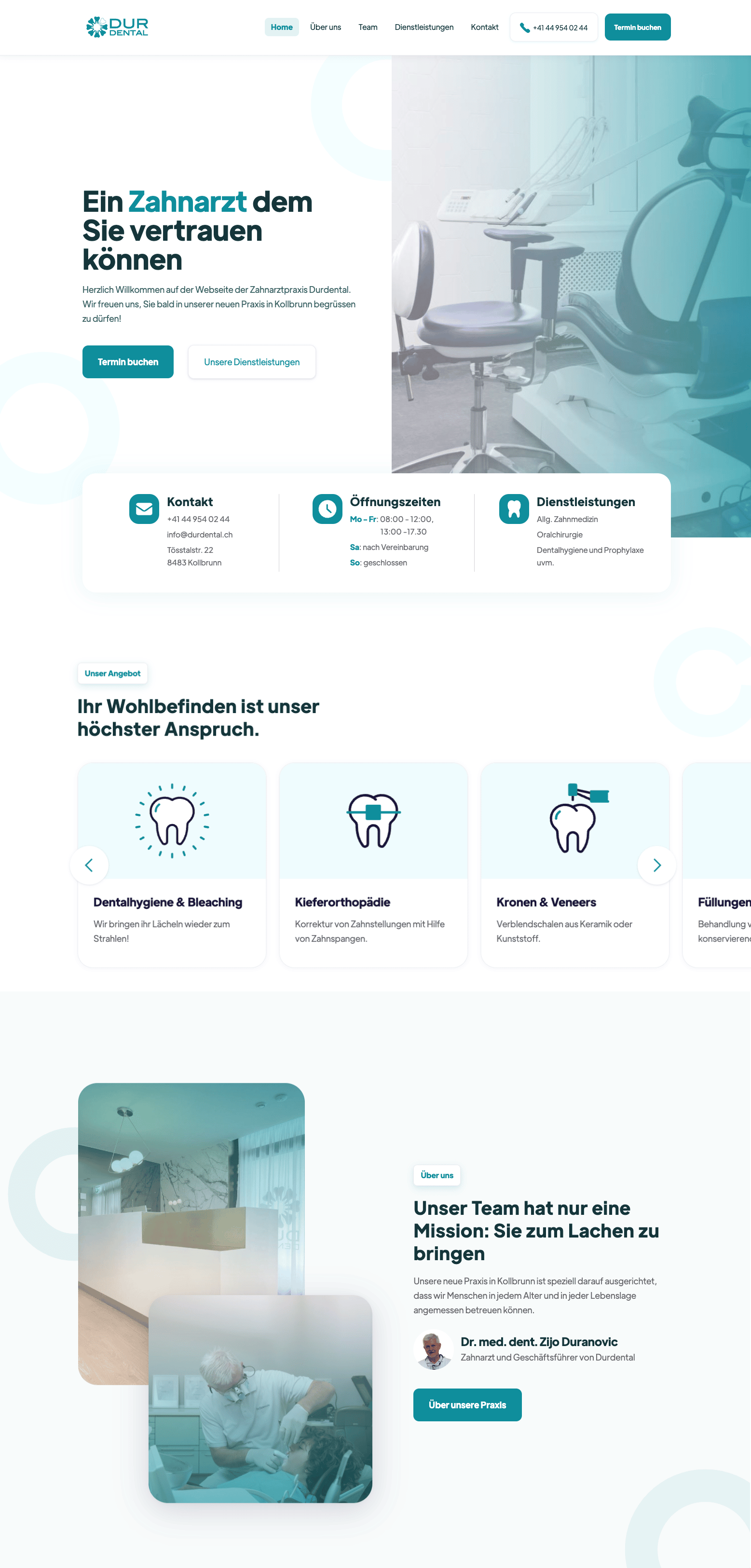
Durdental's website is originally written in German but offers the option to have the site translated into English. The transition is smooth, and the translated page is easily readable with proper grammar and structure.
The website design is clear and straightforward, with soothing blue color embellishment. You can scroll through the topics from the home page to get general information or click on the tabs to go directly to your interest.
Each section has a brief explanation written very clearly and concisely. This makes it easy for the customer to understand what they are offering.
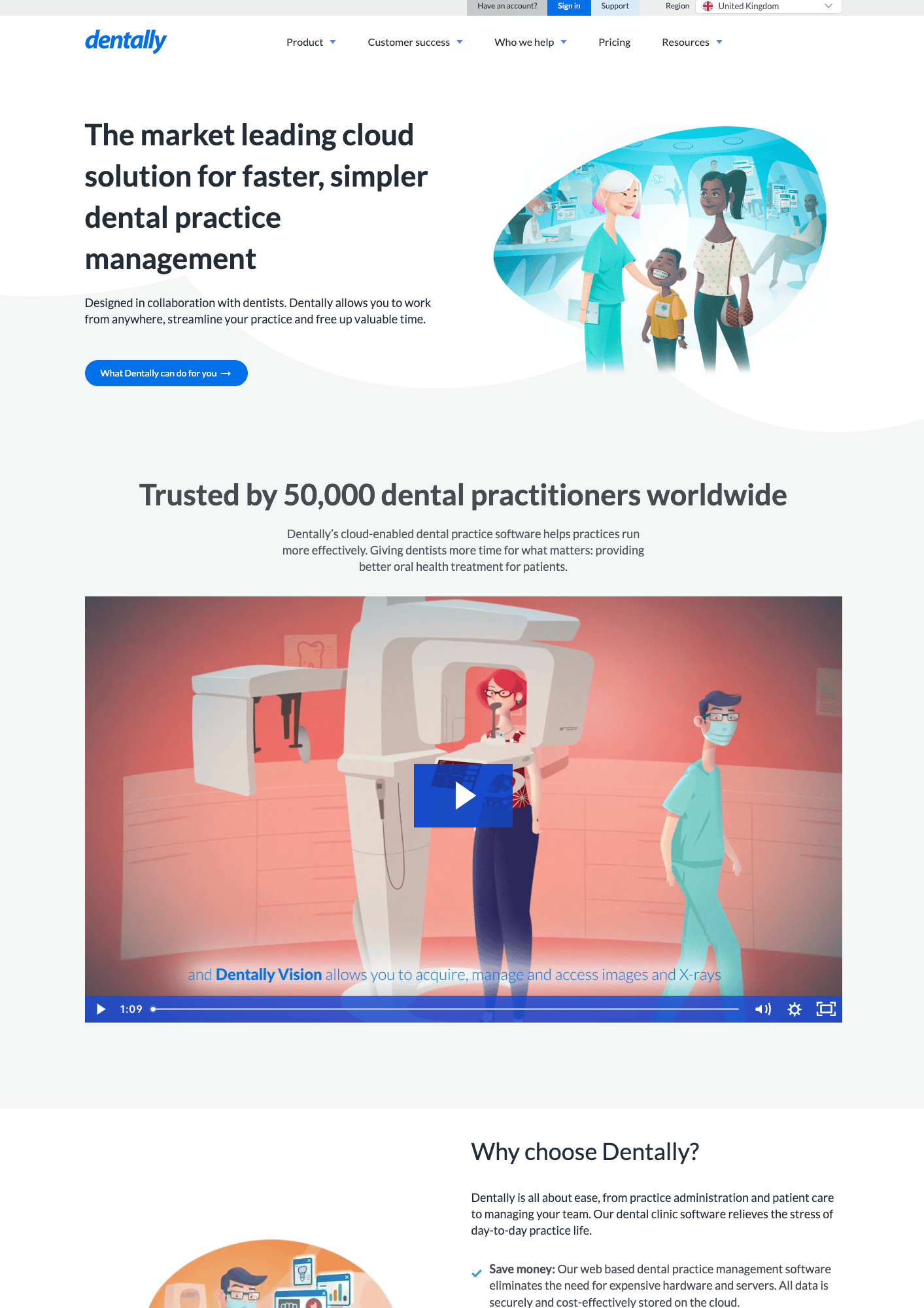
Founded in 2011 by Nick Davies and James Harker, Dentally is a UK-based company offering software designed in collaboration with dentists.
While Dentally is not a clinic, they are enabling dental professionals to work from anywhere, streamline administrative tasks, and focus more on patient care through their cloud-based dental practice management software.
I like that they include an explainer video that shows exactly how their platform works, something that actual clinics can take note of when promoting their services.
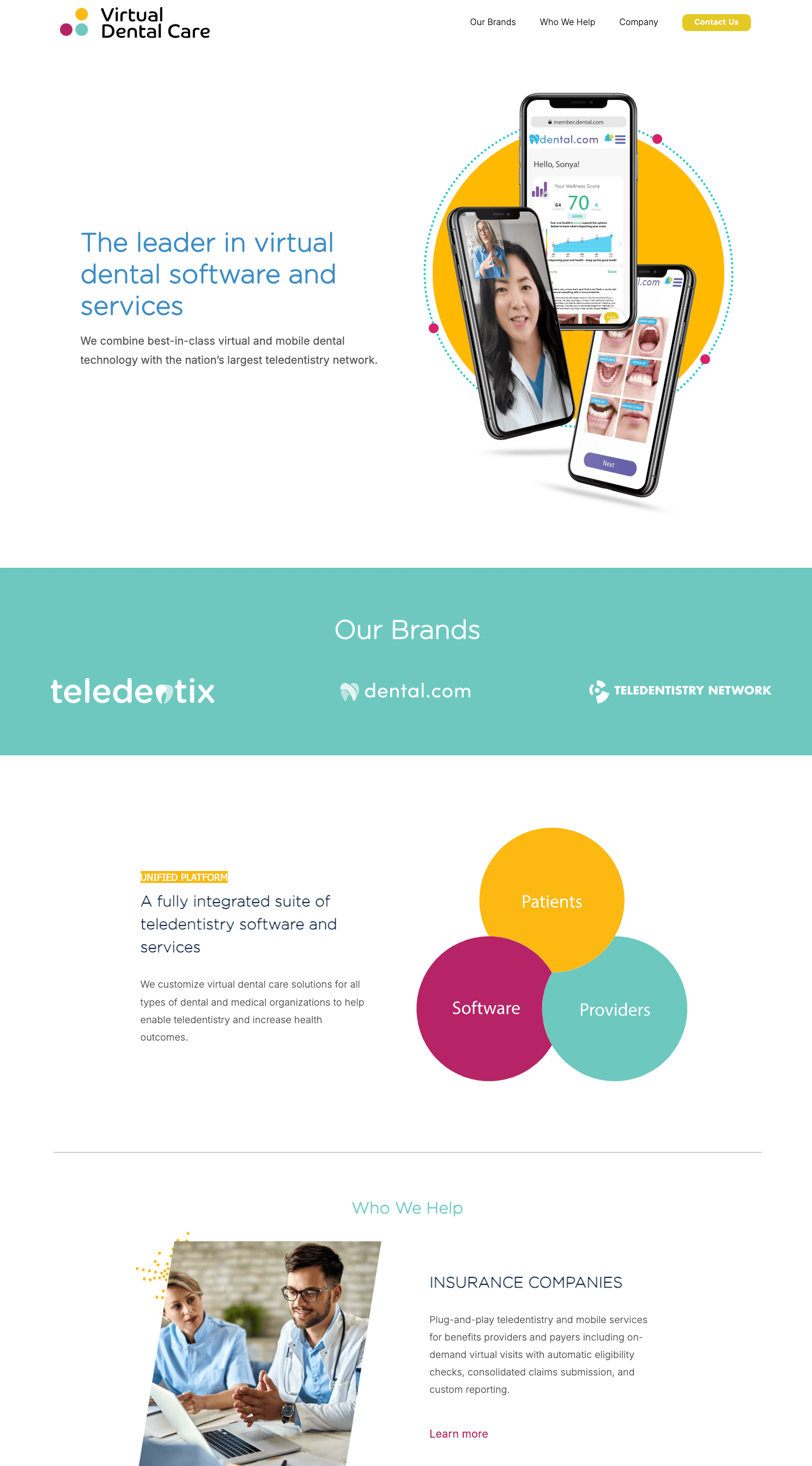
Richard Lee and Dr. William Jackson cofounded Virtual Dental Care and they specialize in teledentistry solutions particularly for underserved populations
They have a fully integrated suite of teledentistry software and services. For example, their Teledentix platform provides live video consultations, secure patient data management, and virtual treatment planning, so they can deliver dental care remotely and efficiently.
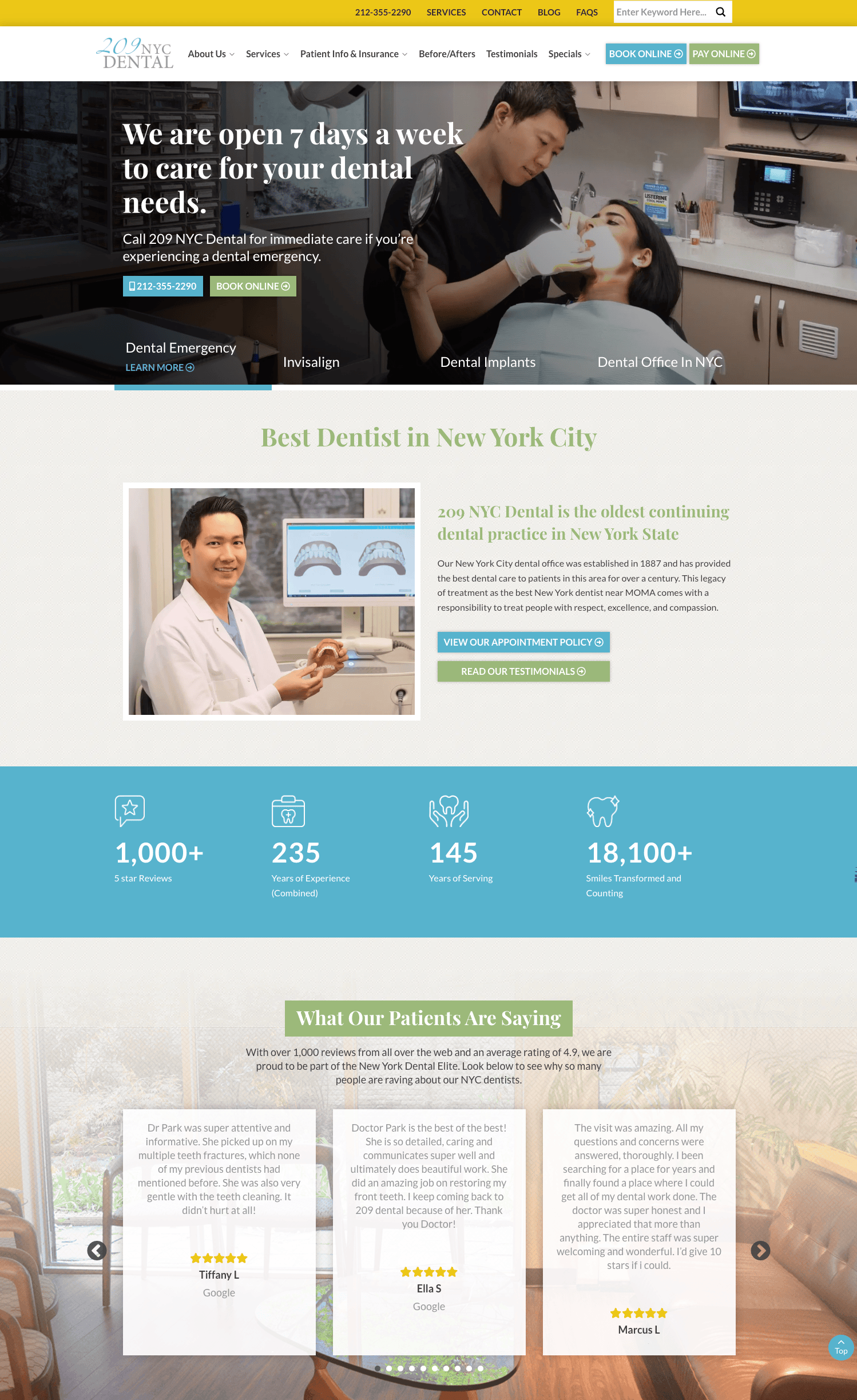
209 NYC Dental is the oldest continuously operating dental practice in New York State, founded by Dr. Joseph Kuhn in 1887.
Over the years, the clinic has expanded its team to include specialists like Dr. Ben Ifraimov, a cosmetic and restorative dentist, and Dr. Jin Wang, a board-certified periodontist and dental implant specialist.
Interestingly, their website is the first I've seen that allows patient to directly book and make payment online.
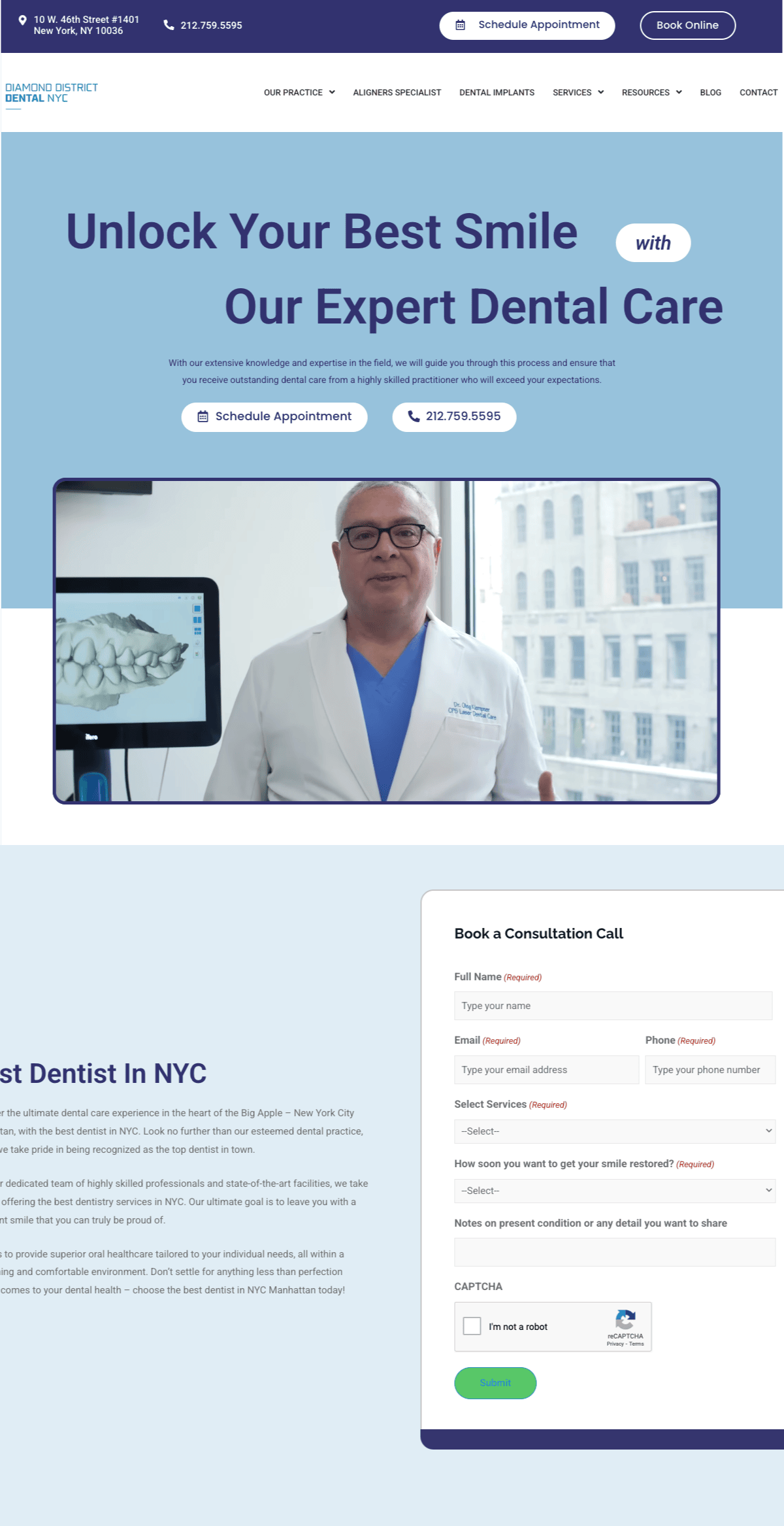
Diamond District Dental, led by Dr. Oleg Klempner, is located in Midtown Manhattan, New York City.
Dr. Klempner have a knack for using humor and kindness to make both children and adults feel comfortable during dental procedures.
The clinic's unique value proposition includes a focus on pediatric dentistry, offering specialized care for children. For example, they provide fluoride treatments to strengthen teeth, orthodontics to ensure proper alignment, and sealants to protect against cavities.
The video explainer aside, I believe more dental site should embed a full consultation booking form on their site.
First, ithelps you pre-qualify clients/leads, and you can personalized follow-ups and address any specific needs that your client has, making your outreach feel more relevant.
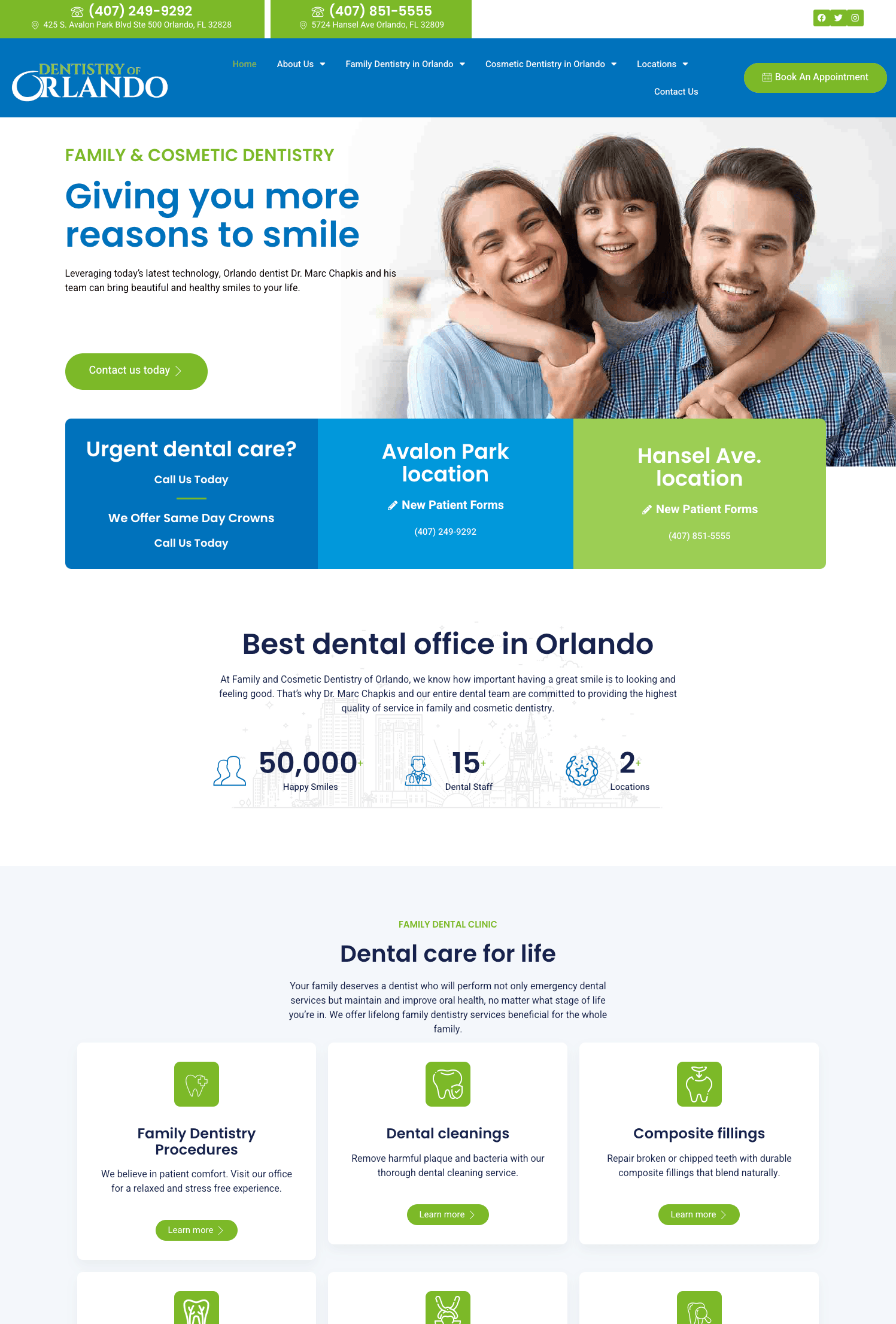
Dentistry of Orlando is run by Dr. Marc Chapkis, and he offers comprehensive family and cosmetic dental services in Orlando, Florida.
Their most unique dental service, in my opinion, is same-day crowns, where patients can receive durable, custom-fitted crowns in a single visit, without the need for multiple appointments
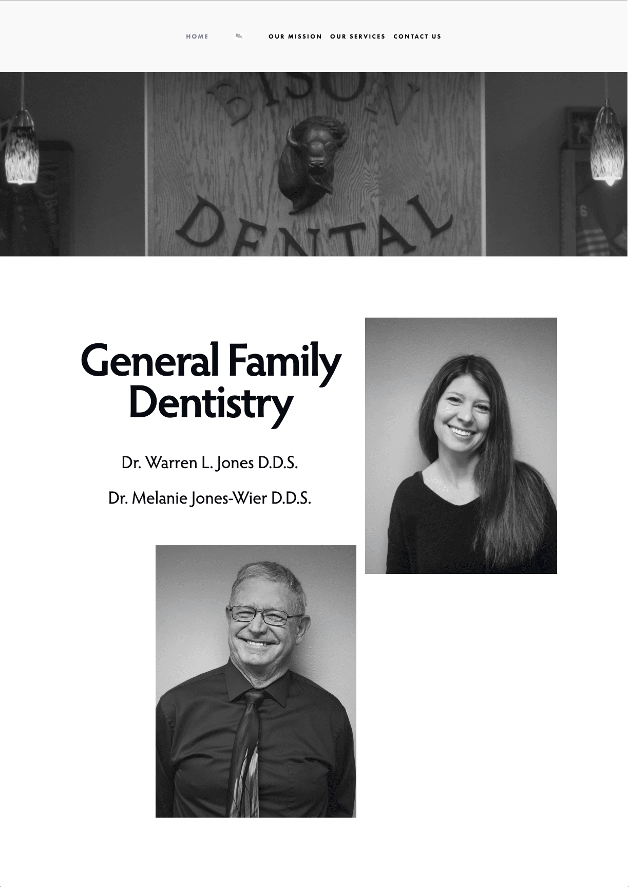
Bison dental is a family-owned general family dental office. Bison Dental offers family dentistry and encourages dentist visits from the age of first molars.
The website is subdued with a black-and-white theme that goes well with their branding.
They are proud non-participating insurance providers giving customized service that is best for the patient as determined by the dentist and patient rather than an insurance company. This will appeal to many discouraged by insurance companies and those who do not have dental insurance.
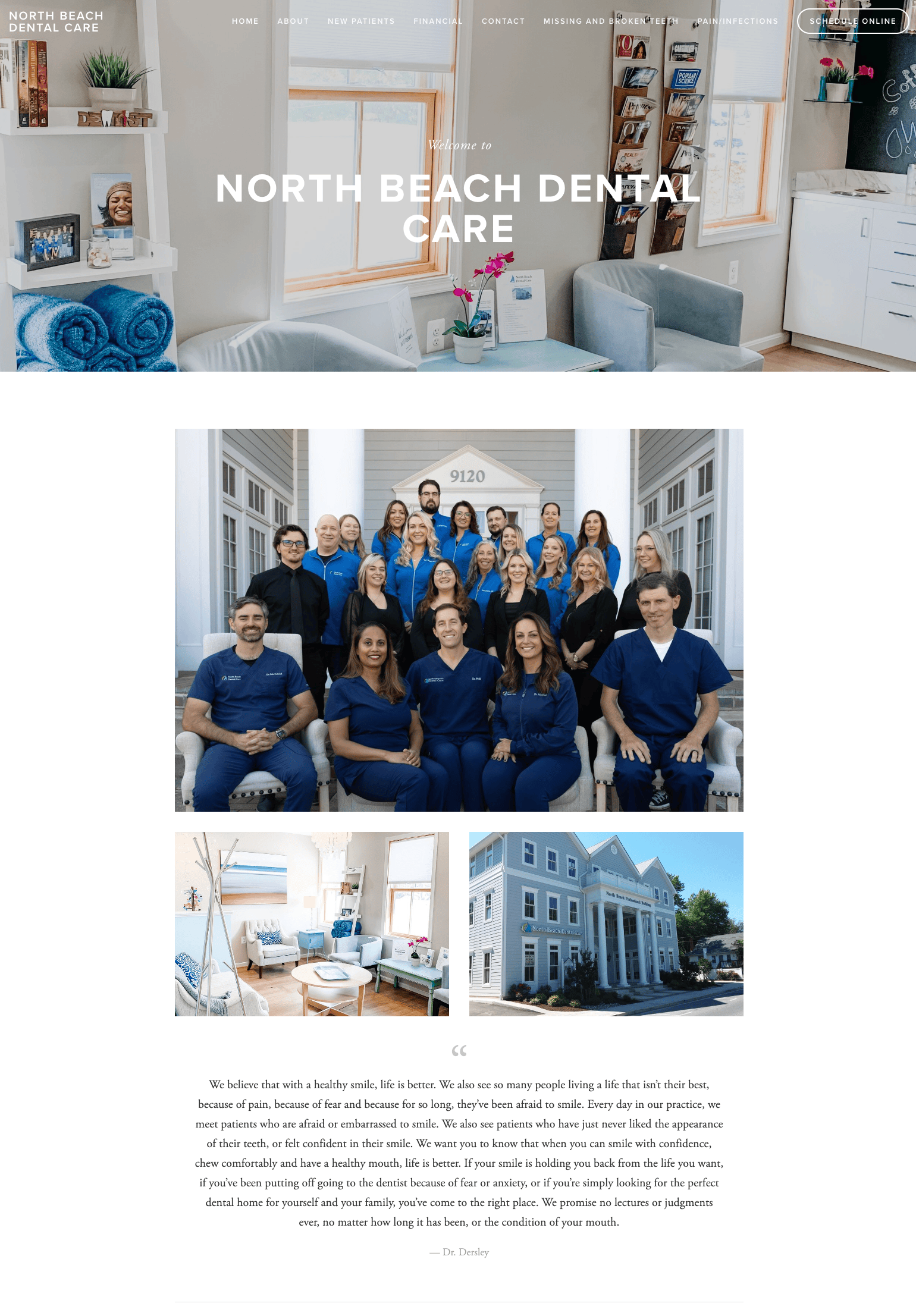
Another dentist website example is this site that has a professional feel featuring North Beach Dental Care office. The practice claims to prioritize personalized service and is involved in the community. In addition to dental hygiene, they also offer botox services.
The large picture of their friendly-looking staff is welcoming when you first go to their home page.
Much information is given on the site, giving you a substantial idea of the service staff, the office environment, state-of-the-art technology, and video and written testimonies.
There is also a link to a sister office on the bottom of the home page and a video from that office that showcases the dentist and his patients.
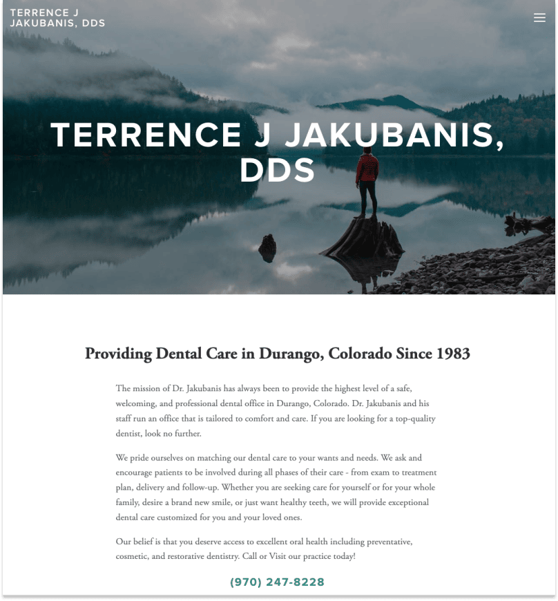
Terrence Jakubanis' site is simple yet professional for a small dental practice . He specializes in providing preventative, cosmetic, and restorative dental care.
He has a dedicated new patient page gives good detailed information and the opportunity to fill out paperwork before the first appointment.
The site also has a comprehensive FAQ page that answers many common questions clients have.
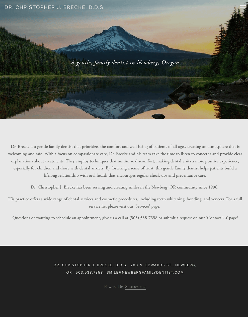
The home page of Dr. Christopher's dental office website has a soft landing with limited text about the dentist, emphasizing his friendly and professional manner.
There is no call to action "schedule" button available, but a phone number and address are easily seen at the top of each page.
A tab specific to "Dentistry for Kids" gives helpful information to prepare for your child's visit. His service page also provides extensive information on all procedures and services offered.
There is a request for reviews to be posted on either Facebook or Yelp, through icons on each page, and specifically on the "Review" tab.
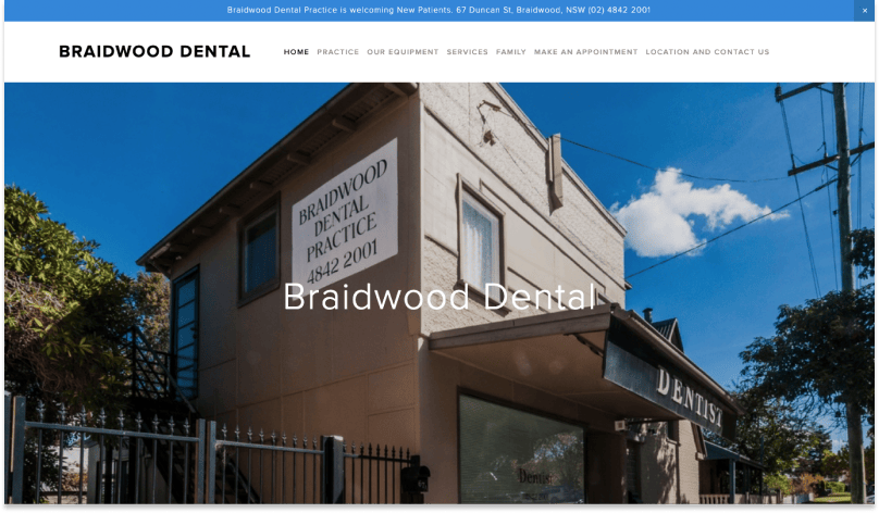
This dental office practices general family dentistry and has some oral surgery capability. They also offer same-day emergency appointments.
The webpage for this dental practice has a bar at the top stating they are taking new patients, which can be closed once read. This immediately lets new clients know they can continue exploring the site.
Beyond the basics, there is a focus on state-of-the-art equipment with limited extraneous information. In addition, one page points out that they treat members of the family of all ages.
The pictures are large, bright, and fit well for a dental office webpage. The text is minimal throughout the site.
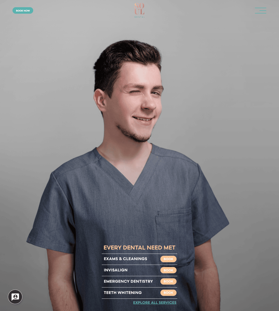
Soul Dental was started by Dr. Yuliya Alterman and Dr. Alexandra Yungelson, who both met at the NYU College of Dentistry.
The site has an interesting feature for booking clients.
They've used a scheduling tool to pre-qualify potential clients by asking them questions like the type of appointment (e.g., cleaning, braces, whitening, etc.) they want and their availability. Pretty smart!
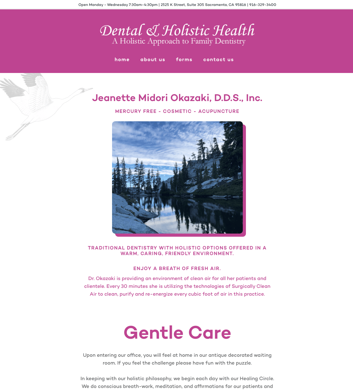
Dr. Jeanette Midori Okazak runs a small holistic dental health clinic with a unique value proposition of using surgically Clean Air to purify every cubic foot of air in this practice.
Talk about fresh air!
Dr Jeanette and her team also offer mercury-free, cosmetic, and acupuncture dental services.
Much focus is on health and environmentally conscious services and office space, which will greatly appeal to a niche crowd.
There is mention of the website being powered by a small innovative company called Digital Sauna, which enhances its small business appeal.
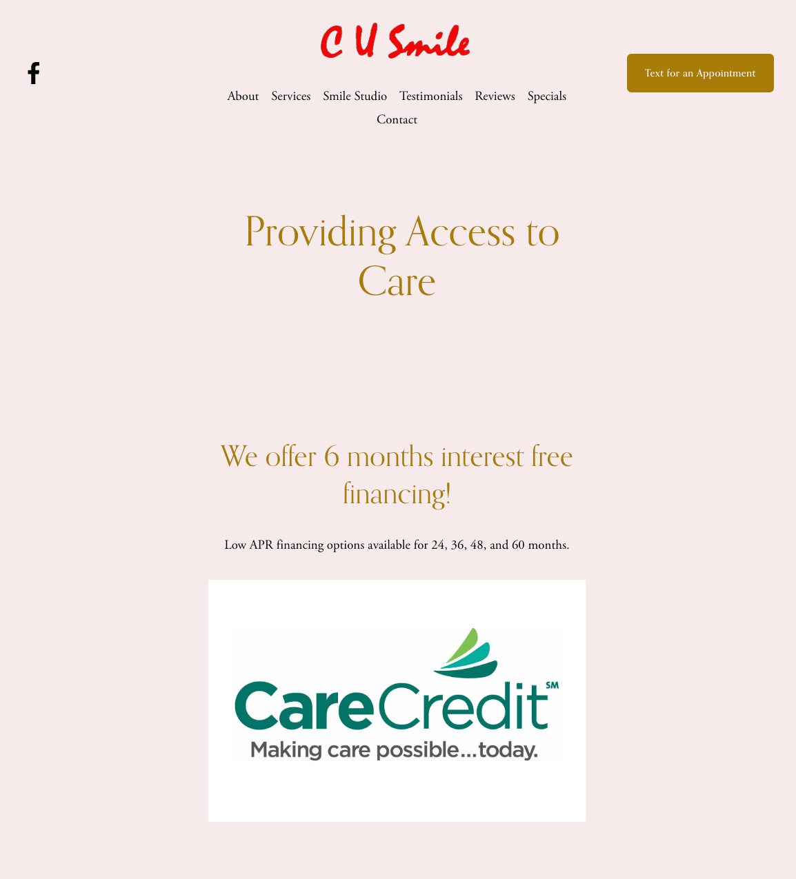
CU Smile has been recognized as one of Champaign's best dentists. They have a pretty affordable dental care and pride themselves on patient experience, health, and happiness.
A little further down the home page you can find their unique six-month free financing with low A.P.R. financing available.
This will immediately appeal to those without insurance or inadequate dental insurance.
The home page also features services, reviews, and other accolades.
This dental office focuses on access to comprehensive dental care, explicitly naming those who have hesitation in going to the dentist, special needs children, geriatric, and low-income patients. This sets the tone for a very inclusive office environment.
They also have a dedicated page for reviews and also one for the latest specials.
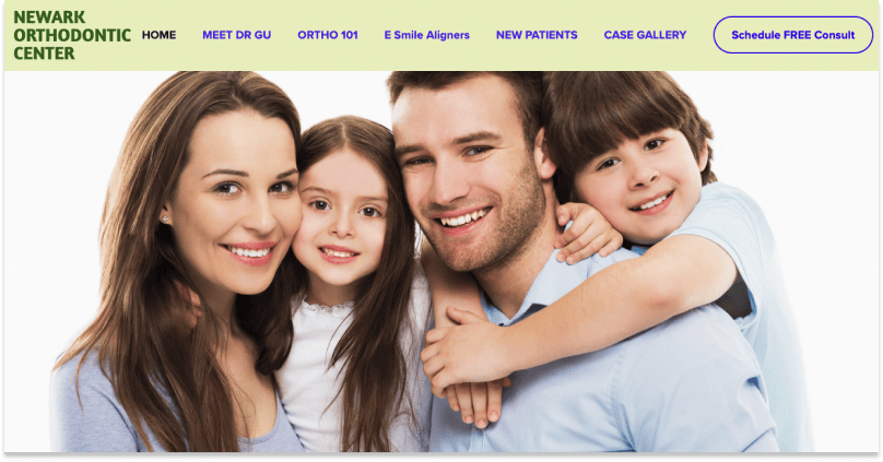
The Newark Orthodontic Center brings attention to their "board-certified" orthodontist. In addition, it provides a pictorial to illustrate this benefit compared to a non-board certified orthodontist.
There is an immediate pop-up button with "6 Spots left this week!" schedule consultation button on all pages. This can stir clients into immediate action.
This is the only site with a virtual assistant chat option on all pages. In addition, there are lots of big, bold pictures and graphics that give it an active feel.
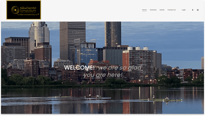
This is a website for the New Dentist Symposium – an affiliate of the Seattle Study Club program started by Seattle dentist Dr. Mary Jane Hanlon at Tufts University School of Dental Medicine. It was created to keep dental school students engaged by forwarding free classes during the pandemic.
This site has a different feel with a darker tone of pictures and a black background on the logo. It provides an overview of the organization, a listing of events, a contact page, and serves as a portal for membership.