How to create a custom 404 page in Squarespace
 By David Nge | Last Updated: January 05, 2024
My work is supported by affiliate commissions. Learn More
 By David Nge | Last Updated: January 05, 2024
My work is supported by affiliate commissions. Learn More
Here's a step-by-step tutorial on how to create and set up a custom 404 page in Squarespace.
We'll go over:
Note that this tutorial is only applicable to the most recent version of Squarespace that is Squarespace 7.1.
By the end of this tutorial, you will have successfully created a custom 404 page that impresses your visitor and increases value for your business.
Let's dive right in.
Here's the step-by-step guide to creating a custom 404 page in Squarespace.

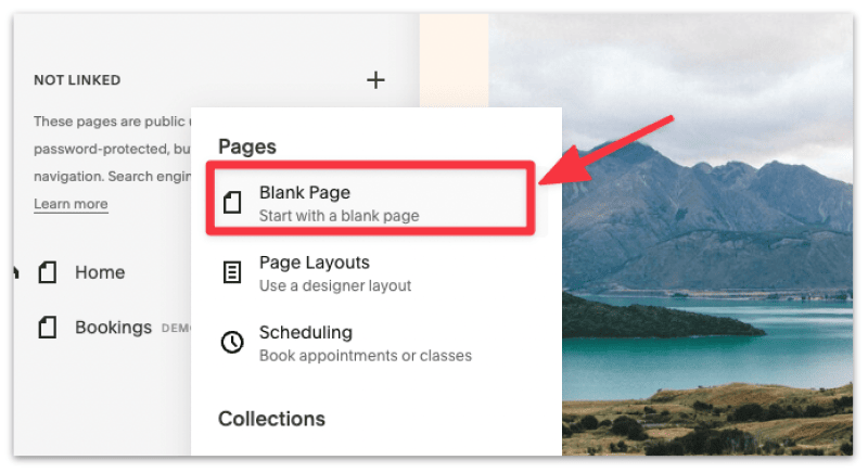
2. Create a new black page under NOT LINKED.
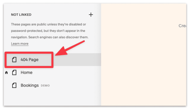
3. Name the page 404 Page.
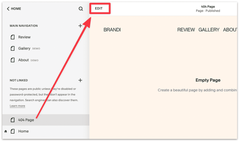
4. Click Edit to start customizing the 404 page. Make sure the page you're editing is the newly created 404 page (it should be highlighted).
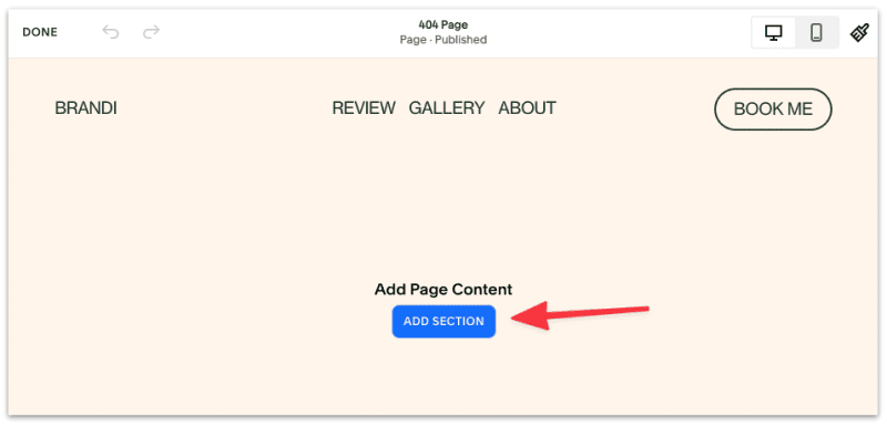
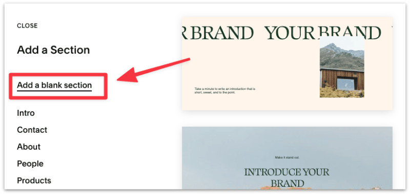
5. Add a new Page Section then add a new blank section.
6. Add the following content blocks, then edit and arrange them accordingly.
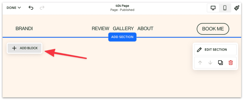
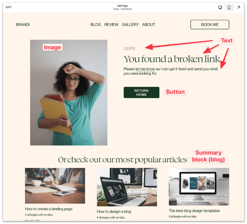
With the newly released Fluid Engine, Squarespace has made it easier to design these pages. Just drag the text and image blocks into their respective order and they should align automatically.
7. That's it. You've created a new custom 404 page. Click Done from the top corner to save changes.
8. The last step is to set the new page as the default 404 page. From your Squarespace dashboard, head to Design ➝ 404 page, then select the new 404 page from the drop down menu.
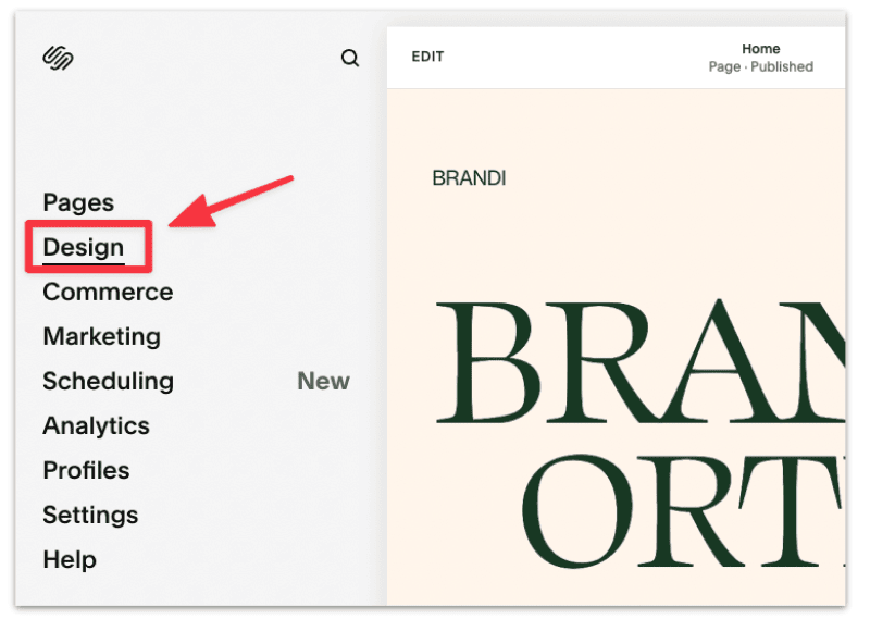
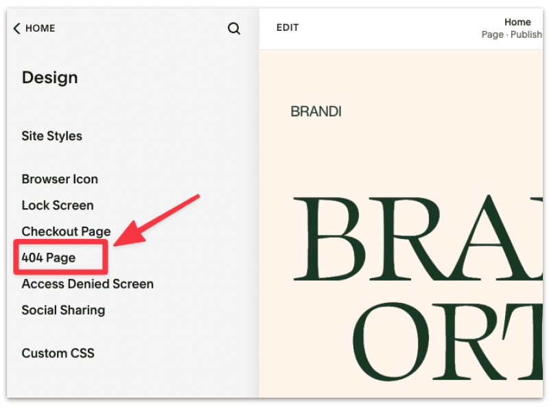
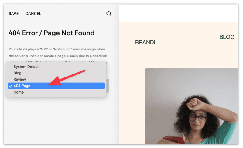
Save the changes and that's it. You've successfully created and set up a new custom 404 page!
These are some helpful things you can include in your 404 page to improve the page experience.
Need some inspiration? Read below to learn how top Squarespace designers design their 404 pages.
Take your custom 404 page one step further by taking inspiration from other Squarespace sites.
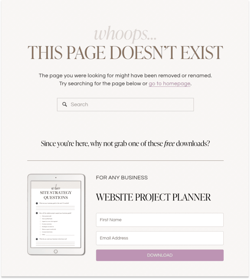
Taylor Nguyen is a Toronto-based freelance web designer who helps small businesses stand out with her design prowess.
Her 404 page is carefully designed, and it doesn't look like a broken page at all!
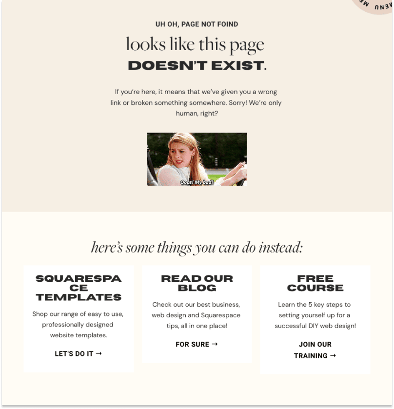
Erica and her team run Big Cat Creative, a web design agency based in New Zealand. It doesn't hurt to incorporate some humor in their 404 page!
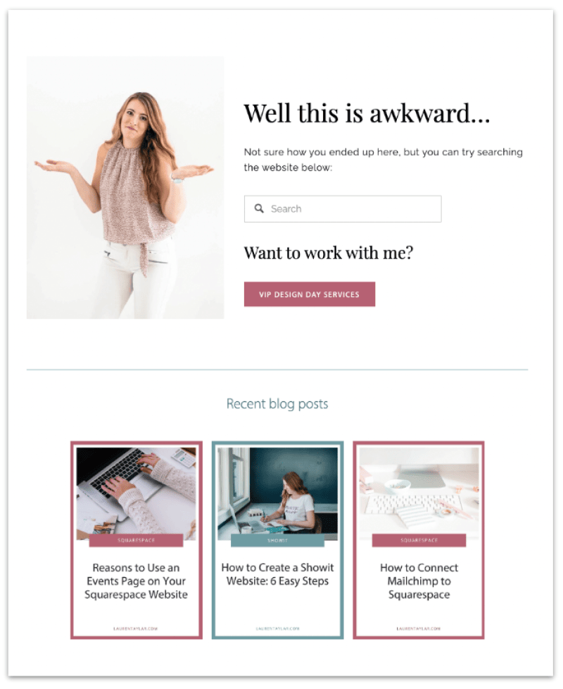
Lauren is a web designer and SEO consultant who helps female creatives build kickass professional websites.
While the 404 page is simple, I like that she added some personal touch to it and made it practical for her visitors.
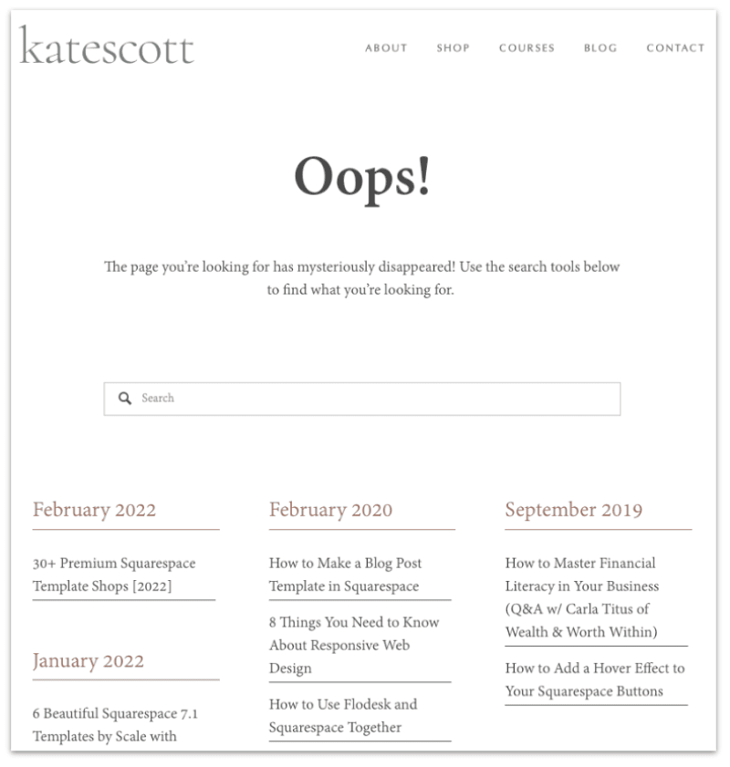
kate Scott creates smart website templates that help entrepreneurs grow their online businesses. Sometimes keeping it simple is all you need, and that's what Kate did for her 404 page.
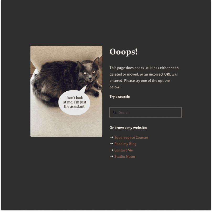
Kerstin is a solopreneur who runs a successful blogging and web design business. She obviously owns a cat and doesn't mind low-key blaming her for the 'bad experience'.
404 pages are often uninspiring, but yours doesn't have to be that way.
You can add value to your visitors and your business by creating a custom 404 page that incorporates useful links, content, and resources.
Your visitors get something out of the bad experience, and you might end up with a potential client. It's a win-win situation.