12 Real-world Squarespace landing page examples
 By David Nge | Last Updated: April 10, 2025
My work is supported by affiliate commissions. Learn More
 By David Nge | Last Updated: April 10, 2025
My work is supported by affiliate commissions. Learn More
Here are proofs (real-world examples) that Squarespace can be an excellent choice for building high-converting landing pages.
Whether you want to generate leads for your real estate listing, launch a book, get clients for your business, or get customers for your courses, there's a landing page inspiration and example for everyone.
Here are 12 types of landing pages you can build for your business using Squarespace (click to skip to section):
Let's dive right in!
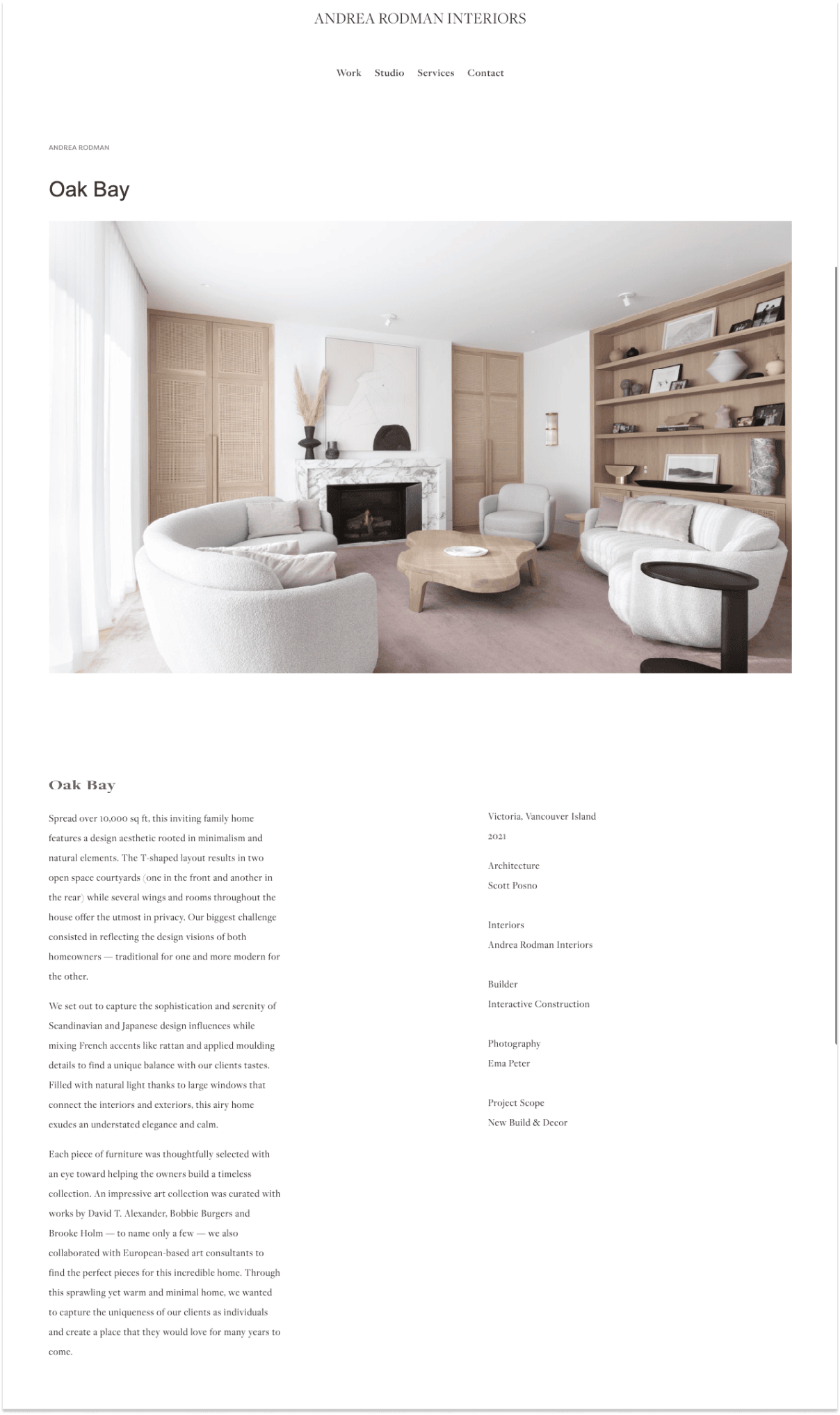
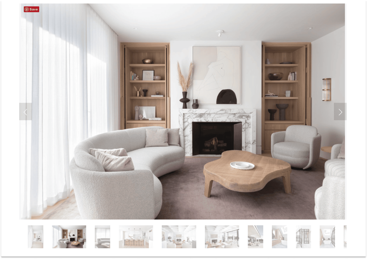
Andrew Wilkinson built his dream house with a luxurious interior in Victoria, BC. But for personal reasons, he must let go of the house.
A few options he had were to:
Either way, he has to market his house, which is why he and his team built a stunning landing page (on Squarespace) to feature his family home — The Oak Bay.
I reckon they built it on Squarespace for its simplicity. The carousel works extremely well here, featuring every section of the house. Plus, any interested buyer or renters can just drop them a line at the end of the page.
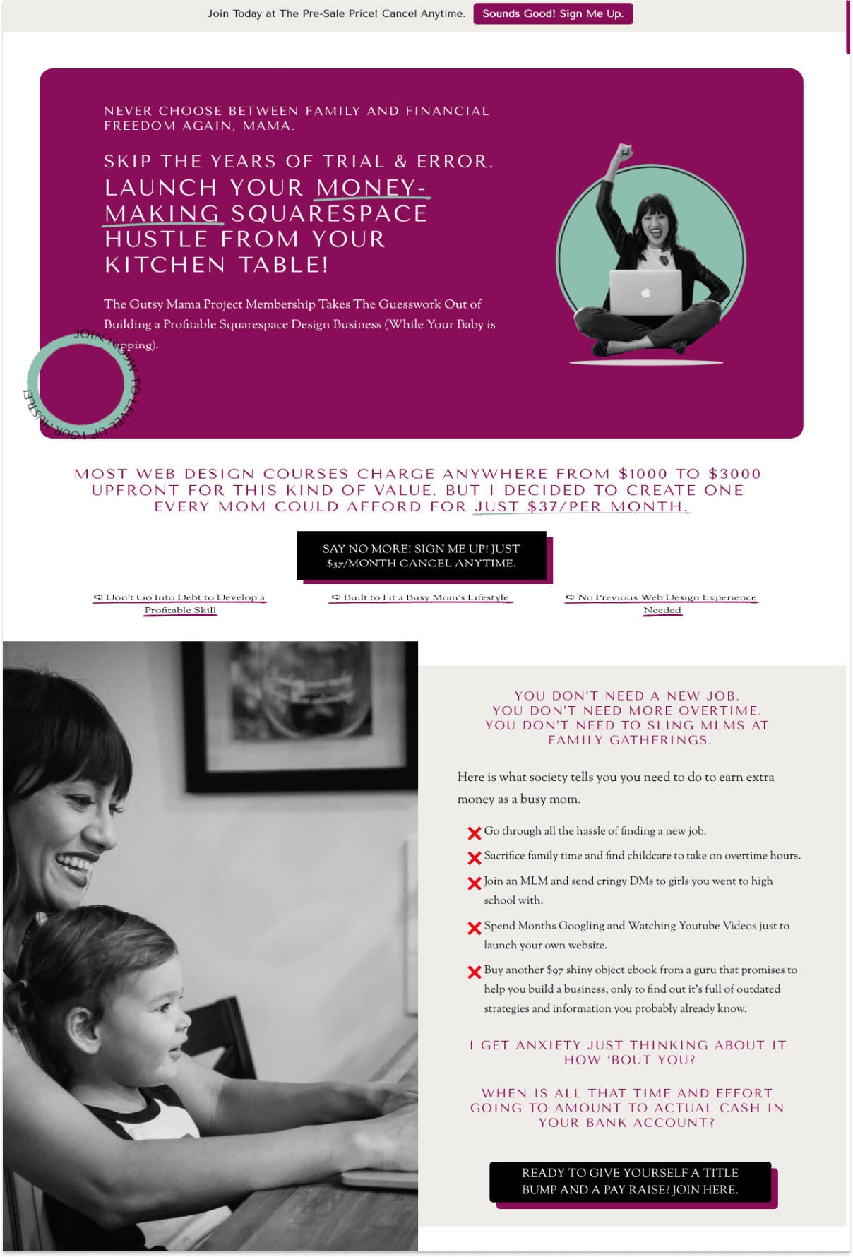
Julie is a mom, a hustler, and she's on a mission to help 9-5 moms build a profitable design business so they can spend more time with their babies.
The copy on the landing page is immaculate. Why?
Check out Gutsy Mama's membership landing page
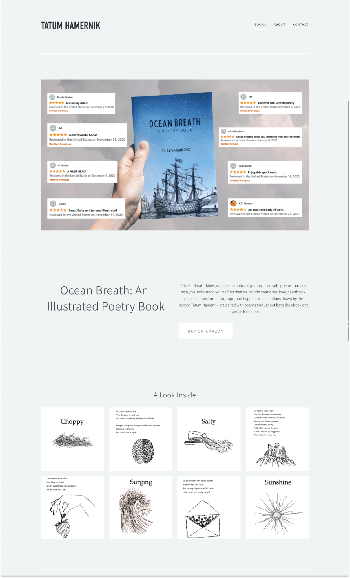
Tatum Hamernik is an avid reader from Connecticut and the writer behind Ocean Breath — A collection of poems and illustrations that takes you on an emotional journey through love, heartbreak, personal transformation, hope, and happiness.
All the illustrations are drawn by Tatum herself!
The landing page is simple but checks all the right components for a book landing page:
Check out the rest of Ocean Breath landing page
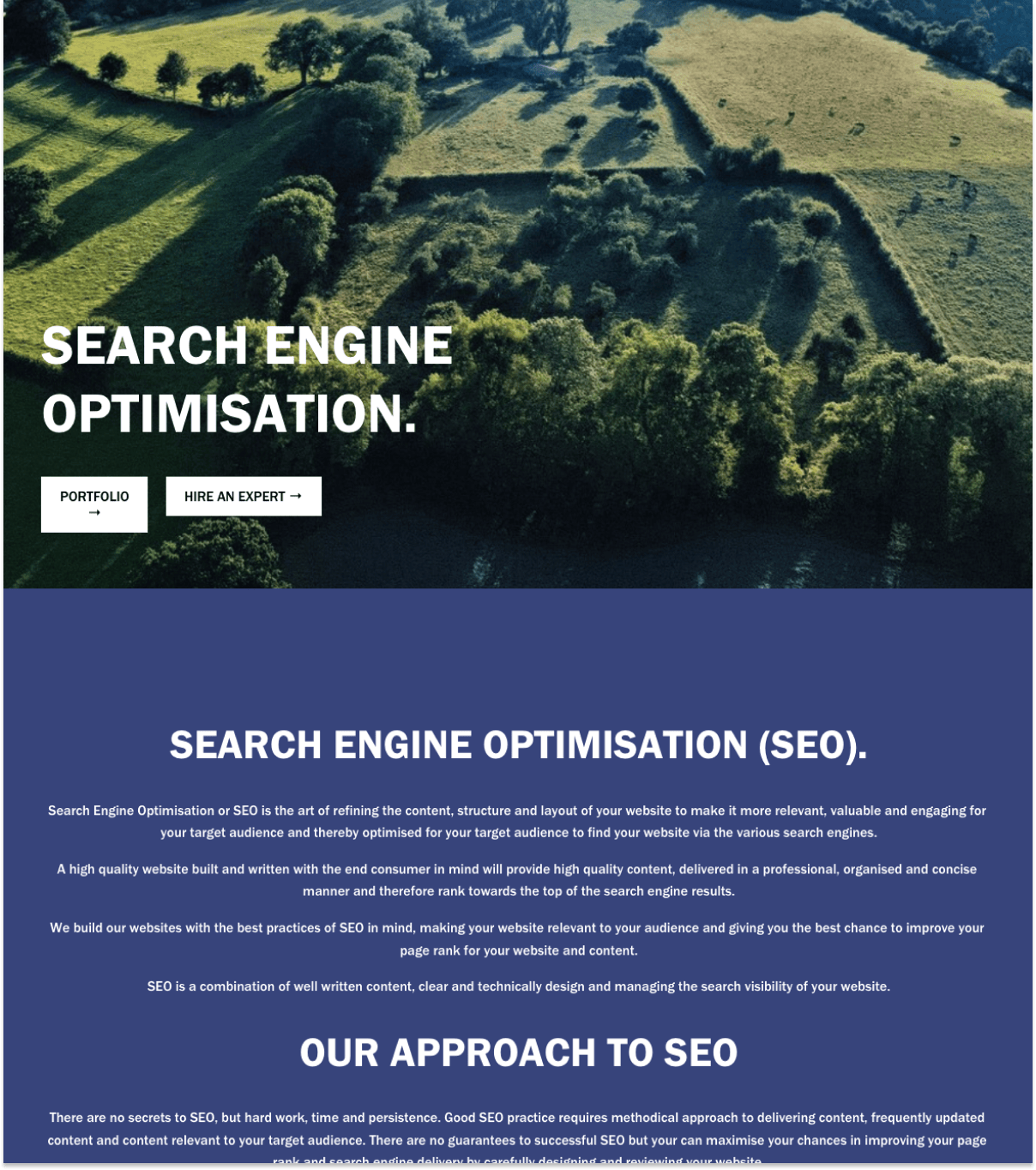
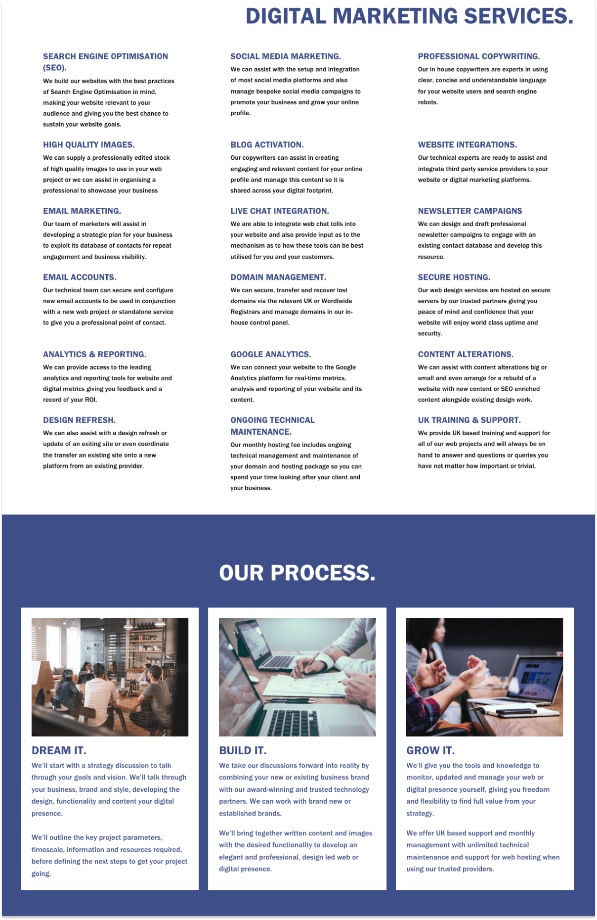
Bluebottle Digital is a web design and digital agency based in Somerset, UK, and they primarily design Wordpress and Squarespace sites for professional businesses.
It's common to create a landing page for marketing services, but this particular SEO service landing page caught my eye.
The page does a great job highlighting their design approach for clients, listing all the marketing services they can provide, and they have a successful portfolio to show clients.
Check out Bluebottle Digital SEO landing page
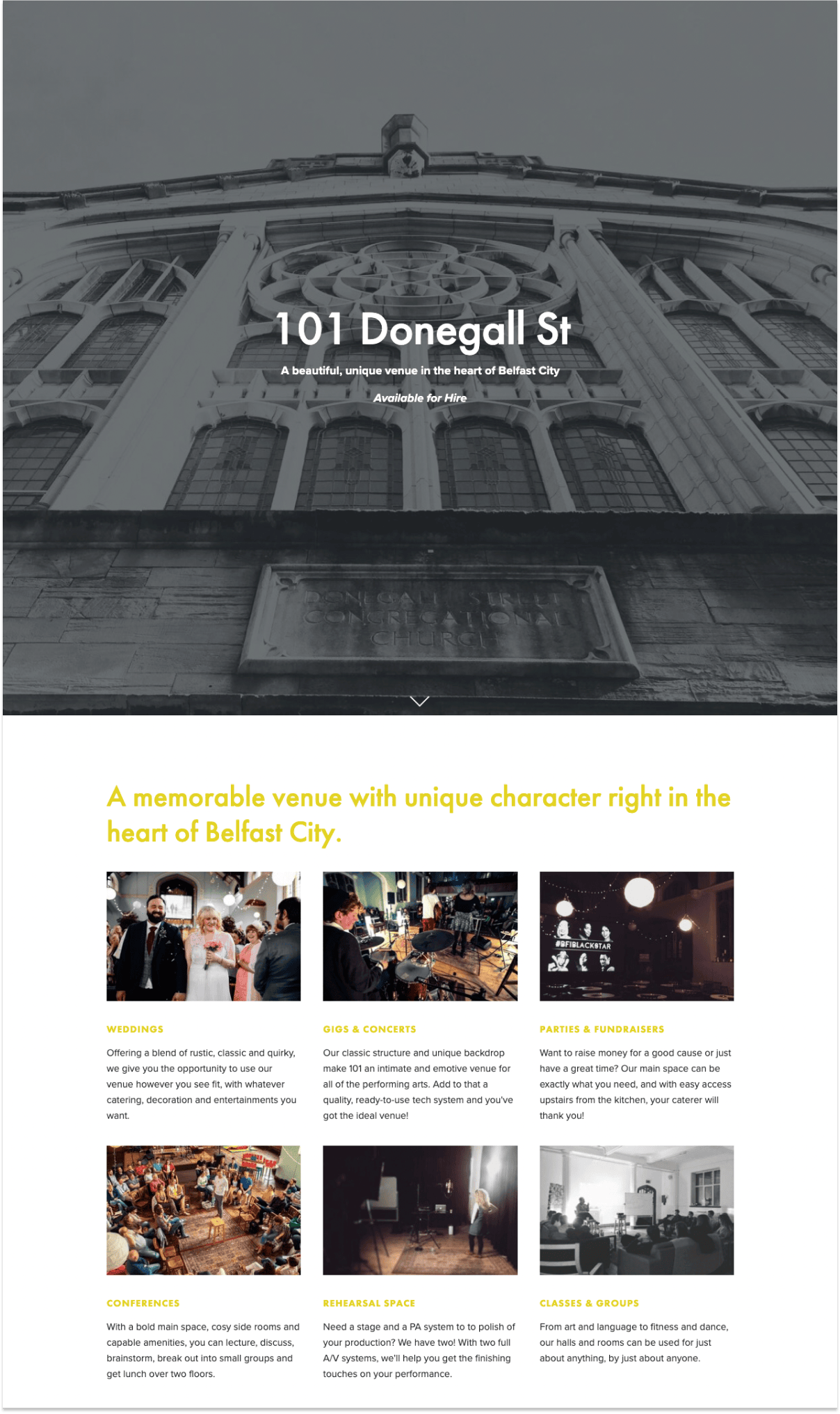
101 Donegall St is a beautiful, unique venue in the heart of Belfast City that's available for hire.
The landing page does a great job showcasing memorable occasions held at the venue: weddings, concerts, parties for fundraisers, conferences, and more.
It also includes a map where customers can locate them.
But more importantly, they included an inquiry form for potential customers to book the venue ahead of time.
Check out 101 Donegall St venue landing page
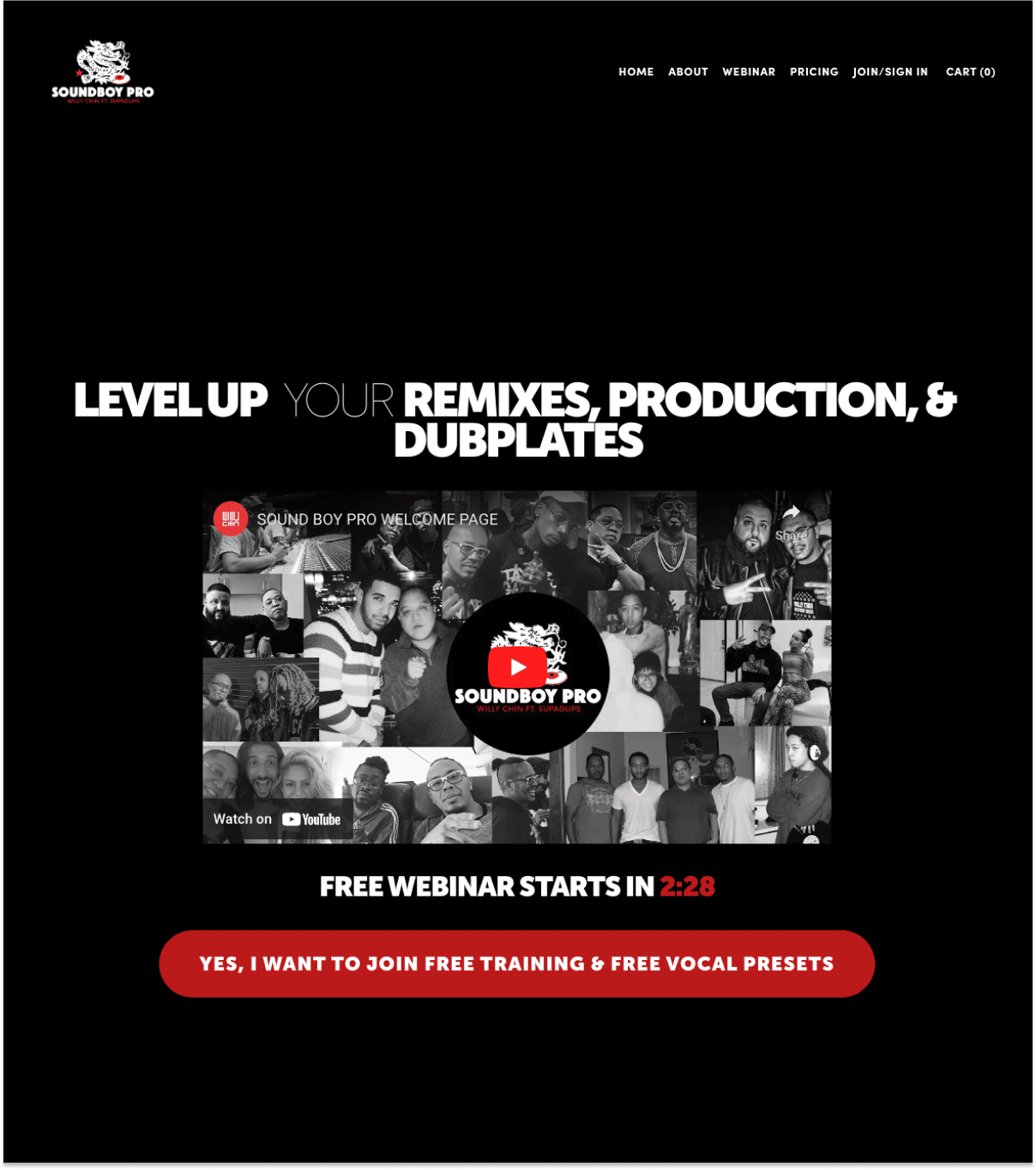
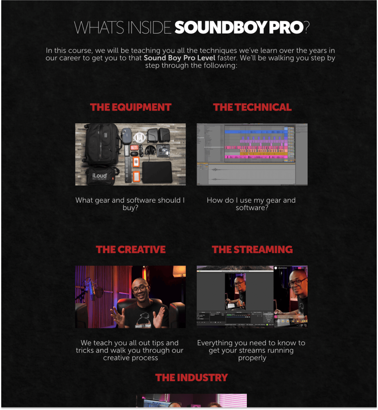
Soundboy Pro aims to help streamers, producers, and working professionals in the music industry produce master remixes and dubplates.
The class goes over the gear and software they use, tips on how to use them, and they'll walk their customers through their entire creative process.
This single-page webinar landing page has a few things going on for them:
Check out the Soundboy pro landing page
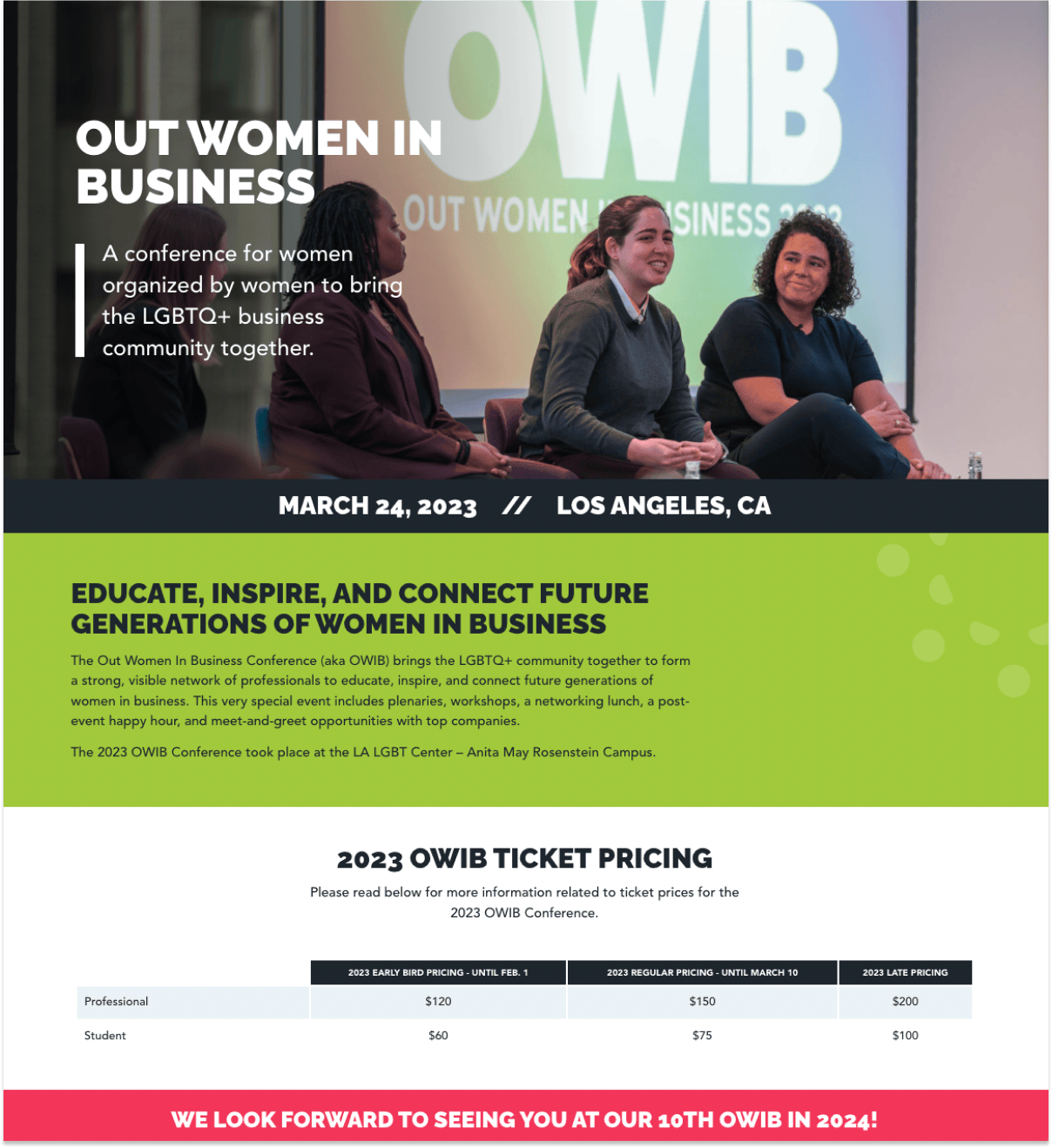
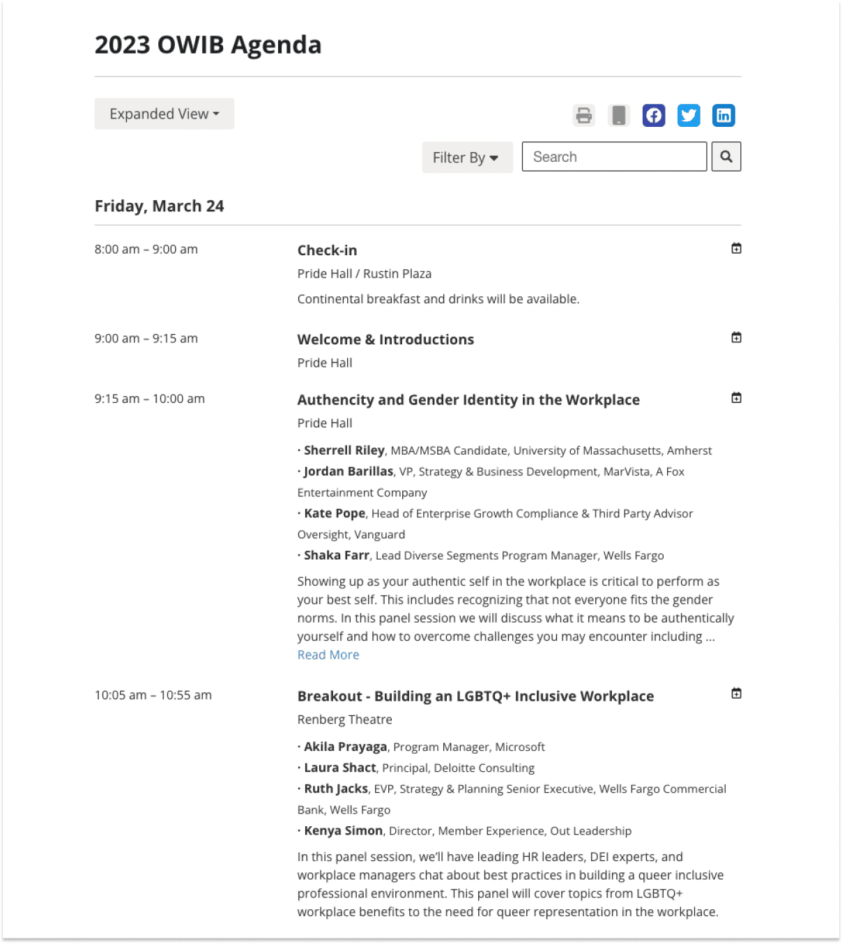
Reaching Out MBA organizes a conference — The Out Women In Business Conference (aka OWIB), to bring the LGBTQ+ community together to form a strong, visible network of professionals for them.
The conference landing page is straightforward. The pricing details, agenda, and speaker details all highlighted and presented neatly on a single page.
There's also a dedicated section for corporate sponsors to become a partner for the conference.
Check out the Out Women In Business Conference landing page
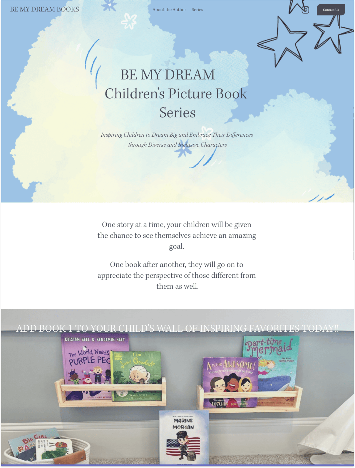
Marie Chandler wrote a series of books with the hope to inspire children and build confidence in them. These stories were inspired by her daughter and her husband, who's a big dreamer (hence the name).
Most authors rely on publishers to promote their books, but Marie took the extra step and set up this site and landing page to feature her story.
The landing page is simple yet inviting — I love the site's illustrations.
The site is mainly used to build an online presence for her books, and she added a number of links to Barnes & Noble and Amazon so her customers can buy the books online.
Check out Be my dream landing page
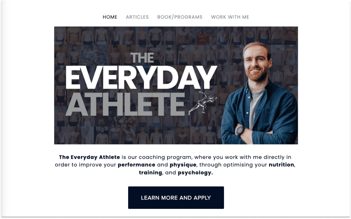
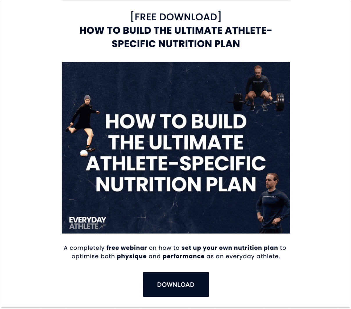
The Everyday Athlete is a coaching program started by Conor O’Neill, where customers work directly with him to improve their physique, performance, and optimize their nutrition.
Conor kept his landing page simple, where he primarily detailed his story and journey to become "The Everyday Athlete".
A key component to his coaching program landing page is that he offers a ton of free materials and resources to build trust with his client, such as a free webinar and nutrition plan people can download.
This is also called a lead magnet, a free product you can offer in exchange for a potential client's email or contact.
Check out Every Athlete coaching program landing page
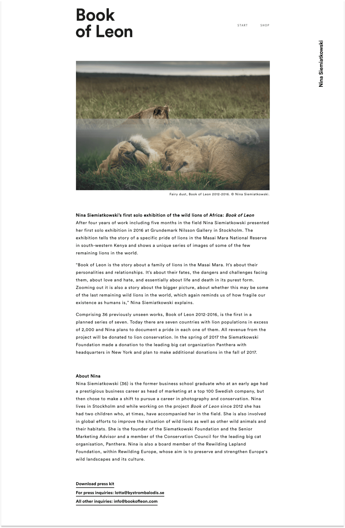
Book of Leon is Nina Siemiatkowski’s first solo exhibition of wild lions in Africa.
The exhibition tells the story of a specific pride of lions in the Masai Mara National Reserve in southwestern Kenya and shows a unique series of images of some of the few remaining lions in the world.
I like that there are dedicated links to a press kit and inquiries for news publications.
Also, interested customers can purchase the book directly on the site, which is powered by Squarespace eCommerce.
Check out Book of Leon exhibition landing page
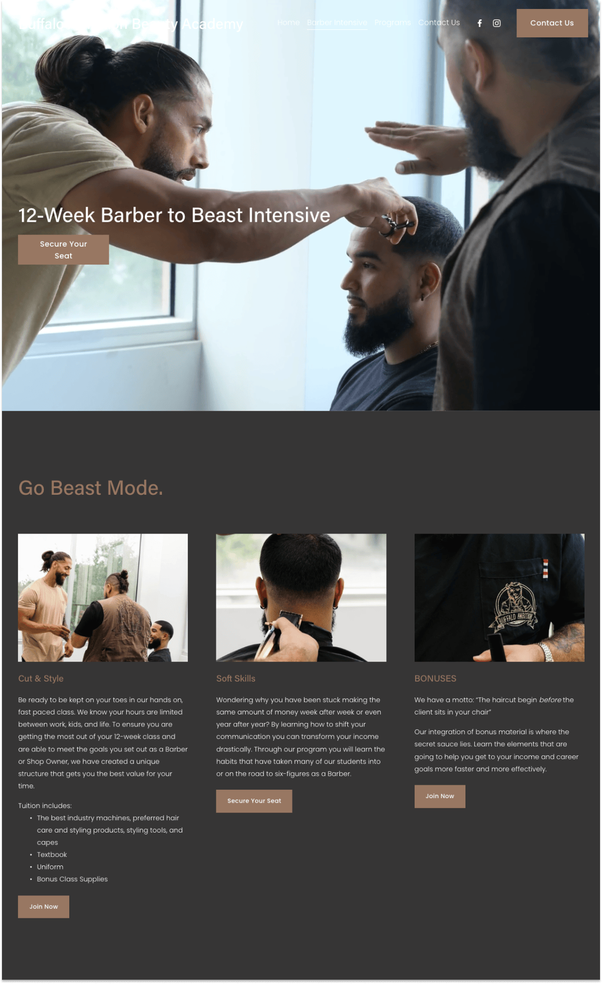
Babeauty Academy offers a 12-week intensive barber class for shop owners and barbers who want to hone their crafts.
This in-person class includes lessons on how to use the best industry machines, hair care & styling products, and related tools.
They will also teach students soft skills to improve communication and their earnings.
What I like about this landing page:
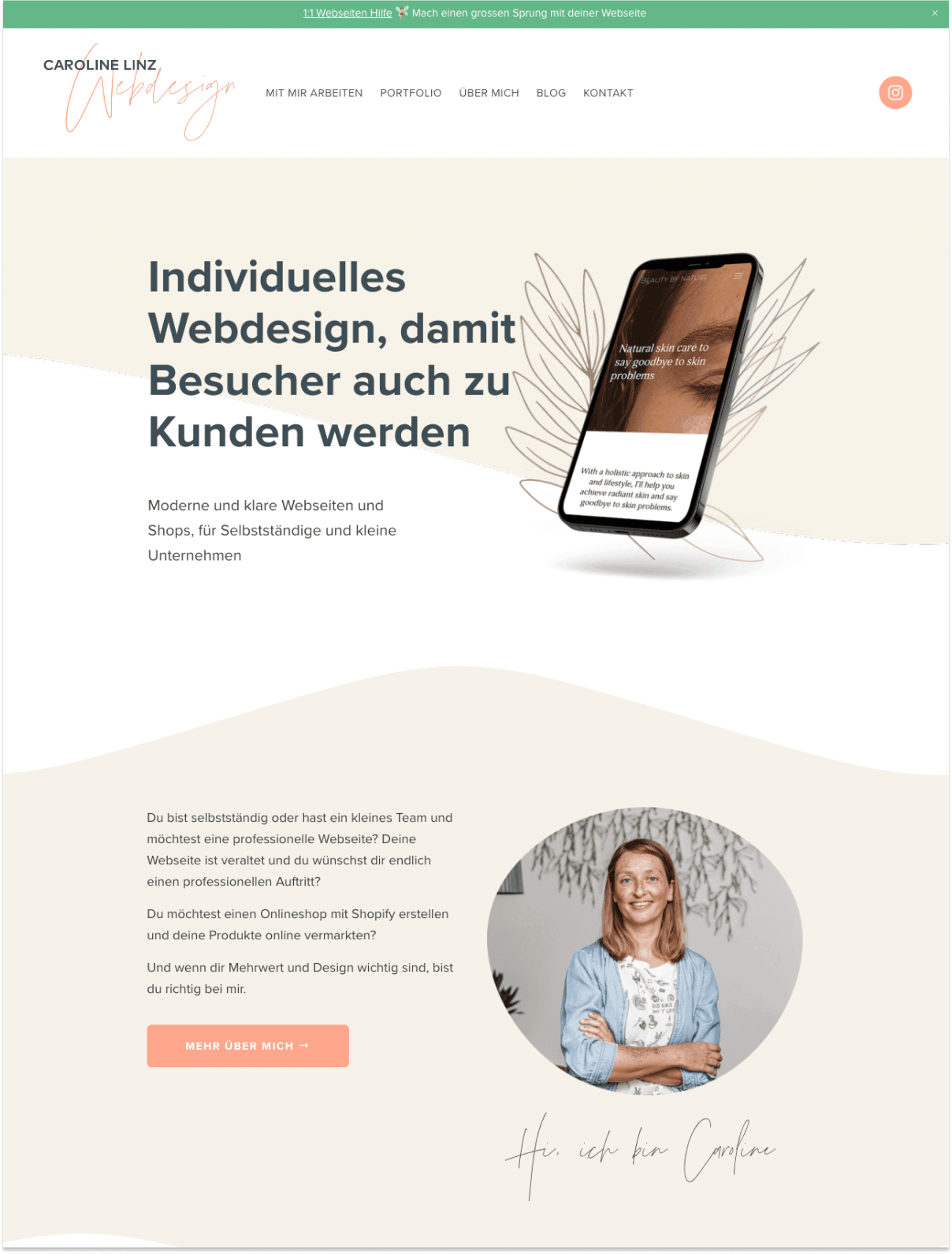
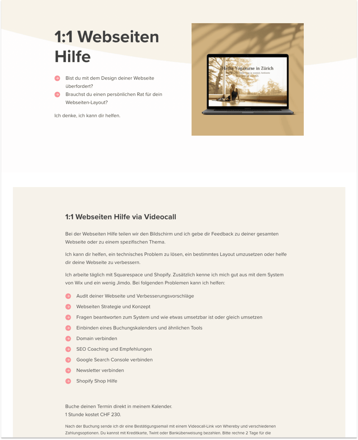
Caroline is a German web designer who helps clients (mostly in Switzerland) solve their user experience problems.
Not surprisingly, her landing page is extremely polished — Clean fonts, professional images sprinkled throughout, raving customer testimonials, a stellar portfolio, and a great 1:1 video call offer to onboard clients.
Check out Caroline's landing page for clients