9 Popular Squarespace templates photographers use
 By David Nge | Last Updated: March 17, 2023
My work is supported by affiliate commissions. Learn More
 By David Nge | Last Updated: March 17, 2023
My work is supported by affiliate commissions. Learn More
If you're wondering which Squarespace template is best for photographers, then this article is for you.
Previously, I've listed down photographers who've successfully customized Squarespace for their portfolio or their personal branding site.
In this article, I'll break down the actual Squarespace templates that these talented photographers use and what makes them great for your photography business as well.
Let's dive right in.
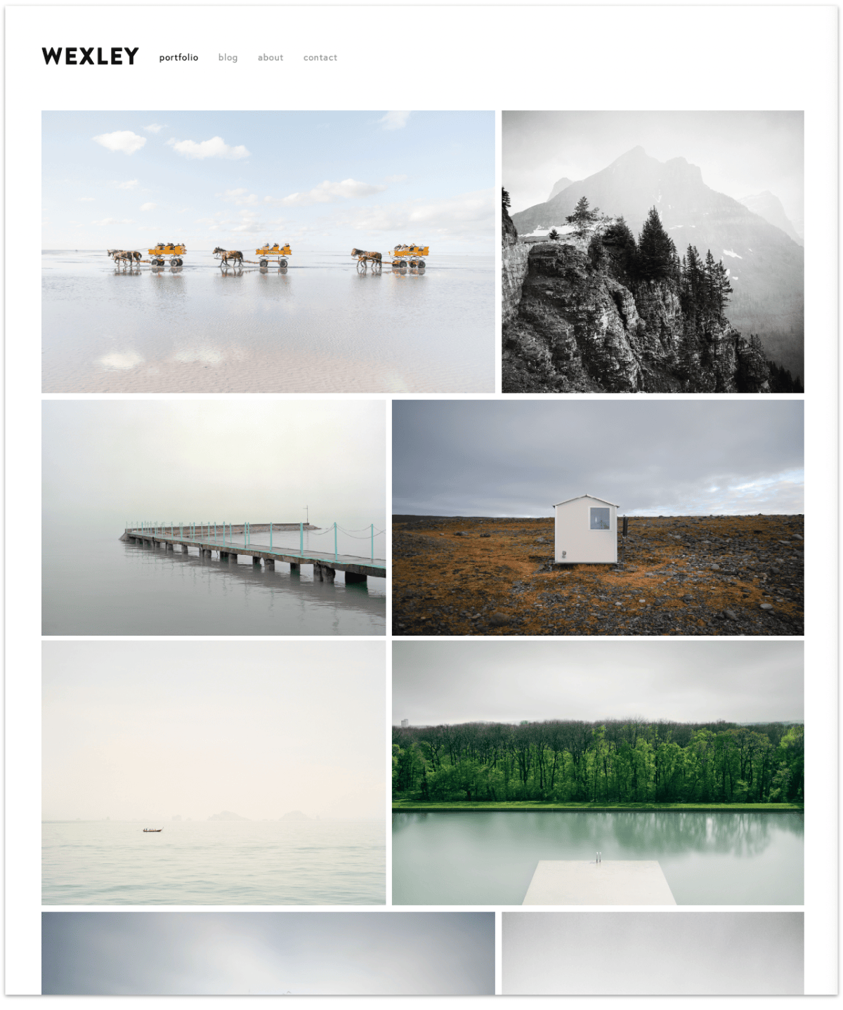
Wexley, as noted in Squarespace official documentation, is a popular template among photographers, artists, and creative professionals to showcase their portfolios.
It features an adaptive mosaic of images and videos that create a stunning gallery layout, as you can see above.
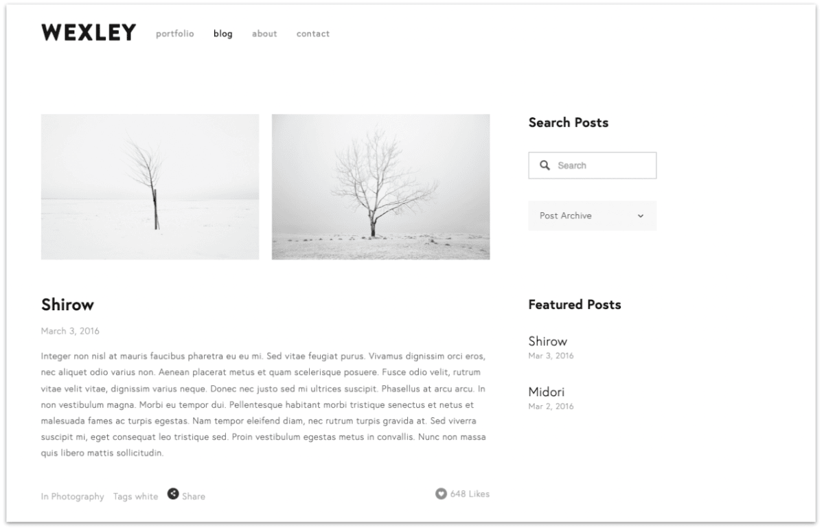
If you're using the Wexley template (demo here), you'll find that it comes with pre-built pages, including:
Each page has its own layout, but you can style and customize them with Site Styles.
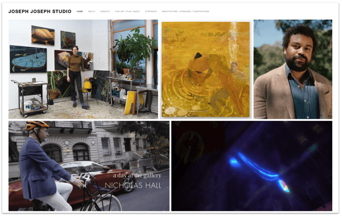
Talented photographers like Joseph and Nina have customized the Wexley template to showcase their personal portfolios.
Overall, the Wexley Squarespace template offers a range of design options and features that you can use to create a stunning website that showcases your work or business.
Learn more about Wexley on Squarespace.
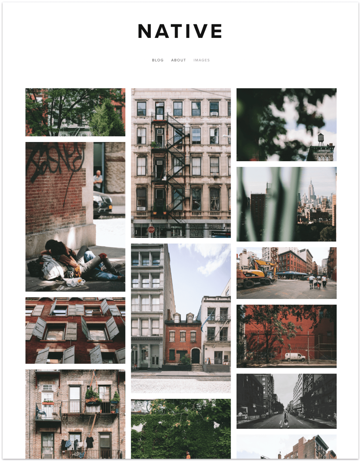
Native (demo here) is a versatile Squarespace template but it's especially good if you plan to incorporate a blog on your site because it has dedicated layout for the main blog page and blog posts.
Some of its other key features are:
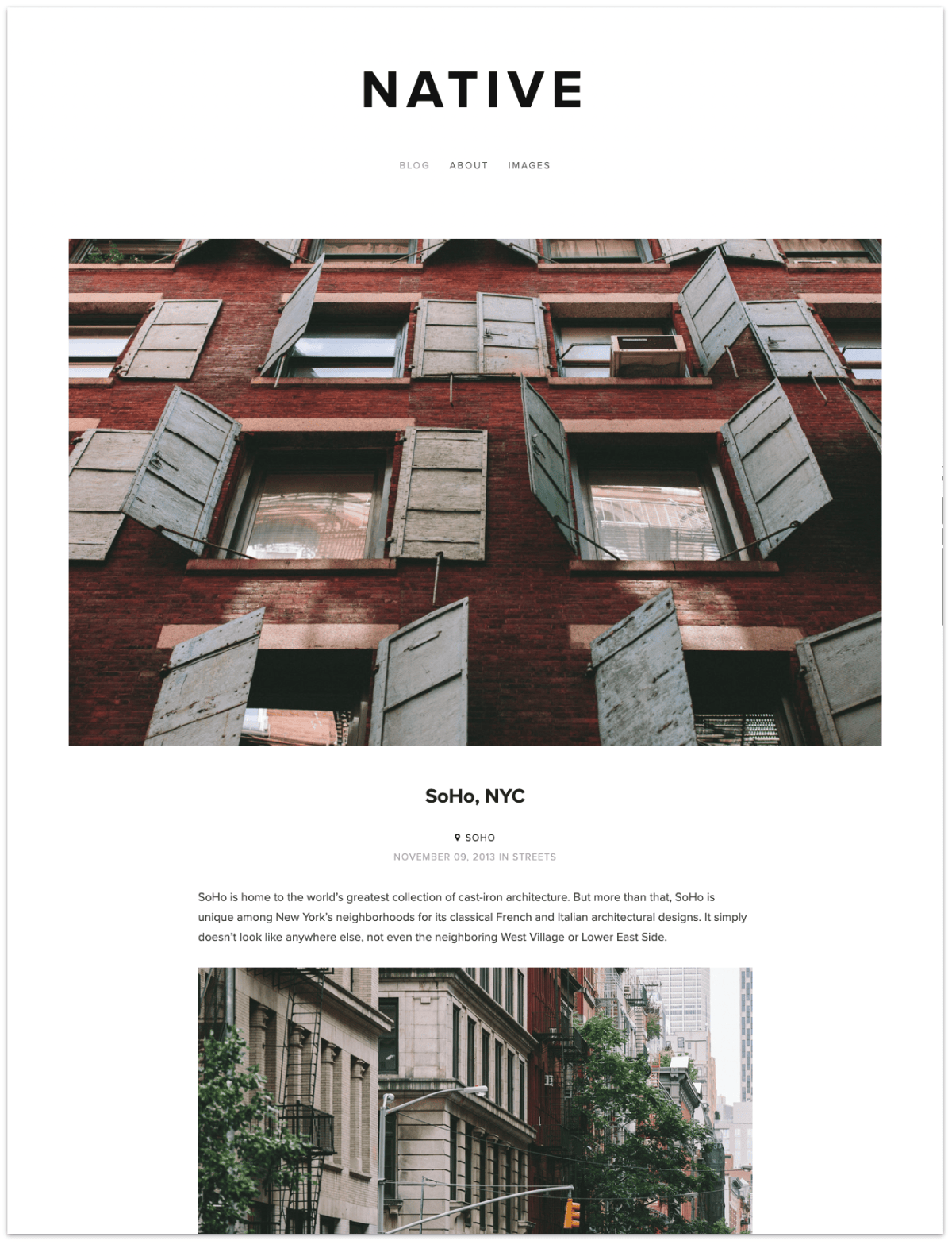
As with all Squarespace templates, Native is responsive and adjusts to look great on any device.
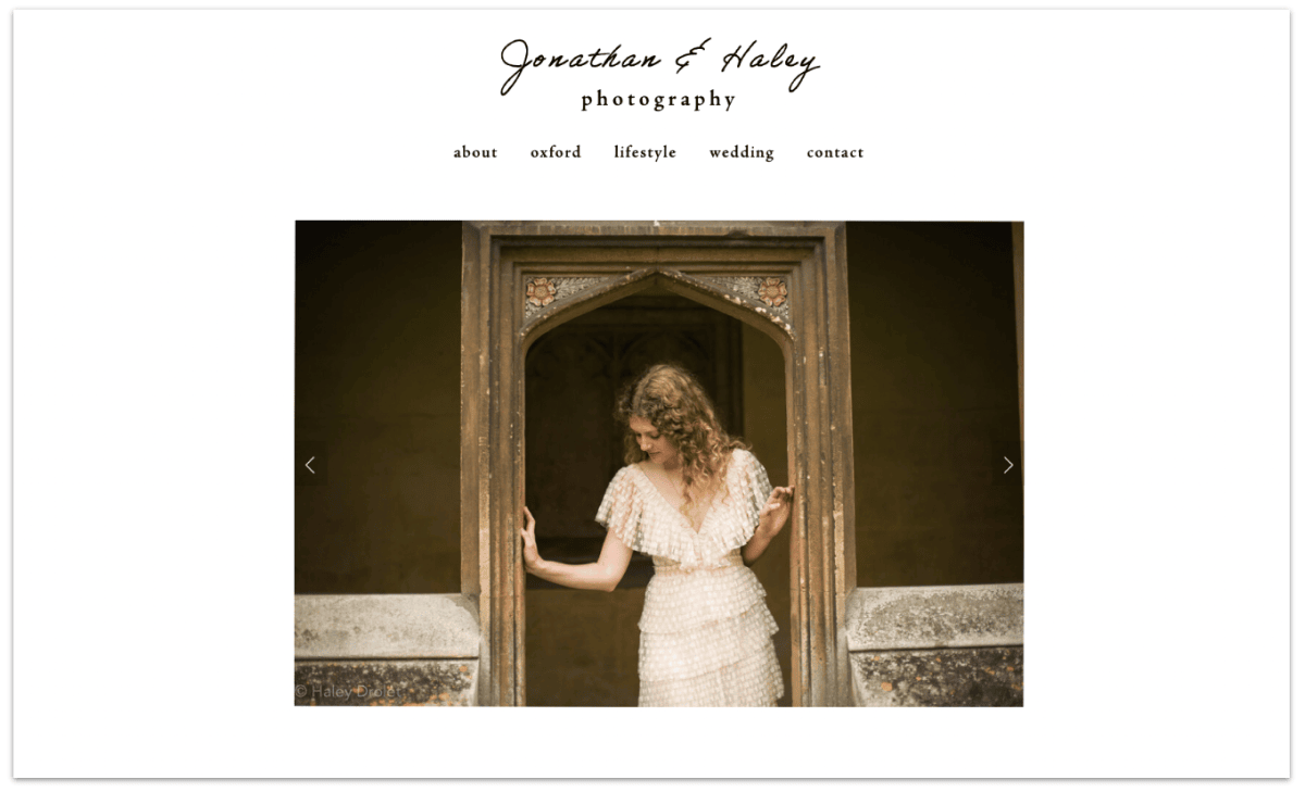
Here's an example of how Jon and Haley used the Native template for their wedding photography business.
Learn more about Native on Squarespace.
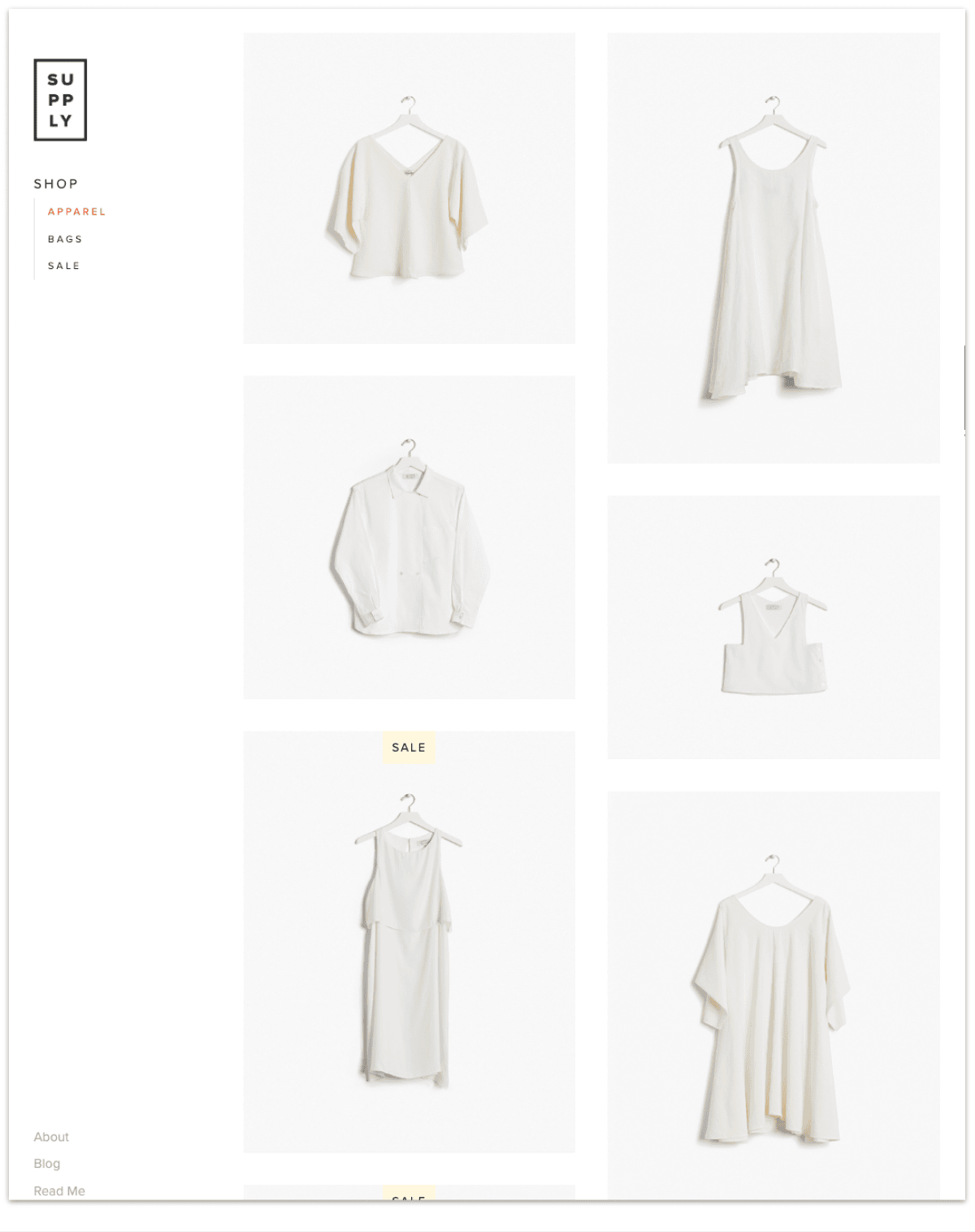
The Squarespace Supply (Demo) template is a business template with a sidebar navigation, customizable store page, and custom thumbnails for the home page.
It also has pre-built pages for music albums, blog, cover, events, gallery, home page, layout, and an online store.
The sidebar displays the site title or logo, tagline, main and secondary navigation, and built-in social icons.
Most pages have a fixed width for the content area. Some pages display a vertical banner to the right of the content area.
Here's an example of how Mike customized the Supply template, which is originally an online store template, to his personal portfolio.
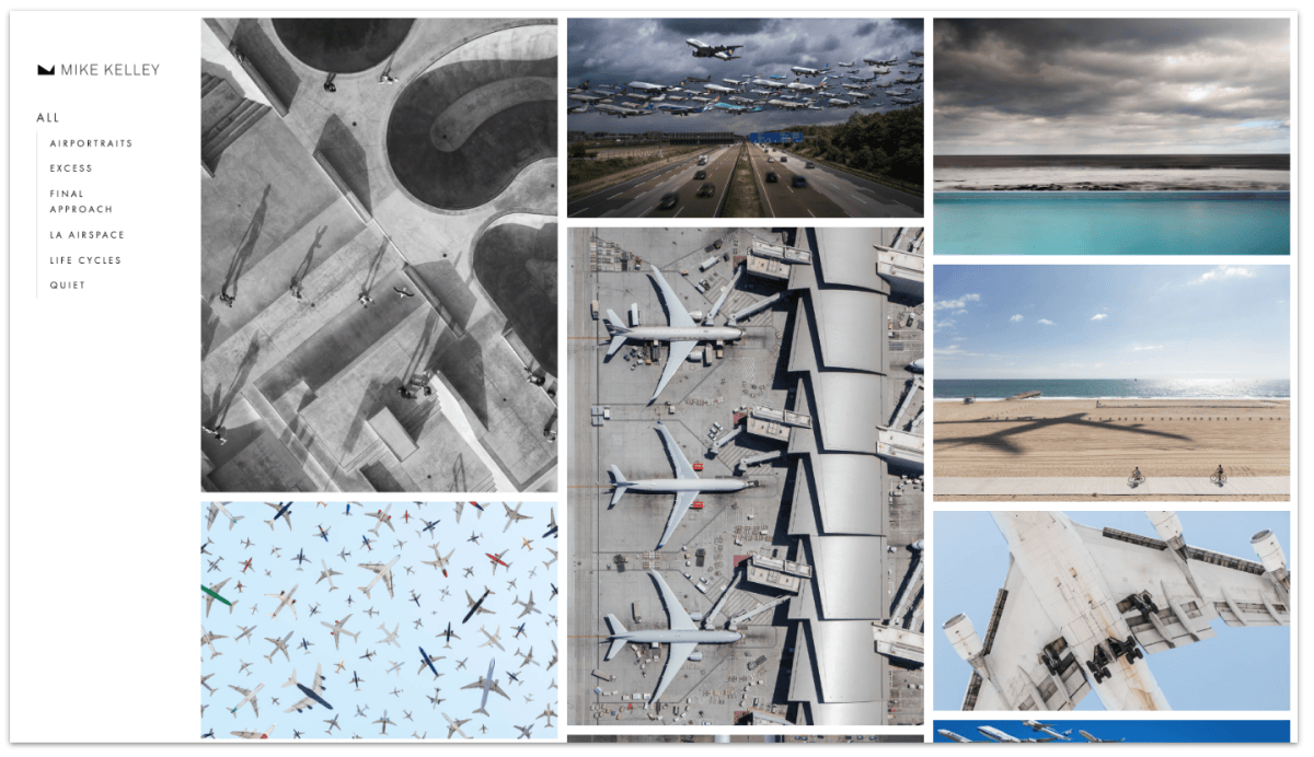
Mike Kelley's portfolio
Learn more about the Supply template on Squarespace.
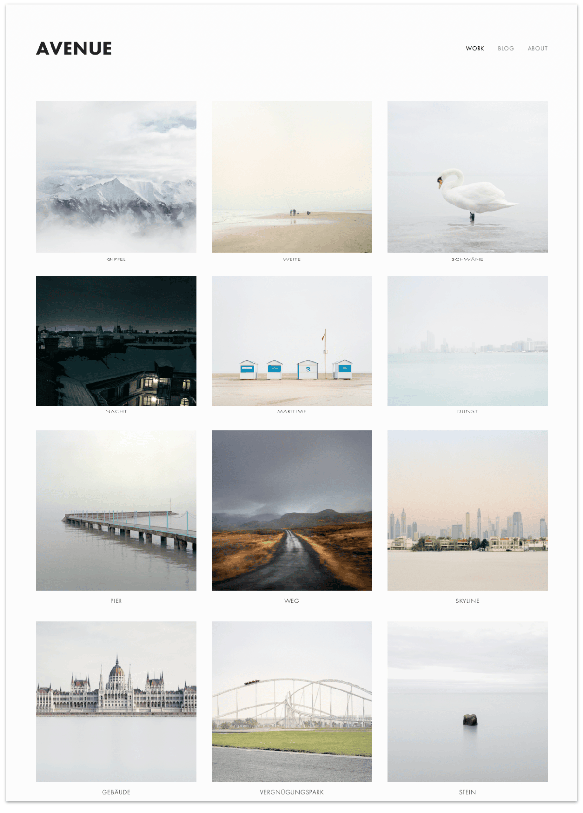
Avenue is a simple Squarespace template that displays your photographs in a grid layout, which makes it particularly well-suited for photography and design portfolios.
You can add specific content to every post or photographer, just like what Shy did for The Hyphenated Canadians project, where she featured stories of immigrants in Canada.
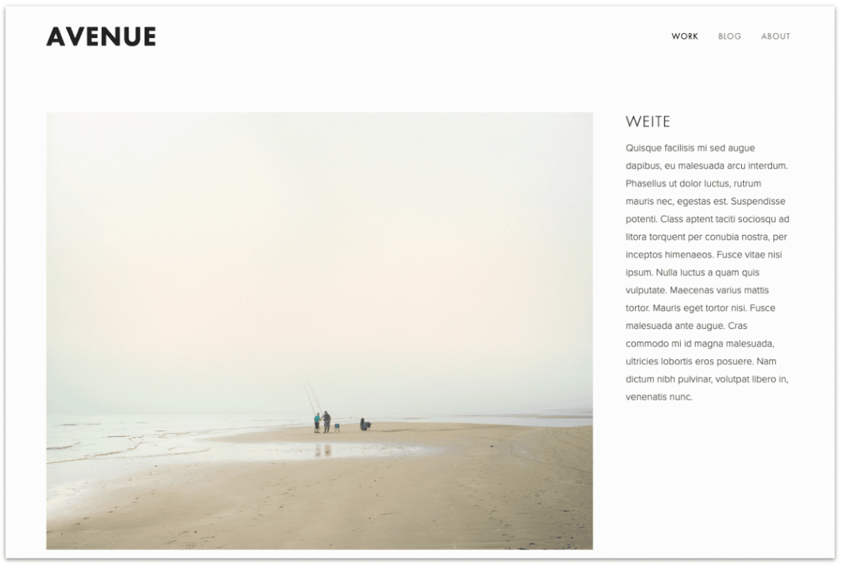
So when a viewer clicks on any of your photographs, it expands to a dedicated post, like a page in itself, where viewers can read more about it.
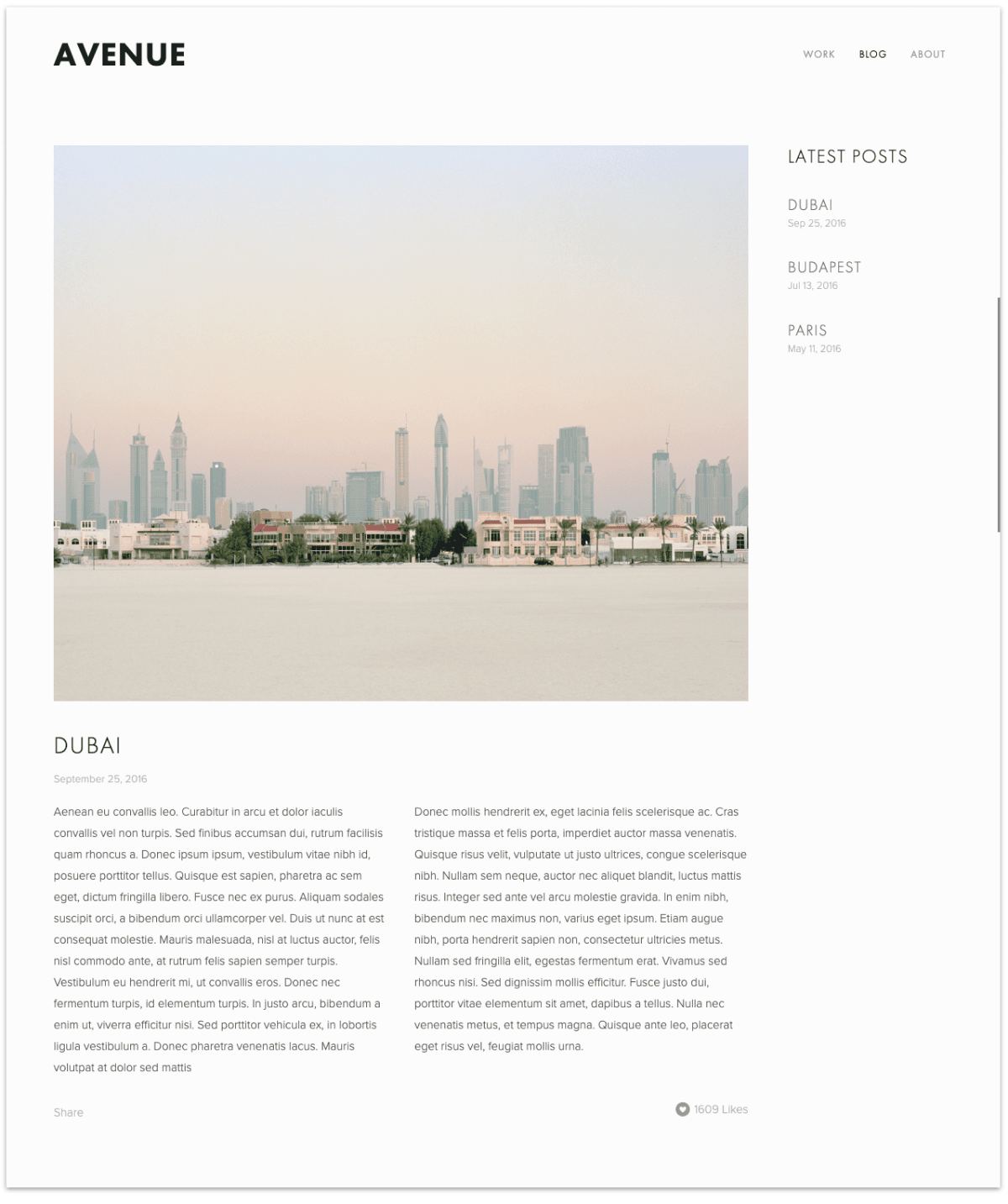
The Avenue template also comes with a blog where viewers can access the latest posts from the sidebar. You have the option to customize the blog layout, and it already has a few built-in features to get you started, such as:
Learn more about the Avenue template on Squarespace.
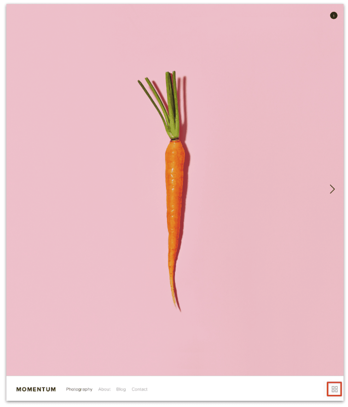
Momentum is an all-purpose portfolio template built to showcase your work with a clean style.
The signature feature of this template is the full-bleed slideshow gallery for your portfolio.
When someone clicks on the gallery icon at the bottom corner, your entire portfolio pulls up (with a slick transition, no less) in a grid view.
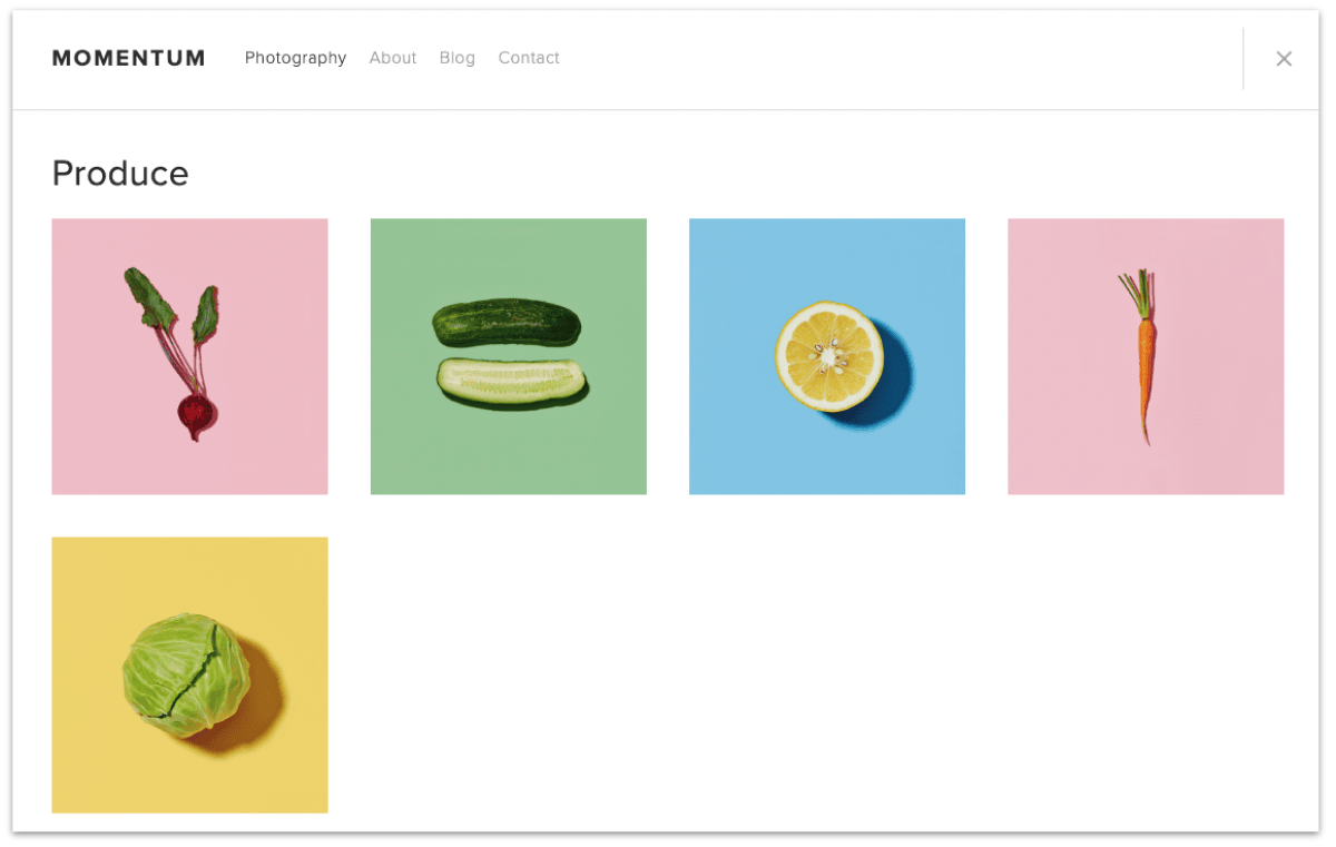
Note that the Momentum template uses a fixed navigation bar — meaning it stays in the same position at all times and across various devices. By default, the fixed navigation bar is situated at the bottom of the page, but you can move this to the top of the page as well.
The template also comes with a clean blog layout and contact page.
Even though the template is basic, well known photographer like Jared Polin used this template and customize it to suit their own style.
Learn more about the Momentum template on Squarespace.
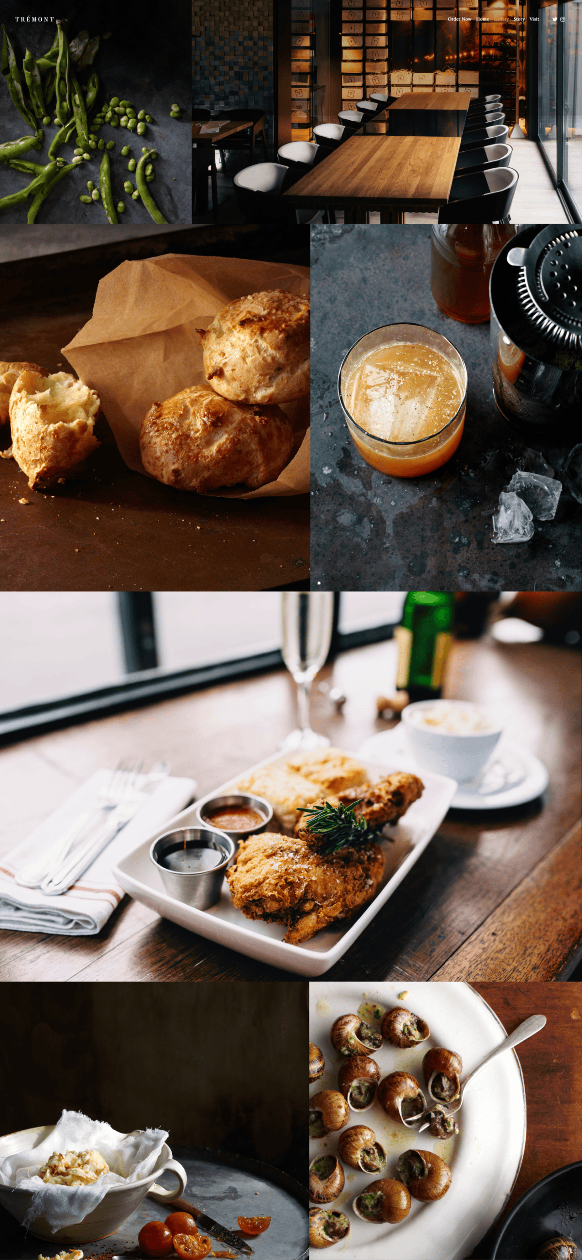
Tremont (demo) was originally a template for restaurants, but 42 FPS Productions customized it for their portfolio. They have a dedicated section to showcase their film projects as well.
If you're the type of photographer who likes full-bleed images aesthetic, then the Tremont template would be a good fit.
The images are featured a masonry layout. It's dynamic — meaning you can just drop your images in the gallery, and it'll figure out the layout automatically.
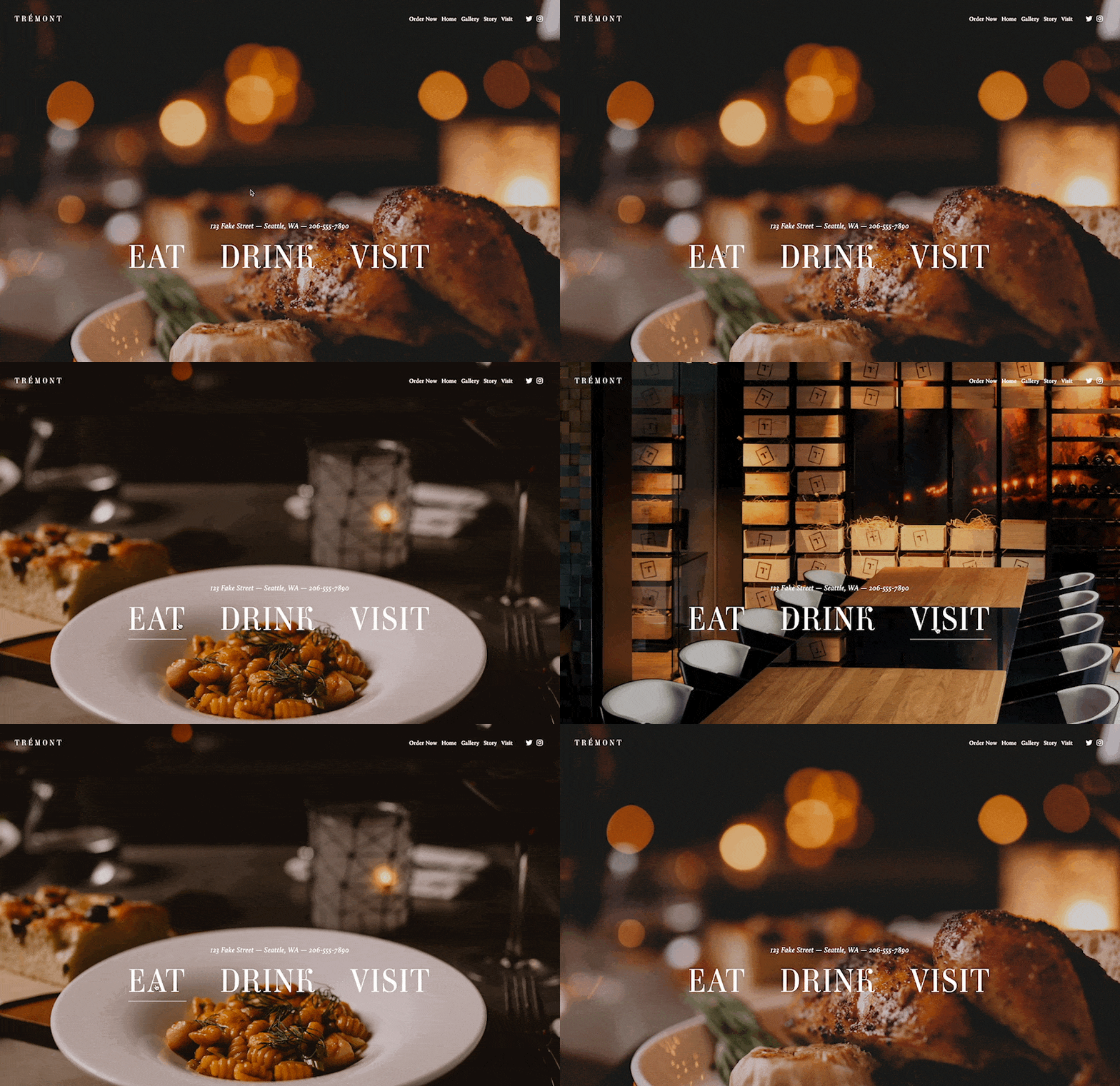
The Tremont template also has a unique text overlay feature. A custom title can show on any front cover of your site. It'll disappear when a user scrolls down, and re-appears when they scroll back to the top of the page.
It also has a hover effect for the overlay text. You can dynamically set a custom image for each overlayed text when someone hovers over them.
Learn more about the Tremont template on Squarespace.
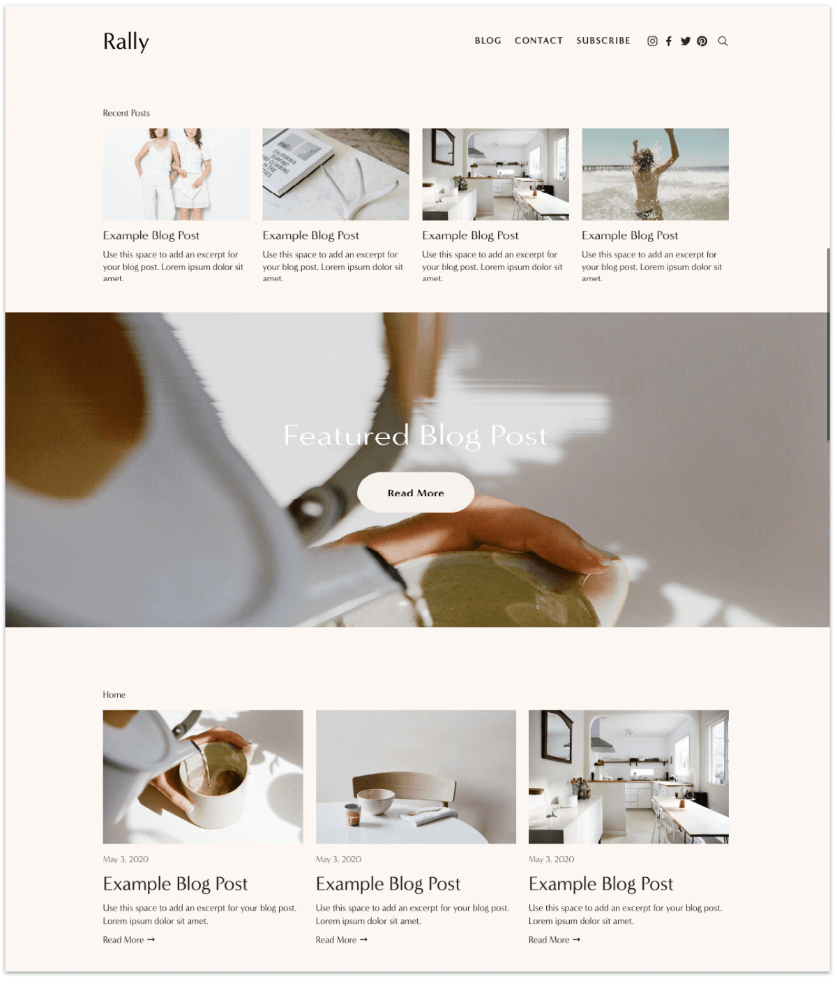
Rally makes a good branding template for photographers who need a more structured layout for their site.
You'll find 2-columns, 3-columns, and 4-columns layout throughout the site, which makes it great for business sites that incorporate a healthy mix of copy and images to sell their services.
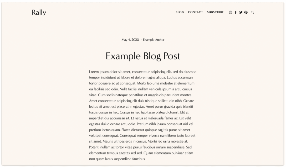
It also has a strong emphasis on blogs, featuring multiple blog categories and the latest posts on the home page. There's a newsletter sign-up form with a beautiful customizable backdrop to help you get subscribers.
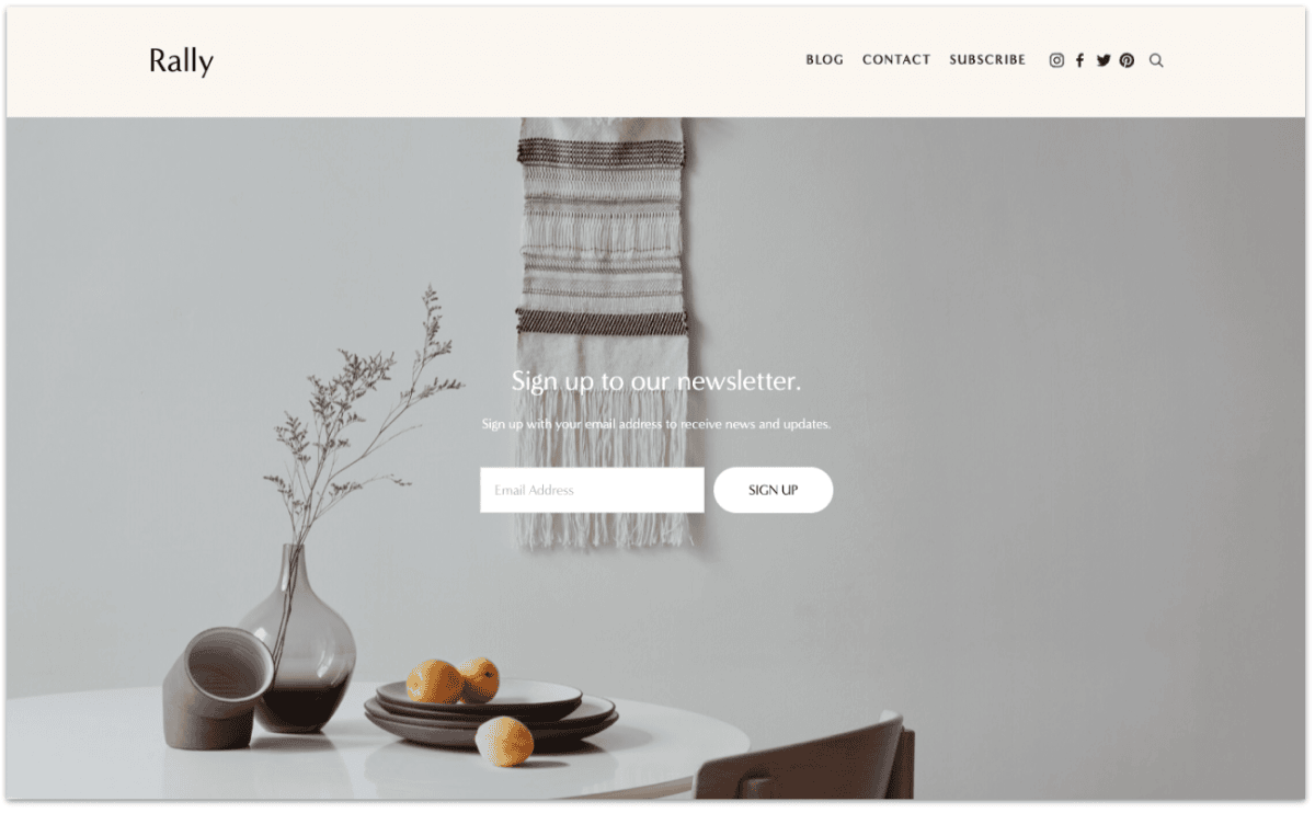
Rebecca Lee is a great example of photographers customizing the Rally template for their branded site — There's a great, consistent layout across her pricing, service, and portfolio pages to convey her values and help secure clients.
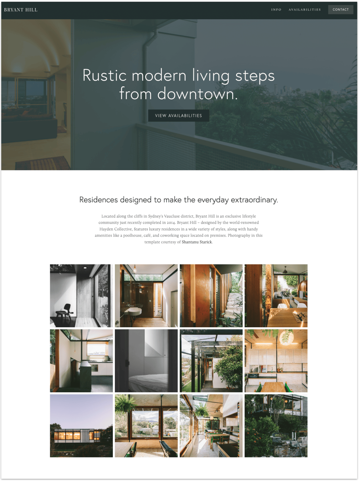
Bryant Hill is another versatile business template photographers can use to promote their product or services.
It features a large banner area at the top of the page, which can be customized into:
or you can remove the banner altogether.
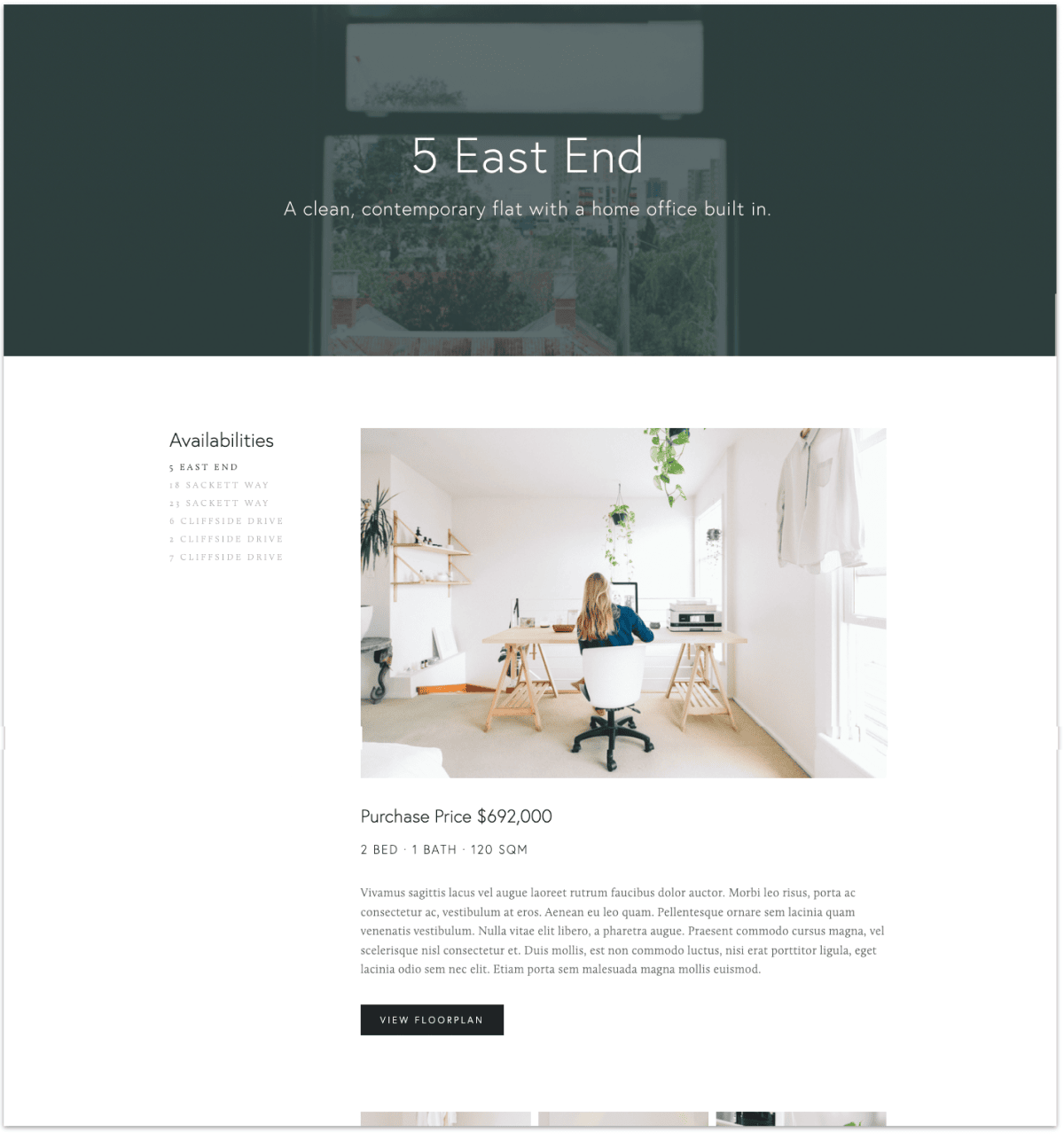
For every top-level page that you create (i.e., A category page), there's a sidebar to help users navigate the site. This sidebar applies to your blog posts as well.
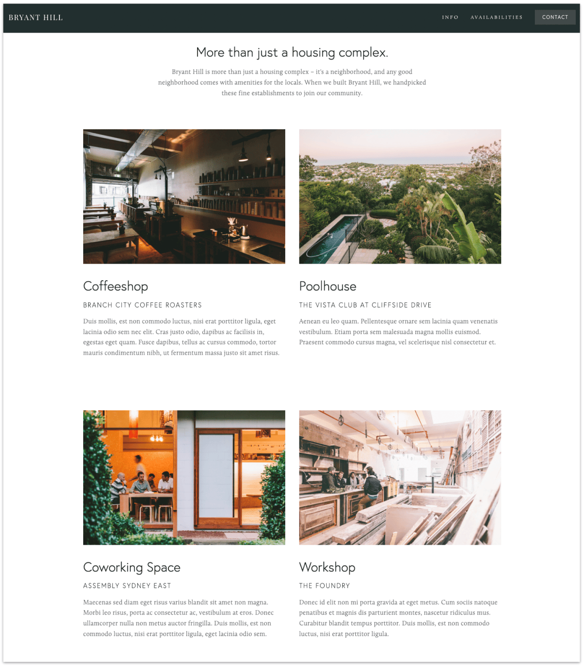
An example of a photography business that has made great use of the Bryant Hill template is Sonoma Bottle.
They specialize in photographing bottle shots for the Wine and Spirits industry. They kept their site super simple but made great use of Bryant Hill's layout to highlight their product photography.
Learn more about the Bryant Hill template on Squarespace here.
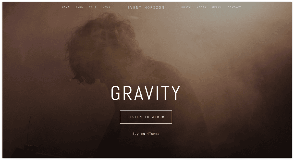
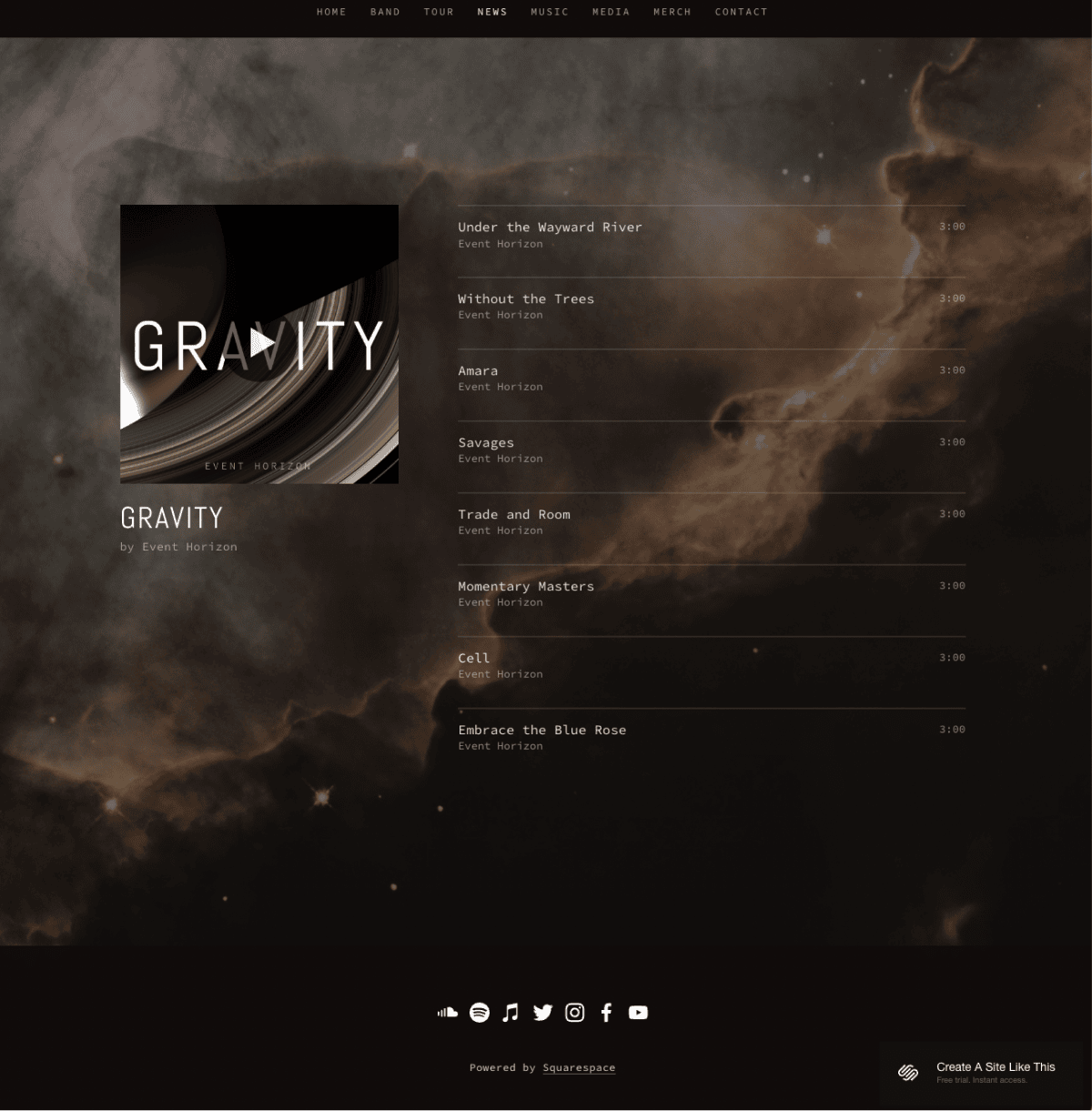
Horizon is one of the few dark-themed Squarespace templates that's also one-page layout.
That means it comes with anchor links in the header where user skips to a section of the page upon clicking it.
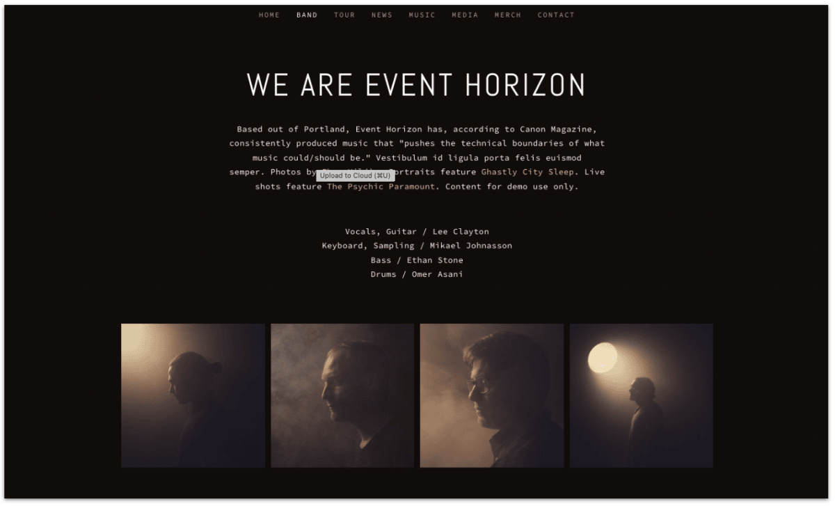
As users scroll down the page, the navigation area transforms into a narrow strip to save some real estate in the top section.
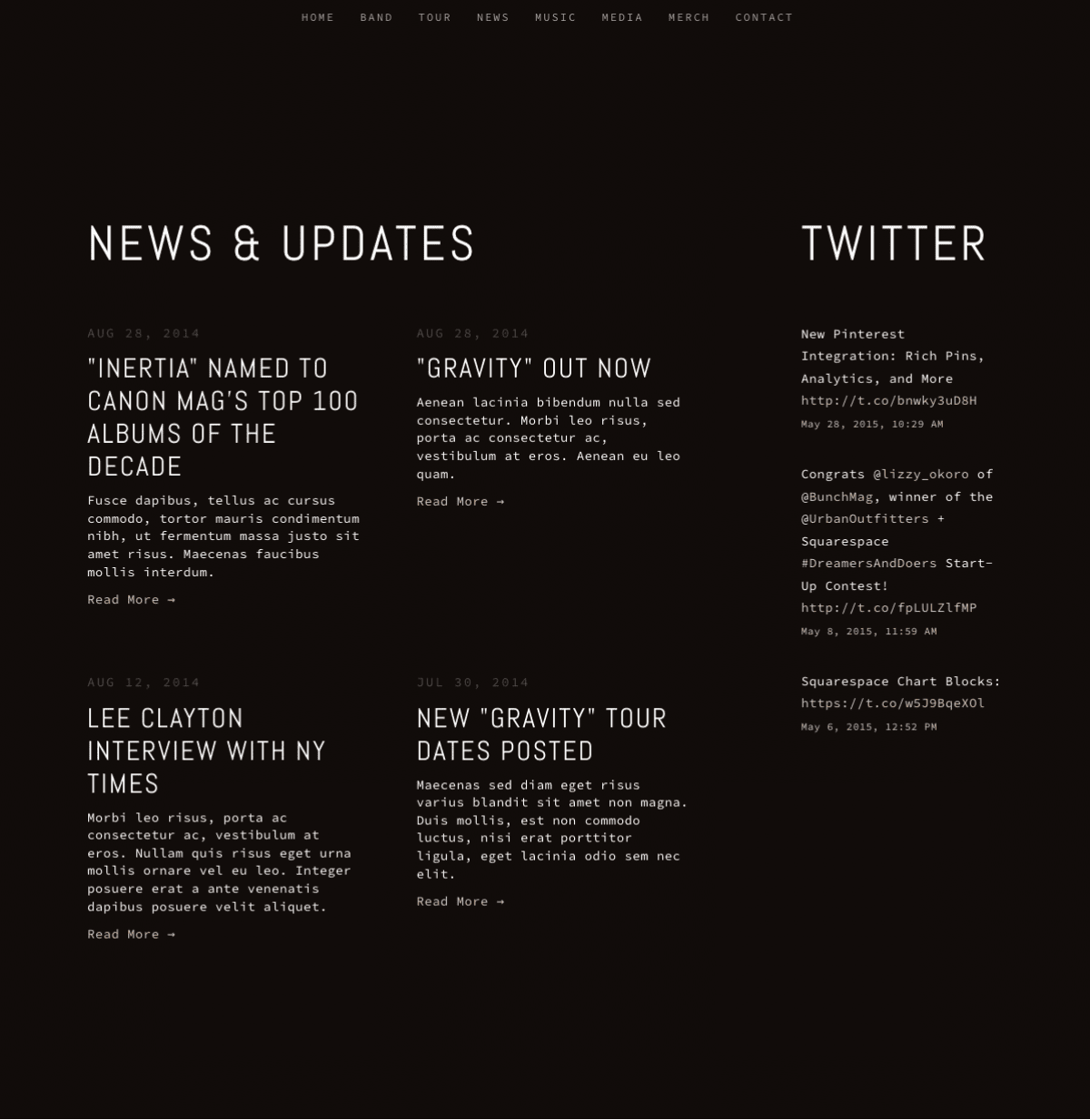
It's perfect for photographers who wants to create a simple but professional personal site to showcase their portfolio.
A great example is Isaact Wilkerson, who's made a one-page portfolio site with the Horizon template.
He's a freelance graphic designer and photographer, but you can tell from his portfolio that he has a keen eye for photography and formidable design skills.
Check out the full feature list and guide for the Horizon template on Squarespace.
For more examples, check out this post where I highlight talented photographers and how they use Squarespace for their portfolios and marketing website